Your saved photos are full of serene, empty rooms, yet your own home has laundry on the sofa, shoes by the door and a counter that collects everything. The gap makes minimalism feel reserved for people with bigger houses and quieter lives.
It is not. You do not need stricter rules or a weekend of throwing things away; you need better examples. The minimalistic home aesthetic, at its best, is simply a room that feels calm on an ordinary Tuesday — and the seven people below reached it by very different roads.
So borrow like a chef, not a photocopier. Take one detail — a colour pairing, a layout habit, a way of placing a chair — and leave the famous room behind. A borrowed principle fits your floor plan; a copied look never does.
The seven icons below include a magazine editor, a small-space planner, architects of concrete and light, and designers who build from raw stone and timber — no two alike, and that variety is their value.
What Makes a Minimalistic Home Icon Worth Following?
A useful icon is not the one with the most dramatic transformation. It is the one whose method you can still recognise in one small photograph: the same palette, the same restraint, the same respect for daylight. Look through enough minimalist living rooms and the lasting ones share exactly that — an approach repeated clearly enough to learn from.
That repeatability turns admiration into a skill: once you can see why a room works, you can borrow the method with your own furniture and budget — no signature pieces, no copied shopping lists.
- A palette you can name in three colours or fewer
- One honest material repeated until the rooms rhyme
- Furniture chosen for proportion first, decoration second
- Daylight treated as a material, not an accident
- Empty space left empty on purpose
Spot those five qualities, and your question shifts from “Where did they get that?” to “Why does that work so well?” — and the second question is the one that improves your home.
| Icon | Best Inspiration For | The Detail Worth Borrowing |
|---|---|---|
| Rosa Park | Calm tonal colour stories | One muted palette, repeated everywhere |
| Colin Chee | Tiny homes that live large | Furniture that folds, slides, disappears |
| Joseph Dirand | Quiet luxury in classical rooms | Restraint set against ornate bones |
| Karl Fournier & Olivier Marty | Raw, earthy modern spaces | Local stone, plaster, unfinished timber |
| Leo Marmol | Indoor-outdoor desert calm | Rooms arranged around the view |
| Tadao Ando | Light used as decoration | One opening, one shaft of light |
| Peter Zumthor | Atmosphere you can feel | Materials chosen for mood |
Rosa Park and Colin Chee Edit Down to What Matters
Rosa Park
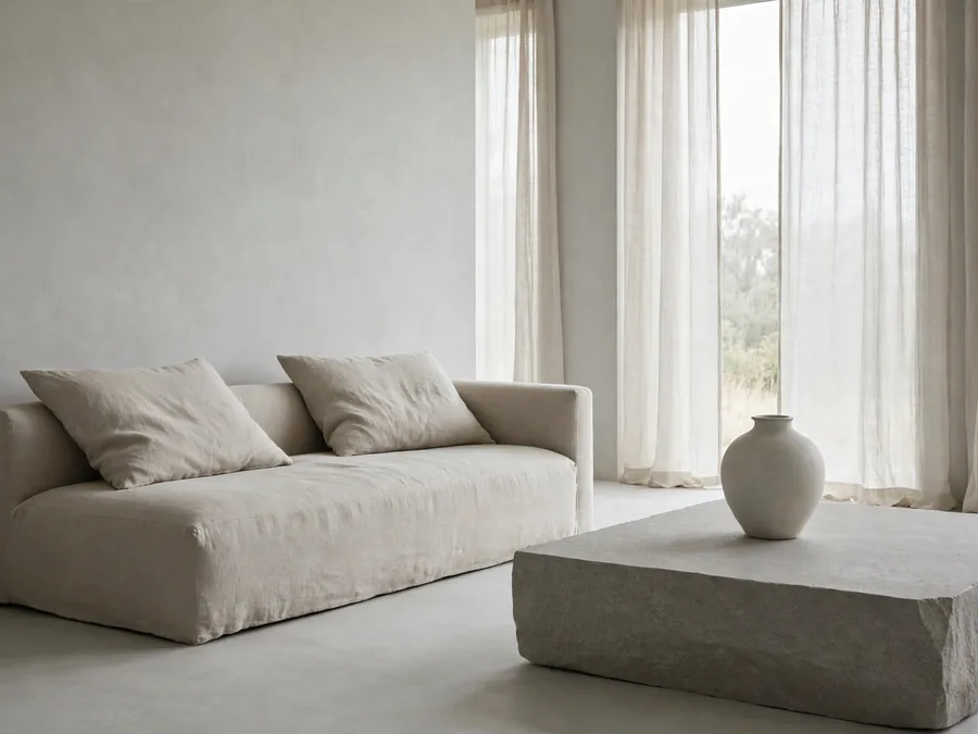
As founder-editor of Cereal magazine, Rosa Park built a world from muted tones — stone, fog, oat, pale grey — arranged like still-life paintings. Surfaces hold one or two objects, never five, and colours stay inside one tight tonal family, so a home feels like a single quiet sentence.
Borrowing the effect costs almost nothing: choose three neighbouring tones — warm white, oatmeal, soft grey — and let them govern a single room: curtains, cushions, ceramics, even the books. Anything outside the family moves to another room, and inexpensive pieces suddenly look deliberately chosen.
Color note: Tonal rooms fail when the tones quietly fight. Hold fabrics and paint cards together in daylight first; when two greiges clash, the warmer one wins the living room and the cooler moves to the bathroom.
If your home feels noisy rather than colourful, Park’s discipline is the fastest way to turn the volume down.
Colin Chee
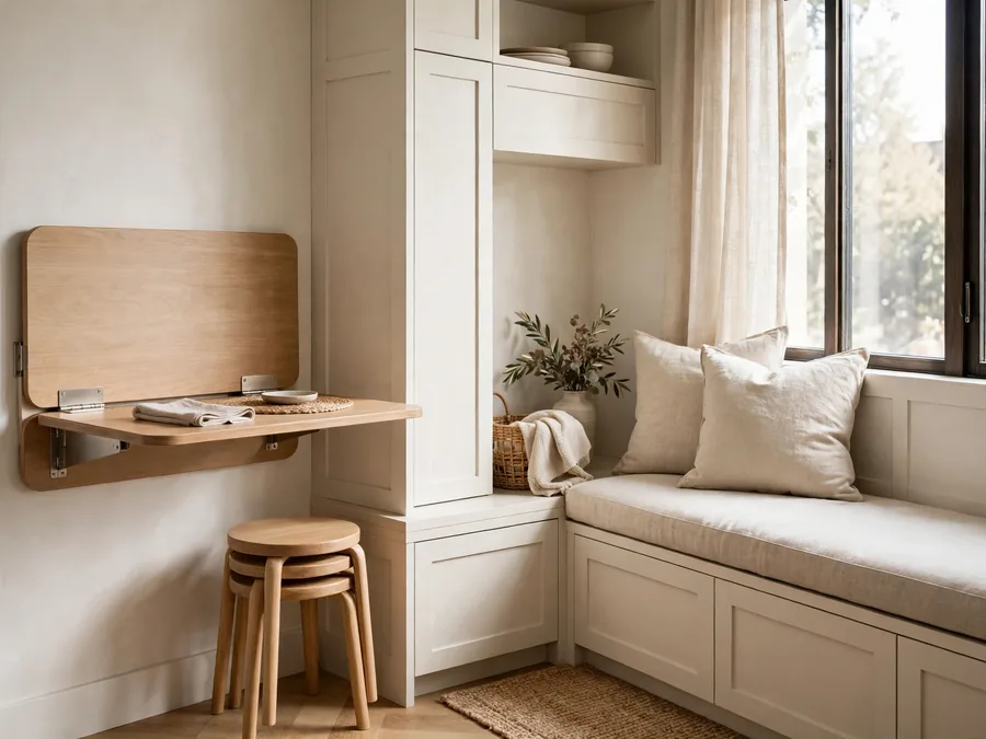
Through Never Too Small, Colin Chee built a career on small apartments that hold a full life. His signature is planning, not purchasing: joinery that hides the bed, tables that fold flat to the wall, storage tucked into every stair and hallway, so one floor plan changes jobs across the day.
No custom carpentry is needed to borrow it. List what each room must do — sleep, work, eat, host — then give every job a piece that folds, stacks, nests or rolls away. A drop-leaf table and a trolley parked in a corner outperform most decorative purchases.
| Situation | Base Pieces | Why It Works |
|---|---|---|
| Studio doubles as guest room | Sofa bed, folding screen | Room changes jobs in minutes |
| Dinner for two, or six | Drop-leaf table, stackable chairs | Table grows only when needed |
| No spare office | Fold-down wall desk, stool | Work surface vanishes at night |
Chee’s deepest lesson is respect — for small rooms, and for the people living full lives inside them.
Joseph Dirand and Studio KO Let the Architecture Speak
Joseph Dirand
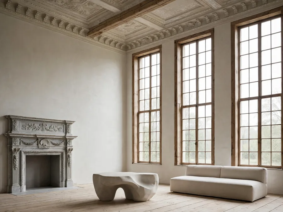
Joseph Dirand works in grand Parisian rooms — high ceilings, tall windows, marble fireplaces, swirling mouldings — and pointedly refuses to fill them. A sculptural table, a low sofa, one piece of art: the restraint turns the architecture itself into the decoration, with marble and blackened metal as quiet accents.
Every home has one generous feature, though: a tall window, an old fireplace, a run of beautiful afternoon light. Dirand’s method is simply to clear away everything competing with it — the extra chairs, the small ornaments, the visual noise — and let that one asset perform solo.
Borrow his courage to leave a beautiful corner almost empty; it will look richer than anything you could add.
Karl Fournier and Olivier Marty (Studio KO)
Karl Fournier and Olivier Marty, the pair behind Studio KO, build from the ground a house stands on. Their homes use stone from the site, bare plaster, tadelakt and raw timber, left unfinished on purpose; rooms feel carved rather than decorated, with openings cut like picture frames around the landscape.
The borrowable version is a materials-first rule for ordinary shopping. When you add or replace anything, choose the most honest material available — unlacquered wood, plain linen, unglazed clay, real stone over imitation. One true material, repeated calmly, roots a room as mixed finishes never can.
If your rooms feel decorated but never quite rooted, Studio KO’s earth-first palette is the antidote.
Leo Marmol and Tadao Ando Build Around Light Itself
Leo Marmol
Leo Marmol, of Marmol Radziner, is known for glass-walled California homes in desert and hillside landscapes, and for restoring mid-century modernist houses. Inside, furniture stays low, level and quiet, because the view through the glass is meant to be the loudest thing in the room.
Borrow the hierarchy without the desert. Decide what your main window actually frames — a tree, a garden corner, rooftops, open sky — then turn seating toward it, clear the sill completely, and remove anything tall that blocks the lower half of the view.
Start small: Clear one windowsill entirely for a week. If the room feels calmer by Friday, you have understood Marmol better than any purchase could teach you.
Marmol’s reminder is humbling: the best picture in your home may already be hanging outside the window.
Tadao Ando
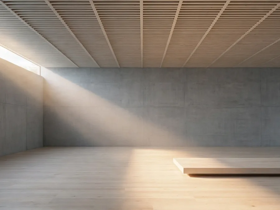
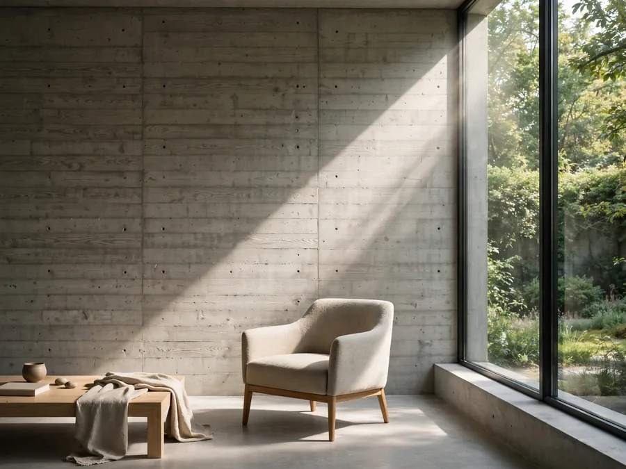
Tadao Ando, the self-taught Japanese architect, builds with smooth concrete, strict geometry and deliberate darkness — then cuts one precise opening so daylight enters like a spotlight. In his best-known work, the Church of the Light, a single cross of light does all the decorating. Where scandinavian living rooms find calm in pale wood and white paint, Ando finds the same calm in grey shadow and one bright cut.
The household version gives one light source a job. Notice where the strongest daylight lands in the room you use most, at the hour you use it; clear that path, place one meaningful thing in the beam — a plant, a reading chair, a single bowl — and let everything else stay plainer by contrast.
Ando proves a room rarely needs more light; it needs light with a purpose.
Peter Zumthor Designs for the Senses You Forget
Peter Zumthor
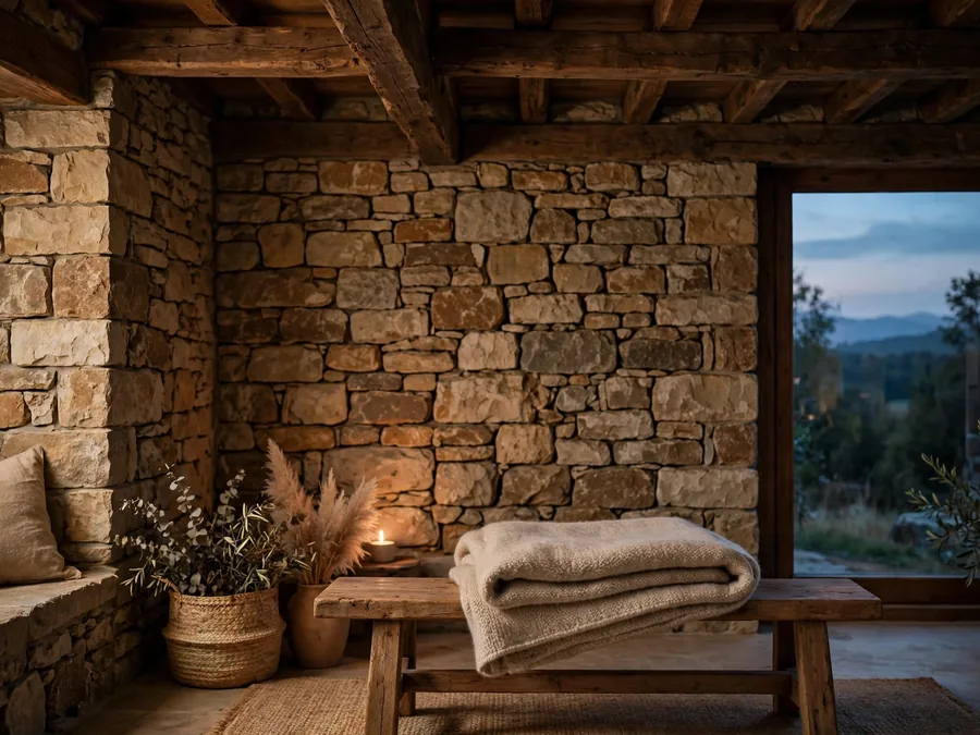
Swiss architect Peter Zumthor composes buildings the way chefs compose flavour. In works like the stone baths of Therme Vals and the brick Kolumba Museum, atmosphere comes from material, sound and temperature: the hush of thick walls, cool stone underfoot, warm timber in low light.
His is the most budget-friendly lesson here, because senses are free to tune. Walk your home slowly and listen: soften the room that echoes, warm the cold corner with wood and wool, keep one room deliberately dim for the end of the day.
Comfort upgrade: Fix one room’s sound before its look — soft furnishings where footsteps and voices land hardest. A calmer-sounding room reads as calmer design, even when nothing visual changes.
Zumthor reminds us that a home is not only looked at; it is heard, touched and remembered.
Copy the Principle, Not the Room
Every famous interior in this article was staged, lit and budgeted in ways your Tuesday evening is not. Copy one wholesale — concrete shell, glass wall, imported stone — and you get an expensive room that still feels like somebody else’s.
Look closer and each look is really a relationship: one material against another, a low line beneath a tall window, three tones repeated until they become rhythm. Relationships are free to copy — they describe how things sit together, not what they cost.
That is why the most lasting minimalist decor changes are usually subtractions and rearrangements, not deliveries. Name the relationship that caught your eye — proportion, contrast, repetition, balance — then rebuild it with the furniture and objects already standing in your house.
| Instead of Copying This | Borrow This Principle |
|---|---|
| A concrete, chapel-quiet living room | One material, repeated faithfully |
| A marble-everything designer kitchen | One honest material, used generously |
| A glass house in the desert | Furniture that never fights the view |
| An all-beige magazine interior | Three tones, held to firmly |
| A micro-apartment puzzle box | Pieces that change jobs daily |
Borrow principles long enough and the copy-shopping quietly stops — because you have built something better: your own taste, trained on rooms you already own.
Build Your Own Home Formula From the Icons You Like
Do not adopt any one icon whole. Mix two or three instead — Park for palette, Chee for planning, Ando for light — or find your own combination: one icon for restraint, one for warmth, one for the view.
Formula: pale walls and plain floors as the base + one layer of natural texture in linen, timber and wool + one deliberate shaft of light or a single artwork + one object with a story as the finishing touch
When a room needs to change, alter one part only — swap the texture layer with the season, or move the single artwork — then live with it a week. One change at a time teaches you what your taste actually is.
The best icon, in the end, is simply the one who helps you recognise what you already like.
Frequently Asked Questions
I rent my home. Can I still use these ideas?
Almost all of them: palette discipline, layout, cleared sills and controlled light are all reversible and need no landlord’s permission. Start with Park’s three-tone rule in the room you use most.
How do I borrow a look without spending much?
Begin with subtraction, which is free: remove, rearrange, clear. Most of these icons are famous for what they left out, so your first borrowed detail should be an edit, not a purchase.
Which icon should a beginner follow first?
The one whose problem matches yours. Small rooms point to Chee, noisy colour to Park, a dull view to Marmol. One matching problem teaches you more than seven admired styles.
Does minimalism mean giving up colour and personality?
No — it means giving them a stage. Ando’s shadow and Zumthor’s timber are full of character; restraint simply means each loved object is seen properly, instead of competing with twenty others.
How do I make an ordinary room look finished?
Give it three things: a palette it obeys, a focal point it serves, and air around what remains. Finished is rarely about adding; it is about deciding.