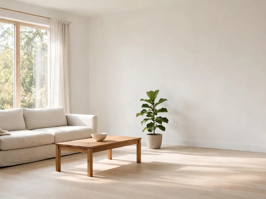
Your saved photos are full of calm, pale rooms that look nothing like the home you live in. The sofa is wrong, the light is wrong, and the budget in those pictures is quietly doing most of the work. So the inspiration piles up, and your rooms stay as they were.
You do not need another list of strict rules. The most useful minimalist home decor ideas tend to arrive as people, not commandments: stylists, writers and designers whose rooms you can study slowly, the way you learn from a good cook by watching their hands.
The trick is to borrow like a grown-up. Never copy a whole look; borrow one detail at a time — a way of pairing black with warm white, a habit of stopping one object early, a layout that leaves the room’s middle empty.
The seven icons below all simplify, but none in the same way. One edits, one contrasts, one softens concrete with something old. Somewhere in these approaches is the one that fits your rooms, your family and your actual Tuesday.
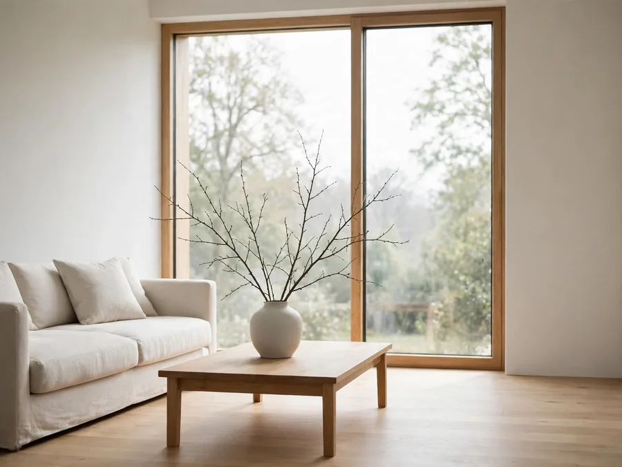
What Makes a Minimalist Home Decor Icon Worth Following?
A useful icon is not the one with the most dramatic before-and-after. It is the one whose approach repeats, calmly and recognizably, until you can explain it back. When the same palette and the same few habits keep showing up, you are looking at a method, not a mood.
That method matters because it travels. You can watch their minimalist decor changes happen one honest step at a time, each small enough to try in a rental or one tired corner. Borrow the method, and the exact products stop mattering.
- A repeatable layout you can sketch from memory
- Color combinations that stay fresh without shouting
- Comfort that still looks calm and finished
- One strong styling habit, used consistently
- Rooms that leave space empty on purpose
Follow people like this and your question changes from “Where did they get that?” to “Why does that work so well?” — the question that actually improves your home.
| Icon | Best Inspiration For | The Detail Worth Borrowing |
|---|---|---|
| Erin Boyle | Small spaces, simple living | Let every object earn its place |
| Jennifer Hagler | Black-and-white Scandinavian calm | Use contrast instead of more objects |
| Desiree Groenendijk | Industrial rooms with soul | Soften hard materials with vintage |
| Becki Owens | Bright, family-friendly interiors | Layer neutrals over a clean shell |
| Melissa Coleman | Organized, everyday minimalism | Give systems priority over styling |
| Molly Kidd | Light-filled, tailored rooms | Plan around daylight first |
| Anne Sage | Warm, collected minimalism | Add texture, not quantity |
Erin Boyle and Jennifer Hagler Show How Editing Becomes the Decor
Erin Boyle, of Reading My Tea Leaves, built her reputation in genuinely small city apartments, where every object had to argue for its place. Her rooms lean on warm white walls, natural wood and linen, and a few well-used things rather than a rotation of new ones.
Her signature is the earn-its-place edit. A chair stays because it is sat in daily and still looks good; a basket stays because it works every day. Each item passed two tests — useful, and pleasant to live with — first.
Start small: Begin with the corner chair, the one holding clothes and good intentions. Clear it completely; let back only what you would miss tomorrow.
Borrow it by auditing one surface at a time, keeping only what passes both tests. If your home is small or shared, Boyle proves fewer, better-kept things can feel like more room, not less.
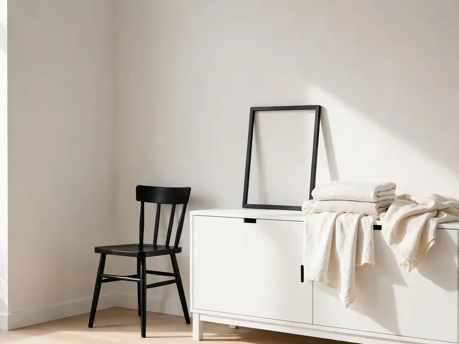
Jennifer Hagler, of A Merry Mishap, works at the opposite temperature: Scandinavian restraint in black, white and grey. Her styling is graphic and quiet — a black outline here, a pale wall there, long stretches of nothing that make few objects look deliberate.
Her lesson is that contrast does the decorating. When black meets warm white, the eye gets all the interest it needs, so she stops adding things far earlier than most of us dare. A dark frame, a pale textile, one strong silhouette — the relationship is the ornament.
Recreate it by choosing two tones and letting them repeat: black in a frame, a lamp and a leg; warm white in walls, bedding and paper. If your rooms feel busy despite owning little, calm may be a contrast problem, not a quantity problem.
Desiree Groenendijk and Becki Owens Prove Balance Beats More Stuff
Desiree Groenendijk, of Vosgesparis, brings an industrial backbone to minimalism: concrete tones, steel, black metal and honest, unpolished surfaces. She mixes them with vintage finds, so a worn stool or aged mirror keeps it human — curated, never showroom-cold.
Her signature move is softening exactly once. The hard material leads — a metal cabinet, a raw wall, a black rail — and one older, warmer piece answers it. Rationed softness registers; three soft things would dissolve the tension.
| Situation | Base Pieces | Why It Works |
|---|---|---|
| Cold rental kitchen | Black rail, steel shelf, worn wooden stool | One warm piece relaxes the hard lines |
| Plain grey corner | Metal cabinet, linen curtain, aged mirror | Soft fabric keeps the edge friendly |
| Stark hallway | Steel bench, vintage rug, simple hook row | The old piece adds the story |
Borrow the balance with what you own: pair your hardest surface with one worn or woven piece, then stop. If your taste runs modern but your rooms feel chilly, her one warm answer is the fix to steal.
Becki Owens builds minimalism’s friendlier end: bright rooms, clean lines and soft neutrals — white, sand, pale wood — with black accents sharpening the edges. Her interiors are made for real households, so the calm must survive children, guests and mess.
Her lesson is the bright base, layered quietly. She starts with a clean, light shell, then adds warmth thinly — a woven texture here, a wood tone there — so the room gains depth without gaining objects. It assumes life will happen in it.
Borrow it by lightening the base first, then adding one layer of texture at a time. That is why her simple minimalist decor feels possible with homework, laundry and muddy shoes around. Owens is calm that forgives real life.
Melissa Coleman and Molly Kidd Build Calm From the Ground Up
Melissa Coleman, of The Faux Martha, treats minimalism as a household practice, not a photo style. Her spaces are simple and neutral, but the real signature is order: things have homes, counters reset easily, and calm is something the house does daily.
Her lesson is systems before styling. A room stays minimal because the mail has a landing place, kitchen tools are few and reachable, and storage is decided before decor is. Her objects are ordinary; the discipline behind them is the point.
Budget note: Coleman’s approach costs almost nothing: the purchase is small — one basket, one drawer divider — while the real work is deciding where things live.
Borrow it by fixing one friction point: the daily pile gets a container and a rule before you buy anything pretty. If your rooms look fine one day after tidying, Coleman shows how to make calm stay.
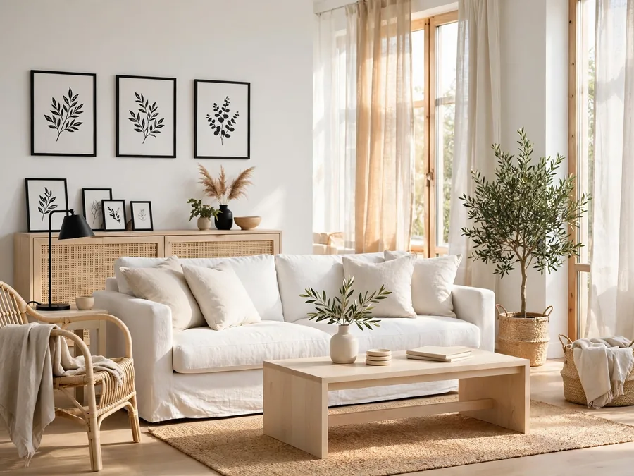
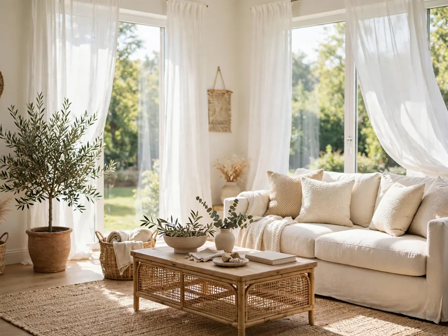
Molly Kidd, of Light and Dwell, designs rooms that begin with daylight. Her interiors favor pale, reflective surfaces, tailored shapes and soft layers of cream, white and natural fiber, arranged so light moves through the room.
Her signature is treating light as the first layer. Before color or furniture, she asks where light enters, what it lands on and what blocks it. Pale upholstery near a window and curtains that open fully do more than any accessory.
Recreate it by moving one seat into your best light, clearing whatever blocks its window, then adding color last, in small doses. If your rooms feel flat when tidy, light first is the missing layer.
Anne Sage Adds Warmth Without Adding Things
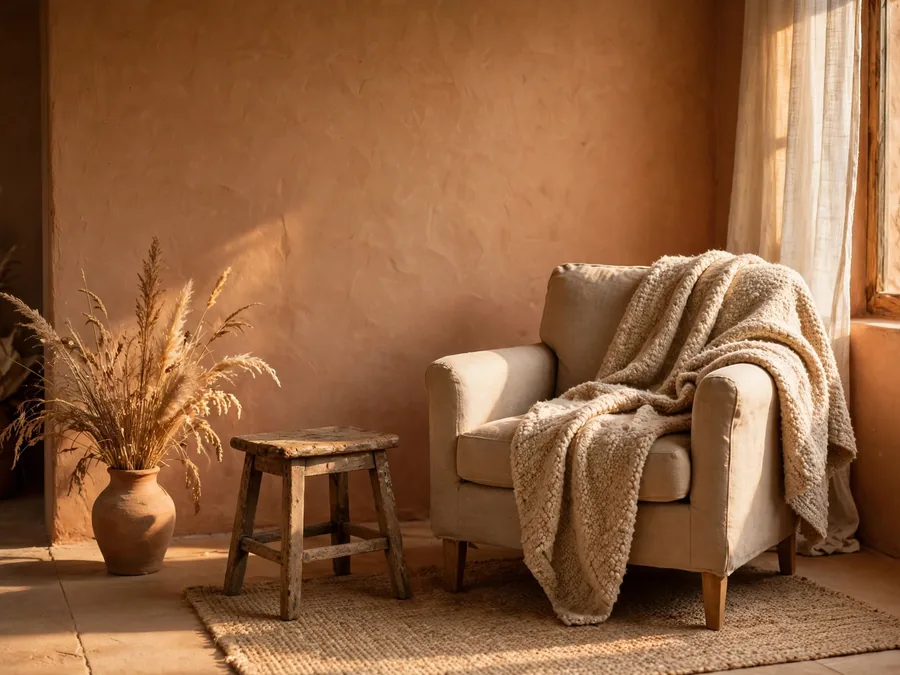
Anne Sage closes the list with the warmest version of restraint. Her rooms mix modern shapes with collected vintage pieces in earthy tones — clay, sand, olive, worn wood — styled with generous breathing room, so a few objects carry the whole space.
Her lesson is warmth through texture, not quantity. A nubby throw, a handmade-looking ceramic, an old stool’s patina: these add what people usually chase with more decor. With palette earthy and count low, texture becomes the richness.
Reality check: Sage’s rooms are styled by a professional, slowly, with an editor’s eye. Borrow her patience and textures, but expect your version to gather over months, not a weekend.
Borrow it by swapping one smooth new surface for something with grain or age — a wooden board, a woven basket, a thrifted stool — and removing one object to pay for it. Sage proves restraint and warmth are the same decision.
Copy the Principle, Not the Room
Every room in your saved photos was staged, lit and budgeted by someone whose job is rooms. Copying the shopping list copies the expense, not the effect — the effect was never in the objects. It was in their relationships: proportion, contrast, repetition, balance.
So learn to name what caught your eye before reaching for your wallet. Was it the calm? That is usually proportion — big pieces, few of them, with air around each. The richness? That is often repetition: one material returning three times.
These are not minimalist styling tricks to memorize; they are relationships to notice until your eye spots them alone. Once you can name one, you can rebuild it with the furniture already in your home.
| Instead of Copying This | Borrow This Principle |
|---|---|
| A designer’s exact white sofa | The pale base that quiets the room |
| A stark black-and-white scheme | Strong contrast in just two tones |
| An industrial loft’s concrete walls | One hard material, honestly shown |
| A styled shelf of matching objects | Repetition of one shape or finish |
| A picture-perfect, untouched room | Proportions that leave breathing space |
Borrow principles and the copy-shopping stops: you are no longer hunting for someone else’s objects, but building your own taste, one relationship at a time.
Build Your Own Home Formula From the Icons You Like
Do not marry one icon. The most livable version mixes two or three: Boyle for editing discipline, Hagler for contrast, Sage for warmth. One gives restraint, another nerve, a third keeps it human.
Formula: edited base pieces + one soft layer + one personal detail + one living finish
Vary it slowly — change one part at a time, then live with it a week. Swap the soft layer from linen to wool, or the personal detail from a print to a plant. Small experiments teach faster than big makeovers.
In the end, the best icon is simply the one who helps you understand what you already like — and trust it enough to stop there.
Frequently Asked Questions
How many of these icons should I follow at once?
Two or three is plenty: one for restraint, one for contrast, one for comfort. More voices than that usually means more screenshots, not better rooms.
How can I borrow these looks without buying new furniture?
Start by editing, moving and repeating what you already own. Most effects above come from placement, contrast and breathing room — all free. Buy only when a borrowed principle names a genuine gap.
What if my home is small, rented or shared?
Begin with Boyle’s earn-its-place edit and Coleman’s simple systems, which need no permission and no renovation. Small spaces show these principles fastest: every object removed changes the whole room.
Should I follow minimalist trends when they change?
Borrow principles, not trends. A trend asks you to replace things; a principle asks you to rearrange, repeat or remove them. If it still works with what you own, it was never a trend.
How do I make a room look finished without adding decor?
Give it one clear focal point, repeat one material three times, and leave real space around what remains. Finished is a matter of relationships, not one more object.