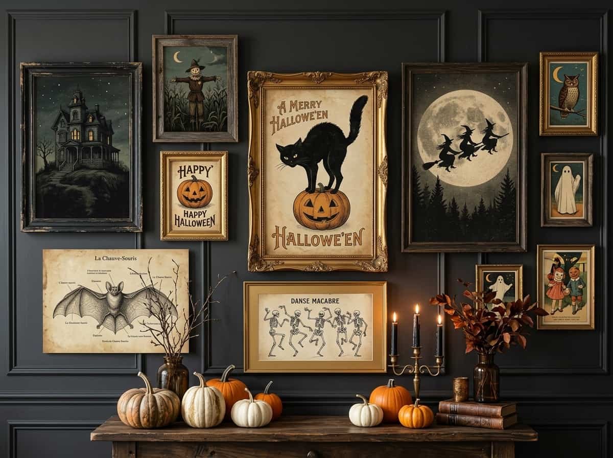
You pull out the Halloween box, and there it is again: the plastic skeletons, the glittery bats, the orange garland that looks a little tired before October even starts. You want your home to feel spooky, but you also want it to feel like your home. Most seasonal decor asks you to choose between fun and tasteful.
There is a better way, and it hangs on the wall. Vintage Halloween art prints bring mood, history, and a bit of mystery into a room without turning it into a party store. One well-chosen print can do what a dozen novelty props can’t.
In this guide, I’ll walk you through how to find, print, frame, and arrange vintage Halloween art prints so your walls look collected, not costumed.
What Makes Vintage Halloween Art So Timeless
Old Halloween art works because it was made to be looked at, not just scanned past. The illustrators of earlier eras used hand-drawn lines, softly printed color, and slightly odd, expressive faces. That handmade quality gives a print a personality that glossy modern graphics rarely match.
There is also a restraint to it. Vintage pieces tend to use a limited palette: muted orange, inky black, faded cream, dusty green. Limited color is the reason these prints feel calm even when the subject is a witch or a skeleton. Your eye reads “atmosphere,” not “noise.”
Think of it this way: modern Halloween decor shouts, while vintage Halloween art whispers. A whisper is easier to live with, and it fits beside your everyday furniture instead of fighting it.
1. Where to Find Free Public Domain Halloween Prints
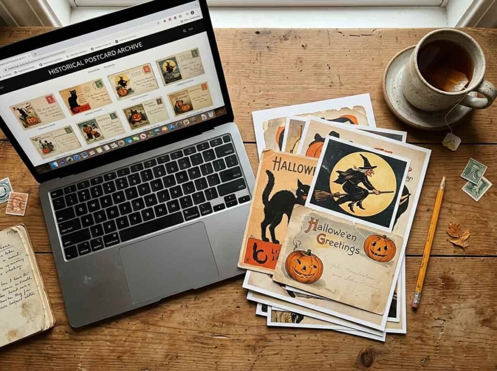
You don’t need a big budget to start. Many libraries, museums, and archives share digital collections of old postcards, magazine pages, and illustrations. Public domain Halloween prints from these sources are often free to download and print for your own home.
A quick note: rights can differ by item and by country, so always read the usage notes on the page before you download.
| Where to Look | What to Look For | Why It Works |
|---|---|---|
| Library and museum digital collections | High-resolution scans with clear usage notes | Bigger files stay sharp when you print them larger |
| Antique postcard archives | Full-card scans including the border and handwriting | The aged edges add authenticity you can’t fake |
| Old magazine and book illustration collections | Single bold images with plenty of empty space | Simple compositions look stronger on a wall |
| Vintage greeting card collections | Lettering and decorative frames | Typography adds a collected, ephemeral feel |
Quick Tip: Download the largest file available, even if you plan to print small. You can always scale down, but you can never scale up without losing detail.
2. Antique Witch and Black Cat Illustrations
Witches and black cats are the heart of classic Halloween imagery, and they are an easy place to start because they read as “spooky” instantly, even in a quiet palette.
The trick is balance. Pair something a little eerie with something calm. A witch silhouette against a pale moon looks gorgeous over a soft linen sofa. A black cat print looks sophisticated next to a plain wooden shelf. The contrast between spooky subject and gentle surroundings is what makes the whole look feel intentional.
Here is how the thinking has shifted:
| Old Rule | What Works Better Now |
|---|---|
| Fill every wall with Halloween items | Choose one or two walls and leave the rest alone |
| Use bright orange everywhere | Let muted orange appear as a small accent |
| Buy matching decor sets | Mix different eras and artists for a collected look |
| Take it all down on November 1 | Choose prints moody enough to stay up through autumn |
3. Retro Pumpkin and Jack-O’-Lantern Postcards
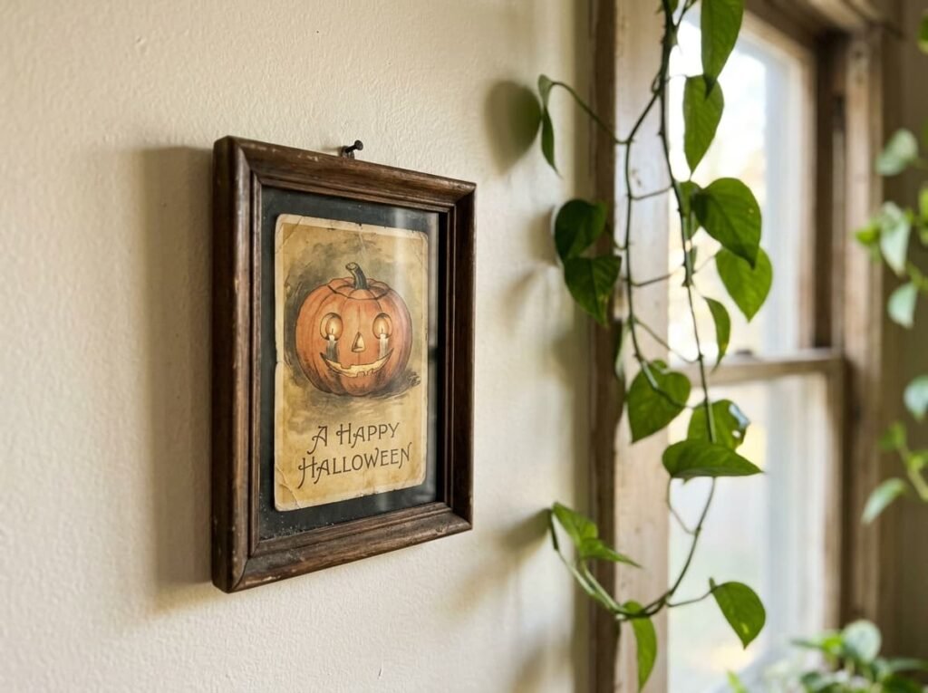
Old pumpkin and jack-o’-lantern postcards are charming because the faces are so characterful: lopsided grins, wide eyes, a bit of mischief. They are the friendliest corner of vintage Halloween art, which makes them perfect for kitchens, hallways, and family spaces.
Give One Print Permission to Stand Out
Here is the rule I come back to again and again: pick one focal point. Choose your single boldest print, such as the biggest pumpkin scene, and hang it where the eye lands first. Let the other pieces support it with smaller sizes and quieter colors. When everything competes, nothing wins.
Keep It From Feeling Like a Party Store
- If the orange feels too loud, try sepia or black-and-white versions of the same print.
- If the faces feel too cartoonish, choose prints with more line work and fewer filled-in colors.
- If the wall feels crowded, remove one piece and increase the space between the rest.
- If the look feels too themed, pair one Halloween print with a non-Halloween botanical or landscape print.
- If it feels too heavy for daytime, add a lighter mat or a cream background around the art.
4. Victorian-Style Skeleton and Raven Prints
If you want drama, this is the category. Skeletons and ravens in an engraved, Victorian-inspired style feel more like natural history illustrations than holiday decor. That is exactly why they look so good in a study, bedroom, or dining room.
Not ready for something so dark? Make it softer. Choose a skeleton print with a lot of white space, or a lone raven on a pale background. Frame it in a light wood or soft white frame and the same image goes from gothic to gently moody. It is the easiest way to enjoy the spooky look without it feeling heavy.
5. Best Frames for an Aged, Collected Look
The frame decides whether a print looks like a screenshot or a treasure. A few simple choices make a big difference:
- Dark wood or black frames give a classic, library-style look.
- Antique gold or brass-toned frames add warmth and a hint of old-gallery charm.
- Wide off-white mats make small prints feel important and give the eye room to rest.
- Mixed frame styles look more collected than a perfectly matching set, as long as the colors stay in one family.
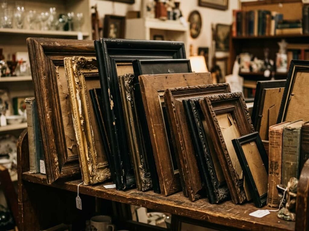
Pro Tip: Thrift stores and flea markets are great for frames. Look for interesting shapes and finishes, and swap out the old artwork for your printed pieces.
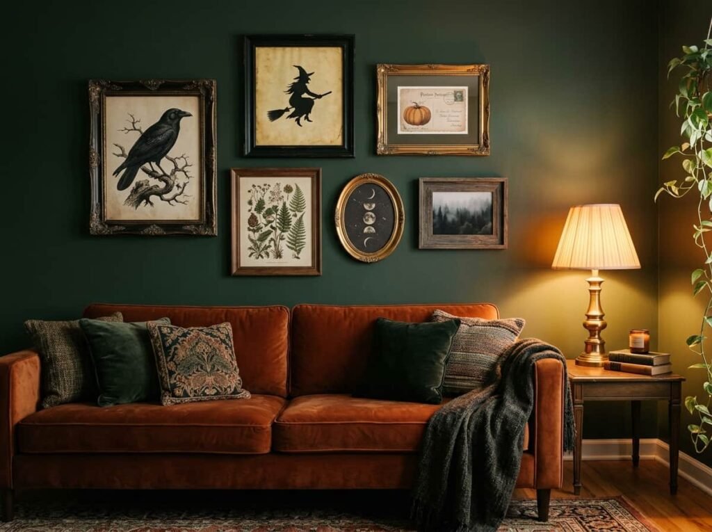
6. Mixing Vintage Prints into a Gallery Wall
A spooky gallery wall doesn’t have to be all Halloween. In fact, it usually looks better when it isn’t. Blend two or three vintage Halloween prints with landscapes, botanical drawings, or old portraits so the wall feels like a collection that grew over time.
Build Your Own Repeatable Formula
Use this simple formula: one hero print + two supporting prints + one non-Halloween piece. Adjust it to the space you have.
| Situation | Formula | Why It Works |
|---|---|---|
| Small entryway | One large hero print + one small supporting print | Makes a strong first impression without crowding |
| Living room feature wall | Hero print + two supporting prints + one botanical | Gives variety and keeps the eye moving |
| Above a mantel | Three prints in matching tones, one centered hero | Feels formal and balanced |
| Rental with no nails | Leaning frames on a shelf or ledge | Easy to change and easy to remove |
| Bedroom | One dark raven or skeleton print + a soft landscape | Moody but still restful |
Before you hang anything, lay your frames on the floor and arrange them first. Trace each frame on paper, tape the paper to the wall, and adjust until you’re happy. It saves you from extra nail holes.
7. Printing Tips for Paper That Looks Truly Old
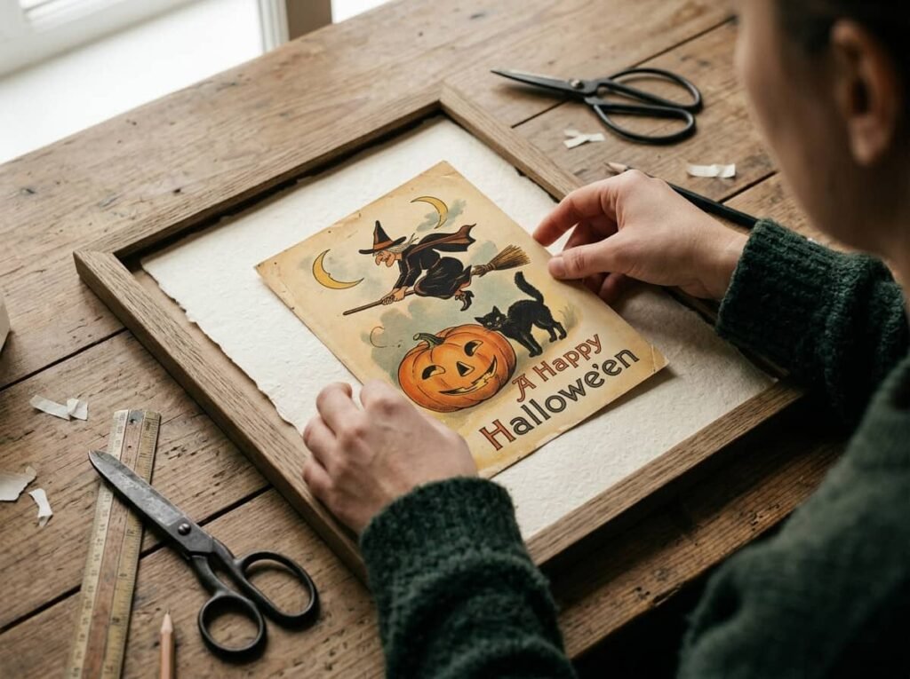
The right paper makes your print feel like an antique rather than a printout.
- Choose matte or textured paper. Shiny photo paper looks modern and reflects light. Matte, cotton-style, or lightly textured paper feels softer and more authentic.
- Warm up the color. If your printer or print shop allows it, slightly warming the tones gives a gently aged look.
- Keep the edges. If your scan includes worn corners or a postcard border, leave them in. They tell a story.
- Print a test first. Colors can shift from screen to paper, so a small test print saves you from wasting good paper.
- Use a local print shop for larger sizes. Bigger prints often look better when printed professionally.
The Budget Version
You can do this whole project for the cost of paper, printing, and a few thrifted frames. Start with just one print and one frame, live with it for a few days, then add more once you know what you love.
8. Final Thoughts on Styling Your Spooky Walls
Vintage Halloween art prints let you decorate with personality instead of clutter. Choose a limited palette, pick one focal point, and mix in non-Halloween pieces so the look feels like part of your home, not a separate holiday.
Frequently Asked Questions
What are vintage Halloween art prints?
They are reproductions of older Halloween illustrations, such as postcards, magazine art, and greeting cards. You print them yourself or buy them, then frame them as wall art.
Can beginners create a gallery wall with them?
Absolutely. Start with three frames and the “hero plus supporting prints” formula. Arrange everything on the floor first, and you’ll see what works before touching the wall.
How do I make cheap prints look better?
Use matte or textured paper, add a wide mat, and choose a frame with some character. Those three upgrades matter more than the price of the print itself.
Do I need expensive frames or professional printing?
No. Thrifted frames and home or local printing work well, especially for smaller prints. Save professional printing for your largest hero piece.
How do I keep the look spooky without it feeling childish?
Stick to muted colors, choose line-heavy illustrations, and use generous spacing. Subtle always looks more grown-up than bright and busy.