Terracotta — The Earthy Hug Your Walls Need
There’s a reason terracotta keeps showing up in every interior design magazine. It’s warm, grounded, and honestly feels like a campfire that never burns out. When I first painted my cousin’s living room colors, she called me two weeks later, saying it felt like a completely different house. That dusty orange-red tone pulls in the light during the day and holds onto it at night. It pairs beautifully with cream linen sofas, wooden furniture, and even dark green plants. If your living room feels cold or disconnected, terracotta is one of the fastest fixes you can try. It doesn’t scream; it just wraps the room in warmth. Go with a matte finish for the coziest result.

Warm Beige — Never Boring, Always Welcoming
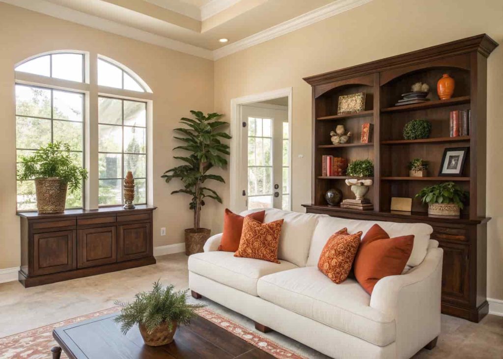
Beige gets a bad reputation. People think it means boring. But warm beige — the kind with a little yellow or peach underneath — is one of the most versatile and comforting colors you can choose for a family living room. It’s like the color equivalent of a well-worn flannel shirt. It goes with nearly everything, makes small rooms feel bigger, and gives you total freedom with your furniture choices. I’ve seen warm beige living rooms that look absolutely stunning with rust-colored throw pillows and dark walnut shelving. The key is to avoid beige with too much gray or green in it. Look for names like “soft sand,” “honey bisque,” or “warm ivory” on paint chips. Those are the ones that actually feel warm instead of flat.
Mustard Yellow — Bold, Sunny, and Surprisingly Easy to Live With
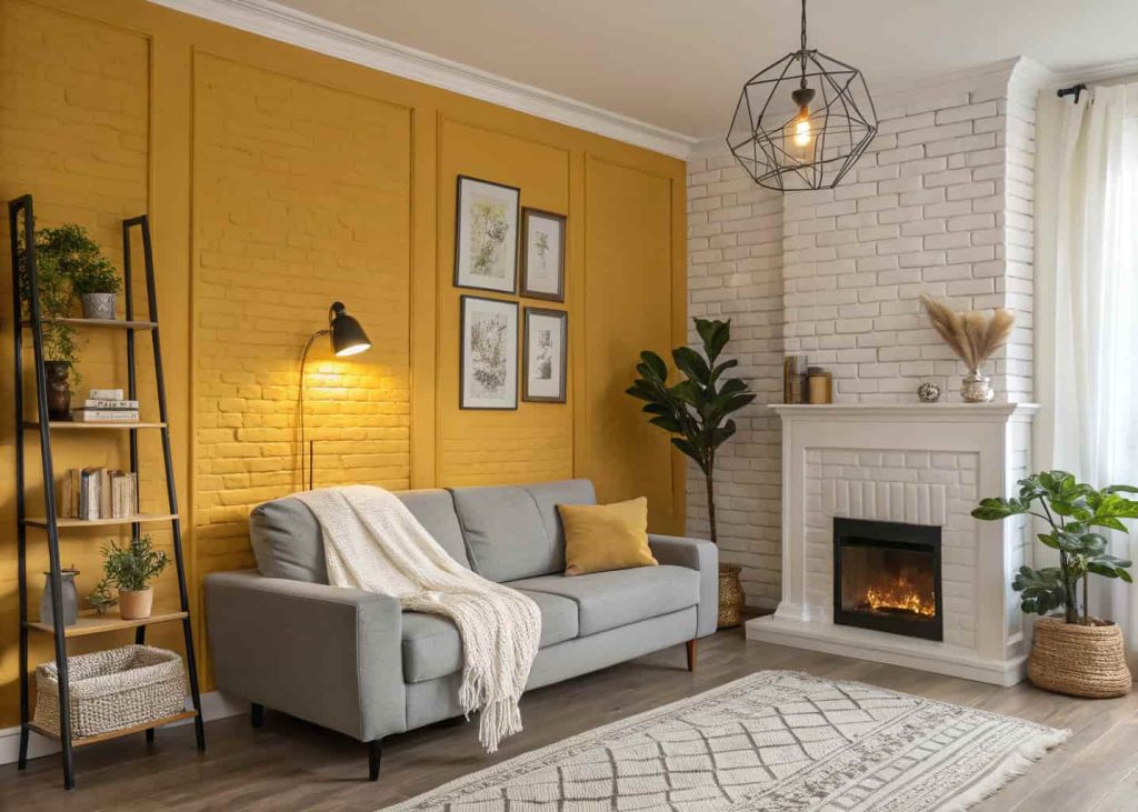
Mustard yellow sounds like a risk, but once you see it done right, you’ll wonder why you ever hesitated. This is not the sharp, neon yellow of a school bus — it’s deeper, richer, almost golden. It adds instant energy to a room without being overwhelming. Think of it as bottled sunshine on a cold January afternoon. A mustard accent wall behind your sofa works incredibly well, especially when the rest of the room stays neutral. My neighbor did this in her townhouse and paired it with gray couches and a white brick fireplace. The result was jaw-dropping. Kids tend to love it too — there’s something about the color that just feels alive. If you’re nervous, start with a single wall and go from there.
Burnt Orange — Autumn in Every Corner
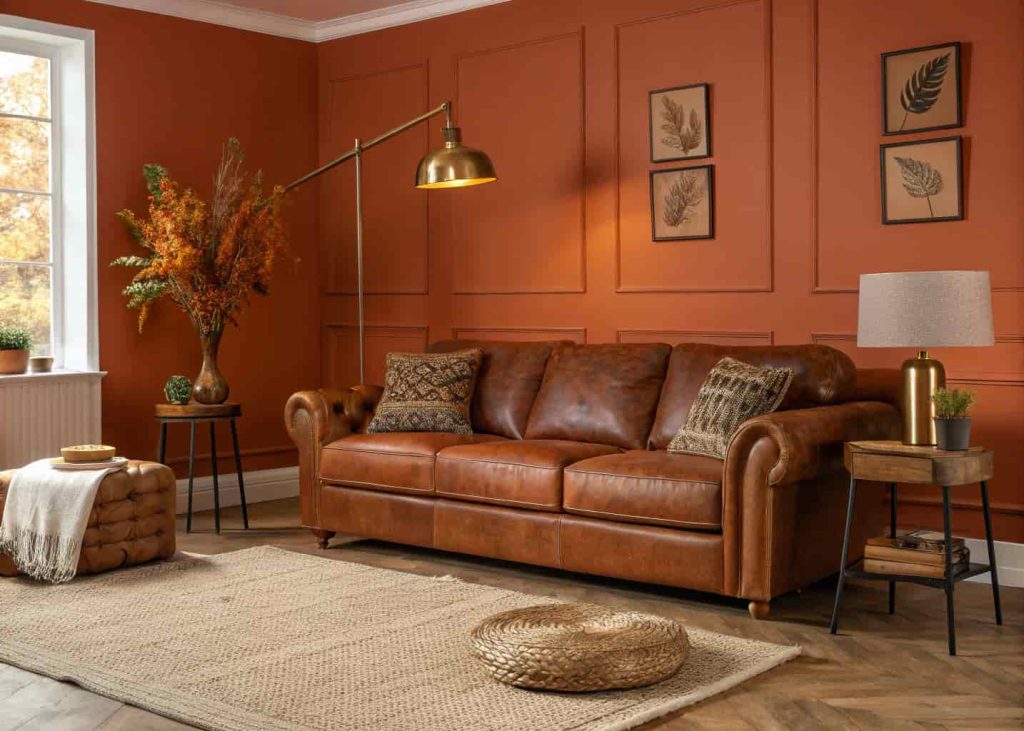
If terracotta is a campfire, burnt orange is a full autumn bonfire. It’s a step deeper, more dramatic, and absolutely stunning in rooms that get good natural light. Burnt orange works especially well in larger living rooms where you want the color to really make a statement without the space feeling crowded. It’s one of those colors that changes dramatically throughout the day — soft and peachy in the morning, rich and glowing in the evening. Pair it with brass fixtures, warm leather furniture, and a chunky jute rug for that perfectly layered, magazine-worthy look. It can be intimidating, but if your family loves spending time in the living room, this color will make them love it even more. It’s a “stay awhile” kind of color.
Warm Gray — The Modern Middle Ground
Sometimes you want something subtle but not sterile. Warm gray — often called “greige” — sits beautifully between beige and gray, and it manages to feel both modern and cozy at the same time. It’s a great choice if your family has colorful furniture or lots of art on the walls, because it acts as a calm backdrop without disappearing. A warm gray living room feels grown-up but not stiff, relaxed but not sloppy. I’d describe it as the Goldilocks of living room colors — not too warm, not too cool, just right. Use it with soft white trim, wood accents, and warm-toned textiles like camel or sage and you’ve got a room that practically styles itself.
Dusty Rose — Soft, Romantic, and Very Livable
Before you scroll past — dusty rose in a living room is not as daring as it sounds. This muted, earthy pink is more blush than bubblegum, and it creates the softest, most serene atmosphere you can imagine. It’s the kind of color that makes people slow down a little when they walk into the room. If your family is always rushing past each other, a room in dusty rose might actually get everyone to sit down and stay. It pairs beautifully with warm whites, natural linens, and rattan furniture. It’s especially lovely in north-facing rooms that don’t get a ton of direct sun because the warmth in the tone compensates for cooler light. Think of it as a warm hug in color form.

Deep Caramel — Rich, Warm, and Full of Character
Deep caramel is one of those colors that feels almost edible — in the best way. It’s a rich, toasty brown-gold that makes a living room feel deeply intentional and put-together. It’s bold enough to make a statement but grounded enough to feel cozy rather than loud. Think of the inside of a warm bakery or a beautiful wooden library. It’s that feeling. This color works especially well with cream upholstery, gold light fixtures, and dark hardwood floors. If you’ve got a fireplace, painting the surrounding wall in deep caramel creates an effect so warm and inviting that you’ll never want to leave the room in winter. It’s not a color for people who want to blend in — it’s for families who want their home to feel like it has a real soul.

Sage Green — Calm, Earthy, and Quietly Warm
Sage green leans on the cooler side of the spectrum, but paired with warm neutrals, it becomes something genuinely special. It’s calming without being sleepy, natural without being outdoorsy, and it brings a sense of freshness that makes a living room feel alive. Think of it as bringing the garden inside, but in the most refined way possible. It works particularly well in family spaces because it’s easy on the eyes during long movie nights and homework sessions. I’ve seen sage green living rooms that feel so peaceful you’d swear the room itself was breathing. Pair with warm cream, terracotta accents, and rattan or cane furniture for a look that is effortlessly pulled together.

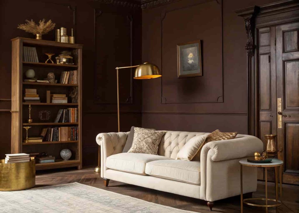
Chocolate Brown — Dark, Cozy, and Utterly Comforting
Dark colors in a living room get unfairly dismissed. Chocolate brown, when done well, creates one of the most intimate and cozy atmospheres possible. It’s the visual equivalent of a weighted blanket. This works best in rooms with good artificial lighting or large windows — the contrast between the dark walls and a bright source of light is actually what makes it so dramatic and beautiful. Pair chocolate brown walls with cream or ivory textiles, warm wood tones, and metallic accents in gold or copper. Add plenty of lamps — floor lamps, table lamps, even candles — and the room becomes a place people genuinely don’t want to leave. Perfect for families who love cozy evenings at home.
Warm White — Clean but Never Cold
White living rooms get a bad reputation for feeling clinical. But warm white is a completely different story. Shades like “antique white,” “linen,” or “cotton cream” have just enough warmth in them to stop a room from feeling like a hospital waiting area. Warm white is honestly one of the most forgiving choices you can make — it works in any size room, with any style of furniture, and in any direction of light. It’s also incredibly easy to layer with color through accessories and textiles. If you’re someone who likes to redecorate often, warm white walls are basically a blank canvas you never get tired of. Families with young kids especially love it because it keeps the space feeling open and bright even on gray days.
Peach — Underrated, Cheerful, and Surprisingly Sophisticated
Peach often gets written off as too sweet, but a muted, earthy peach is one of the warmest and most welcoming colors you can put in a family room. It’s cheerful without being loud and soft without being bland. Rooms painted in peach have a natural glow that makes everyone inside look a little healthier and a little happier — and that’s not a small thing. It’s a color that’s been used in Italian villas and traditional Mediterranean homes for centuries because it works so beautifully with natural light. Pair it with warm terracotta tiles, wicker furniture, or dark olive green accessories and you’ll have a living room that feels effortlessly warm. It’s one of those colors that guests always comment on — in the best way.

Burgundy — Dramatic, Warm, and Full of Personality
Burgundy might be the most underused warm color in residential living rooms, and that’s a shame. It’s deep, rich, and incredibly cozy — almost like wrapping the room in velvet. Done right, a burgundy living room feels like a place where good conversations happen, where families gather for board games on rainy evenings, where someone always ends up staying for dinner. It’s a color with real personality. You don’t need to go all-in on every wall — even one burgundy accent wall changes the entire energy of a room. Pair it with blush pink and warm gold for something romantic, or with hunter green and brass for something more classic and bold. Either way, it’s a statement that says: this room was thought about.

Final Thoughts
Picking a living room color is more personal than people give it credit for. It’s not just about what looks good in a photo online — it’s about how the color makes your family feel when you come home at the end of a long day. Warm colors work because they tap into something deeply human: the comfort of fire, the safety of shelter, the feeling that this is your place.
Start by testing two or three paint samples on your actual wall. Live with them for a few days. Watch how they look in the morning, in the afternoon, and in the evening with your lights on. The right one will feel obvious pretty quickly. And when you find it, you’ll know — because the room will finally feel like it belongs to your family.