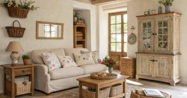

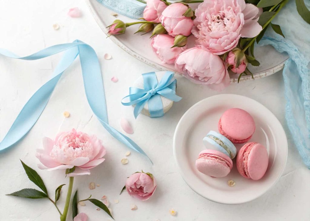
1. Soft Blush and Cream
Spring Color Palette is the season of softness, and nothing captures that feeling better than a blush pink and warm cream combination. These two shades work together in a way that feels effortless and natural, like the first light of a spring morning filtering through sheer curtains. Whether you use this palette in your home décor, outfit choices, or even a wedding theme, the result is always elegant and timeless. Blush brings a gentle warmth, while cream keeps things grounded and clean. Together they create a look that feels both romantic and modern, never too bold, never too plain, always just right.
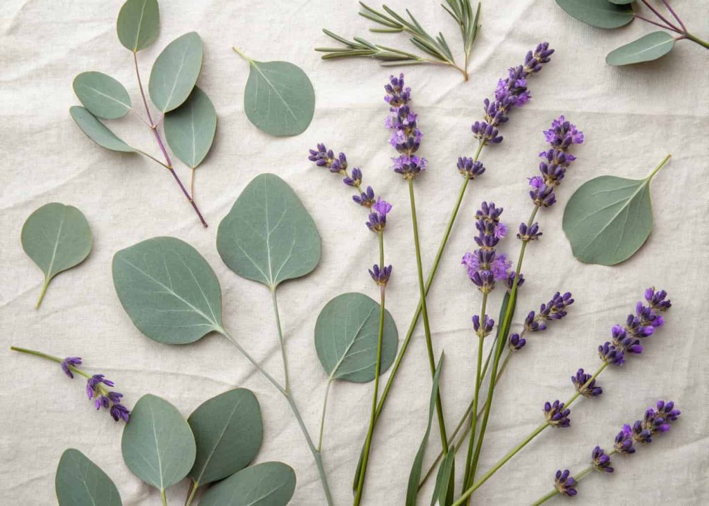
2. Lavender and Sage Green
Lavender and sage green is one of those combinations that feels like it was designed by nature itself. If you have ever walked through a garden in early spring, you already know this palette. The soft purple of blooming lavender paired with the muted, earthy green of sage leaves creates a balance that is both calming and refreshing. This palette works beautifully in bedroom interiors, bridal looks, table settings, and even social media aesthetics. It carries a very organic, botanical energy that makes any space or outfit feel grounded yet dreamy. People are drawn to it because it feels real, natural, and deeply soothing to the eyes.
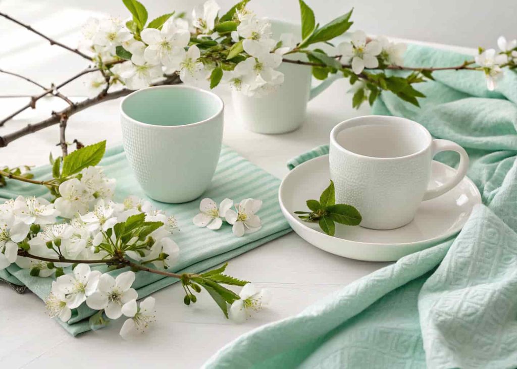
3. Mint Green and White
There is something incredibly clean and refreshing about mint green paired with crisp white. It instantly reminds you of spring cleaning, open windows, and fresh starts. This palette has a very light and airy energy that makes it perfect for kitchens, bathrooms, baby showers, and casual spring outfits. Mint green carries just enough color to feel vibrant without being overwhelming, and white keeps the whole look feeling fresh and breathable. If you are someone who loves minimalist design but still wants a touch of seasonal color, this is your go-to spring palette. It is simple, cheerful, and never goes out of style no matter the year.
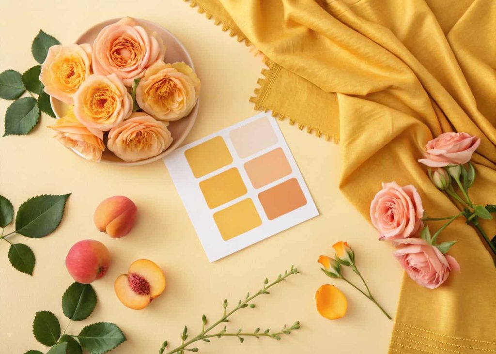
4. Peach and Golden Yellow
Peach and golden yellow together feel like sunshine in color form. This warm, glowing palette is full of happiness and positive energy, making it one of the most uplifting combinations for the spring season. Peach brings a softness and warmth that feels nurturing, while golden yellow adds a cheerful brightness that catches the eye without feeling harsh. This duo works wonderfully in living room décor, spring fashion, floral arrangements, and graphic design projects. It is the kind of palette that makes people smile when they see it. If you want your space or look to radiate warmth and joy during spring, peach and golden yellow is the perfect choice.
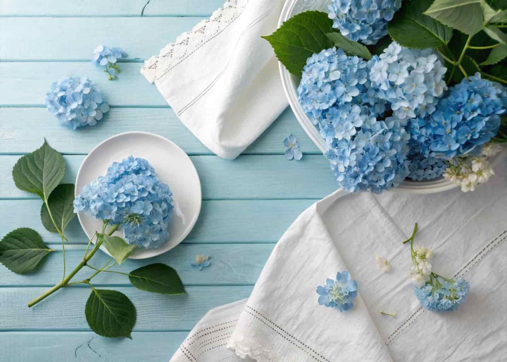
5. Sky Blue and Soft White
Sky blue and soft white is one of the most classic spring palettes that never gets old. It captures the essence of a clear spring day, open skies, gentle breezes, and the kind of calm happiness that comes from being outdoors in perfect weather. This combination feels clean, open, and endlessly versatile. You can use it in coastal-themed interiors, spring wardrobes, baby décor, or even branding and packaging design. Sky blue has a natural tranquility to it that pairs beautifully with the purity of white. Together they create a palette that feels both fresh and familiar, like a favorite memory of a perfect spring afternoon.
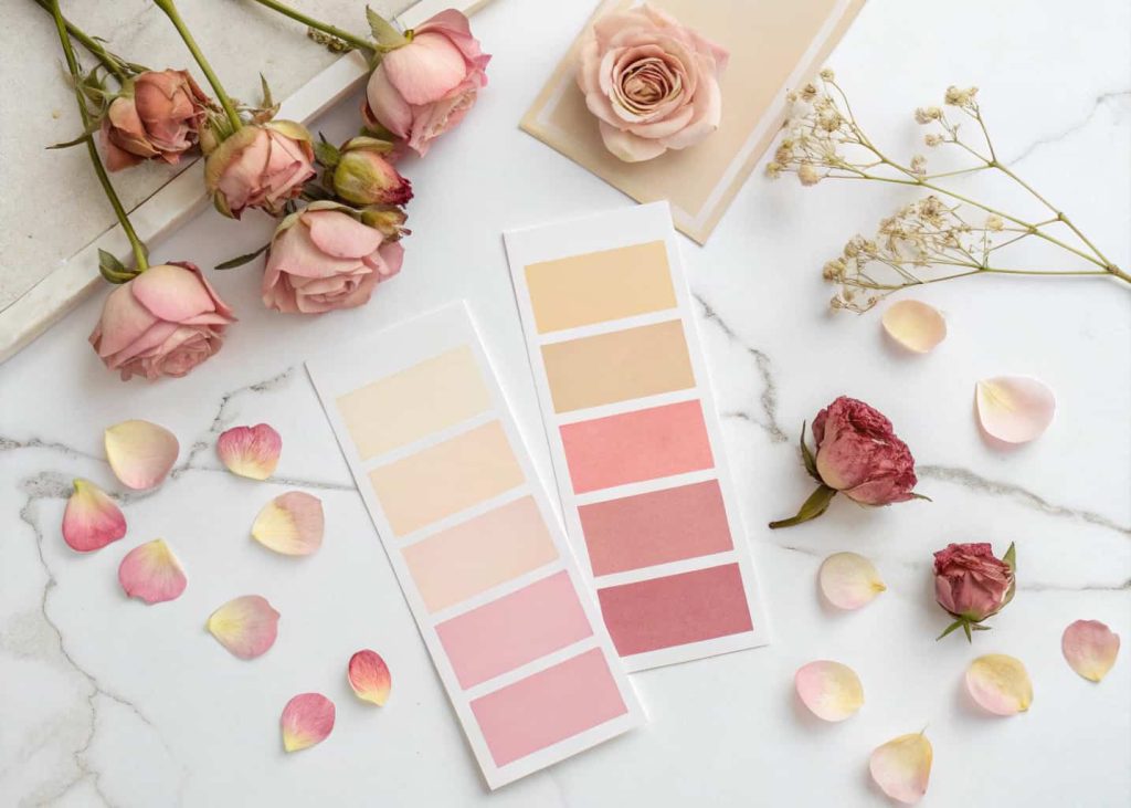
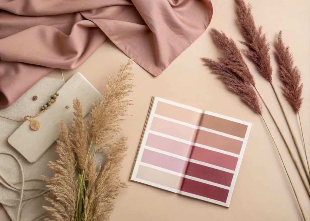
6. Dusty Rose and Mauve
Dusty rose and mauve are the more grown-up, sophisticated cousins of pink. Unlike bright or hot pink, these muted, earthy tones carry a quiet elegance that feels incredibly on-trend for modern spring styling. This palette is popular in wedding décor, fashion editorials, home interiors, and beauty looks because it feels both feminine and refined. Dusty rose has a warmth that is deeply flattering, while mauve adds depth and a slightly moody undertone that keeps the palette from feeling too sweet. If you want a spring look that feels mature, editorial, and beautifully understated, this combination is something you absolutely need to explore and experiment with.
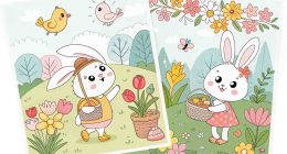
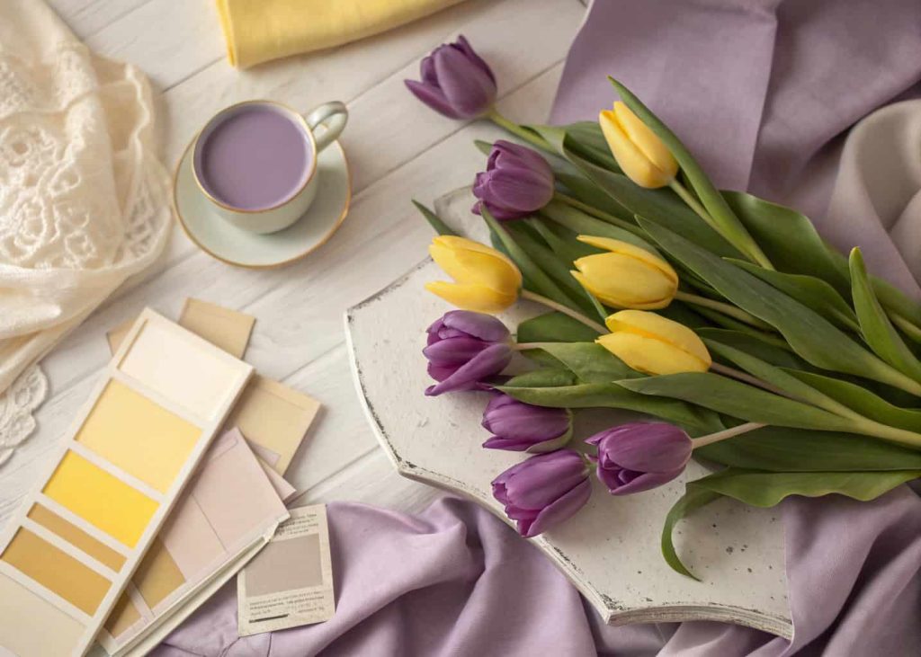
7. Lilac and Butter Yellow
Lilac and butter yellow is a combination that feels straight out of a vintage spring painting. It is soft, playful, and full of a nostalgic charm that makes you think of Easter mornings, flower markets, and lemonade in the garden. Lilac brings a dreamy purple softness, and butter yellow adds a warm, gentle glow that keeps the palette feeling bright and cheerful. This duo is fantastic for children’s rooms, spring events, fashion styling, and social content creation. There is an inherent joy in this palette that is hard to replicate with other colors. It feels light-hearted, sweet, and perfectly seasonal in a way that is both timeless and completely fresh.
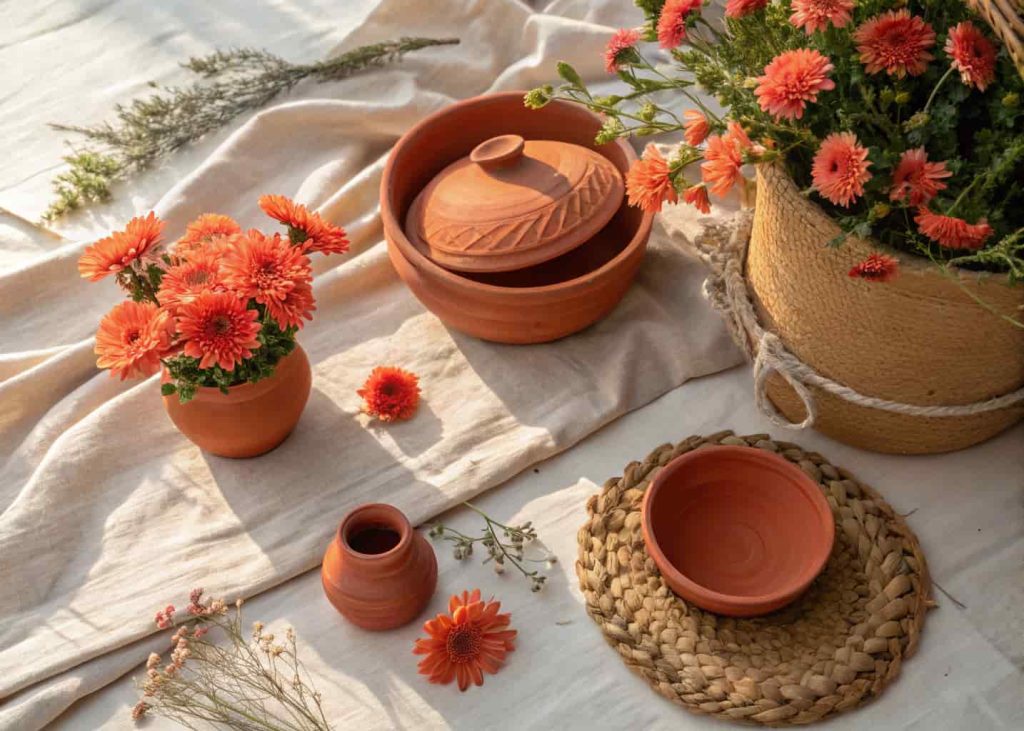
8. Coral and Terracotta
Coral and terracotta bring a warmer, earthier dimension to the spring palette world. While many spring colors lean soft and pastel, this combination is rich, vibrant, and full of personality. Coral is energetic and bold, while terracotta grounds it with a clay-like warmth that feels connected to the earth. This palette is incredibly popular in bohemian home décor, spring fashion collections, and outdoor event styling. It has a Mediterranean energy to it, reminiscent of sun-drenched walls, blooming bougainvillea, and warm evenings outdoors. If you want your spring aesthetic to feel confident, expressive, and a little adventurous rather than soft and delicate, coral and terracotta is your perfect match.
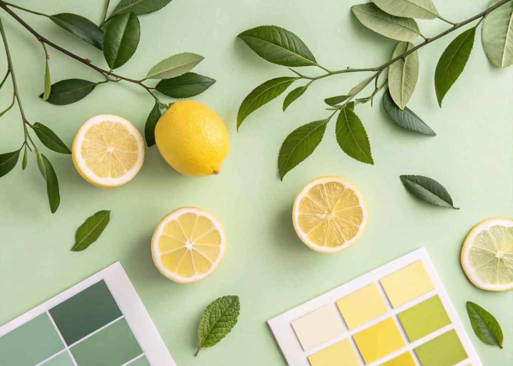
9. Soft Lemon and Pistachio
Soft lemon yellow and pistachio green is a fresh, zesty combination that feels instantly energizing and full of life. It is the kind of palette that makes you feel like you just walked into a bright kitchen filled with fresh fruit and herbs on a sunny spring morning. Lemon brings a crisp, citrusy brightness while pistachio adds a cool, sophisticated green that balances the warmth beautifully. This palette is perfect for kitchen décor, spring brunch tablescapes, stationery design, and vibrant fashion looks. It has a very clean, modern energy that also carries a natural organic feel. It is cheerful without being loud, fresh without being cold, and endlessly refreshing.
10. Baby Blue and Soft Pink
Baby blue and soft pink is perhaps the most iconic spring combination of all time. It is universally loved for a reason — it is gentle, sweet, and carries a sense of innocent joy that perfectly mirrors the season. Baby blue feels calm and serene, while soft pink adds warmth and tenderness. Together they create a palette that works across virtually every context, from newborn décor and spring weddings to fashion styling and brand identity. There is a timeless quality to this pairing that transcends trends. Whether you use it in a bold way or as subtle accents, baby blue and soft pink will always feel perfectly appropriate and absolutely beautiful for the spring season.
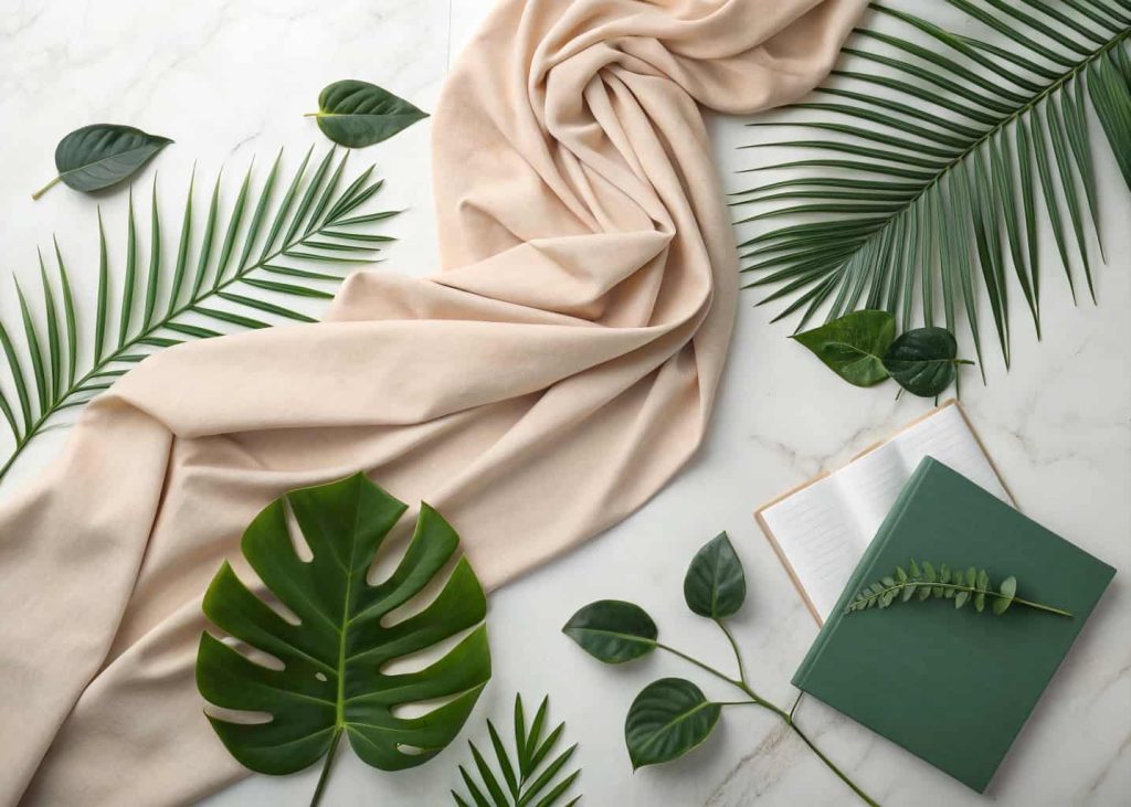
11. Nude and Forest Green
Nude and forest green is a grounded, nature-inspired spring palette that feels elegant and deeply sophisticated. While most spring palettes celebrate brightness and pastels, this combination takes a different approach by embracing the quiet beauty of earth and foliage. Nude tones, whether warm beige or cool taupe, create a clean and versatile base that lets the forest green shine. This palette is ideal for editorial fashion, luxury interiors, branding, and anyone who wants a spring look that feels refined rather than playful. It connects deeply with the feeling of being outdoors in early spring, surrounded by fresh green leaves and natural earthy textures, calm, rooted, and beautifully real.
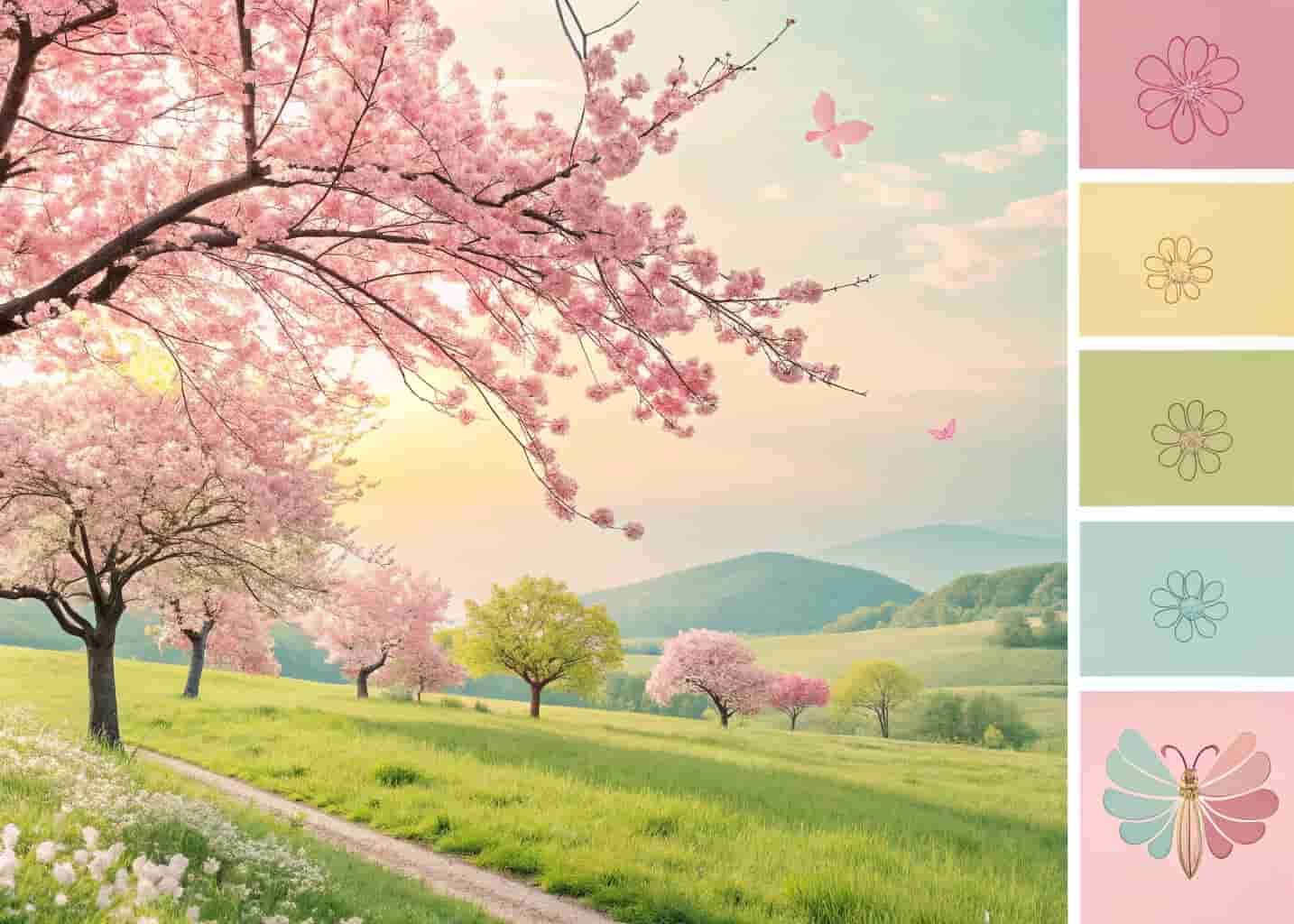
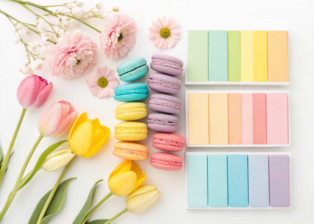
12. Rainbow Pastels
When you cannot choose just one spring color, go for all of them. A full rainbow pastel palette is the ultimate celebration of spring in its most joyful and playful form. Soft versions of pink, yellow, blue, green, lavender, and peach layered together create a look that is festive, fun, and full of life. This palette is perfect for children’s parties, spring festivals, colorful fashion looks, illustrated artwork, and anyone who wants their space or content to radiate pure happiness. The key is keeping all the tones soft and muted rather than saturated so they harmonize instead of clash. Rainbow pastels done right feel like a spring garden in full bloom.
Conclusion
Spring is one of the most color-rich seasons of the year, and the palette you choose can completely transform the way a space, outfit, or project feels. From soft and romantic combinations like blush and cream to bold and earthy pairings like coral and terracotta, there is a spring palette for every personality and style. The most important thing is to choose colors that genuinely make you feel something, because the best palettes are the ones that connect emotionally. Use this guide as a starting point, experiment freely, mix and match, and let the energy of spring inspire your most beautiful, fresh, and colorful work yet.