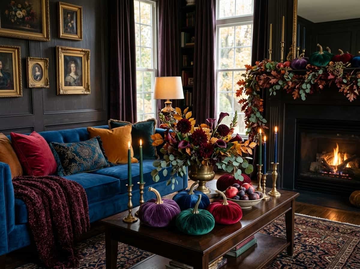
Every October, the same thing happens. You walk into a store, and every shelf is a wall of orange, mustard, and brown. You buy a few pieces, set them out, and your home looks like everyone else’s. It’s pleasant, but it isn’t you, and it certainly doesn’t feel special.
Here’s the better approach: stop decorating with harvest colors and start decorating with gemstone colors. Emerald, sapphire, ruby, amethyst, and citrine are deep, saturated, and made for the shorter, dimmer days of autumn. Paired with metallics and plush textures, they make a home feel like a boutique hotel rather than a hayride. This guide gives you the principle, the formulas, and the practical steps to pull off jewel tone fall decor without redoing your whole house.
Why Deep, Saturated Color Works in Autumn
Fall light is lower, softer, and warmer. Pale or washed-out colors tend to go flat in it, while rich, saturated shades seem to glow. Jewel tones hold their own because they already have depth built in.
There’s also a natural logic to it. Emerald echoes evergreens, ruby and garnet echo ripened berries and wine, amethyst echoes dusk, and citrine echoes late-afternoon sun. You’re still decorating with the season, just in a more refined voice than the usual pumpkin palette.
If you love this deep, candlelit mood, you’ll also enjoy these witchy apothecary decor.
Start With One Big Anchor Color
Every good room needs a foundation. Instead of scattering six colors around, choose one jewel tone and let it lead. Then use a few supporting items to tie it in. Here’s how to choose where each color works best:
| Item | What to Look For | Why It Works |
|---|---|---|
| Large furniture or curtains | Deep emerald or sapphire in velvet or a heavy weave | A big surface sets the whole room’s mood in one move |
| Throws and cushions | Burgundy, ruby, and amethyst in silk and velvet | Mixed textures add depth and a luxe finish |
| Walls or fireplace surround | Deep blue or dark green paint | Creates a dramatic backdrop that makes warm wood and brass pop |
| Area rug | Patterned teal, ruby, or navy | Grounds the furniture and gives an heirloom feel |
| Glassware and vases | Green, amber, and cobalt glass | Catches light and adds sparkle to shelves and windowsills |
Quick Tip: Emerald is the easiest place to begin. It feels natural in fall, so it rarely looks out of place, even in a room with neutral furniture.
Rethink the Old Fall Rules
A lot of seasonal decorating advice hasn’t changed in years. Here’s where a fresher approach pays off:
| Old Rule | What Works Better Now |
|---|---|
| Fall means orange and yellow | Use emerald, sapphire, ruby, and amethyst for a richer mood |
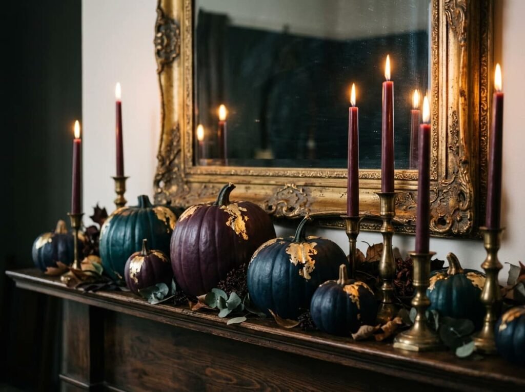
| Pumpkins must be orange | Paint them teal, aubergine, or navy and finish with gold leaf |
| Rustic, matte finishes only | Add brass, gold, and crystal for shimmer |
| Red is the only fall red | Choose burgundy, garnet, and ruby for a deeper take |
| Decorate with lots of small knick-knacks | Use fewer, larger statement pieces |
None of these swaps requires a big budget. A can of paint, a few new candles, and a couple of fresh cushion covers can shift the whole feeling.
Balance Richness With Calm
Jewel tones are bold, so the secret to making them feel elegant is to give them breathing room. Think of it as pairing drama with quiet.
Let your deep colors sit against softer neutrals like ivory, cream, or warm charcoal. Pair velvet with something smooth, like glass or brass. Let a heavily patterned rug sit under plain furniture. The contrast is what makes each element look intentional rather than crowded.
Metallics help too. Brass, gold, and copper act as a bridge between rich color and the neutral base, adding warmth without competing.
Give One Element Permission to Stand Out
Here’s a principle that works for almost any design project: pick one focal point and let it be the star. Everything else supports it.
In a living room, that might be a sapphire accent wall or a deep emerald loveseat. On a dining table, it could be a jewel-toned runner. In an entryway, it might be a dramatic console with a mirror, a brass lamp, and a single bold vase. When one piece carries the color story, the rest of the space can stay calm, and the whole look feels curated.
Pro Tip: Squint at the room. If your eye doesn’t land in one clear place first, you probably have too many competing focal points. Remove one or two items.
Keep It From Feeling Too Heavy
Jewel tones can tip into dark and dramatic if you pile on too much. If a room starts feeling like too much, try these adjustments instead:
- If the walls feel too dark, try keeping the walls neutral and bringing color in through textiles and a single large rug instead.
- If the room feels crowded, try removing half the accessories and keeping only the largest, most striking pieces.
- If the colors feel clashing, try limiting yourself to two jewel tones plus one metallic.
- If the space feels cold, try warming it with wood, candlelight, and a cozy throw in garnet or burgundy.
- If the look feels too formal, try mixing in simple dried stems and a few natural elements to relax it.
Build Your Own Repeatable Formula
Once you know the pattern, you can recreate it anywhere. The simple formula is base color + metallic accent + one soft texture.
| Situation | Formula | Why It Works |
|---|---|---|
| Living room | Emerald sofa + brass lamp + burgundy velvet cushion | One big anchor, one shimmer, one soft layer |
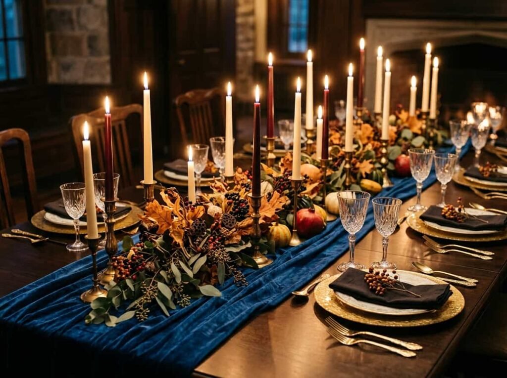
| Dining table | Sapphire runner + gold chargers + ivory tapers | Rich color kept elegant by light neutrals |
| Entryway console | Mirror + jewel-toned vase + brass candlesticks | Reflects light and makes a strong first impression |
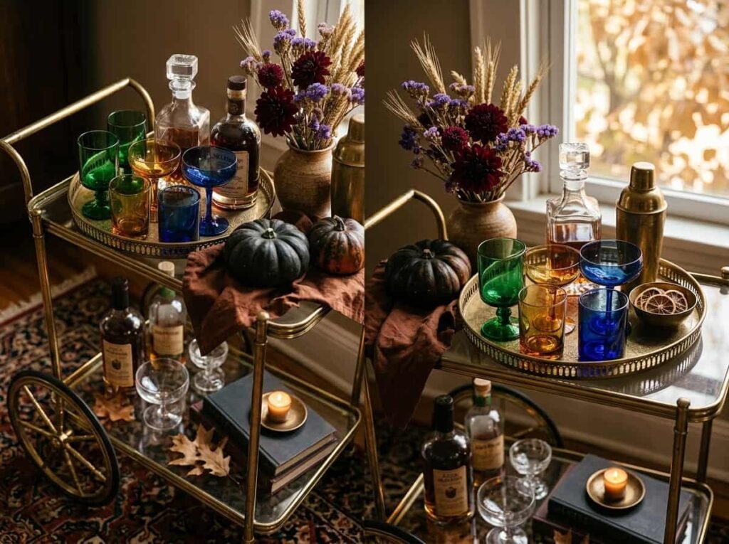
| Bar cart | Colored glasses + brass tray + dried florals | Compact, stylish, and ready for guests |
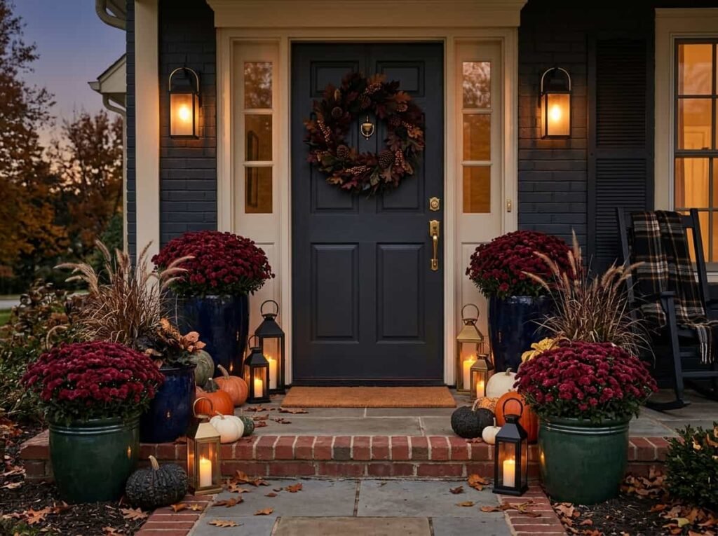
| Front porch | Navy planters + burgundy mums + black lanterns | Dark tones look polished and weather-friendly |
A few color pairings that always work: emerald + brass + ivory for timeless refinement, sapphire + copper for bold warmth, garnet + forest green for classic coziness, and amethyst + gold + charcoal for a moody, modern feel. Setting a table for guests? These table centerpiece ideas pair beautifully with a jewel-toned runner.
Make It Softer and Easier
Not ready to commit to a bold wall or a new sofa? Start with things that are easy to add and easy to remove.
- Swap your cushion covers for jewel-toned velvet and silk.
- Add a burgundy or garnet throw over a chair.
- Light colored candles in burgundy, forest green, or navy, grouped in varying heights.
- Fill a dark ceramic or gold vase with dried burgundy dahlias, purple statice, or dark red roses, which hold their color when dried.
These small changes are low-cost, low-risk, and make a bigger difference than you’d expect.
Beginner Note: Begin with one room, or even one surface. A single styled console or coffee table is enough to see how the look feels in your home.
Take the Look Outside and Into Your Details
Jewel tone fall decor isn’t only for the living room. Your porch can carry it too: deep green or navy planters, burgundy mums, a dark-toned wreath, and black or brass lanterns create a polished welcome.
Indoors, finish the look with a few details: antique-style mirrors in gold frames, moody floral prints that reflect candlelight, and gemstone-colored glassware displayed along shelves and windowsills. Together these small touches make the whole house feel connected. If you want more ways to style your entrance this season, take a look at these outdoor Halloween decorations.
Frequently Asked Questions
What is jewel tone fall decor?
Jewel tone fall decor uses deep, saturated gemstone colors like emerald, sapphire, ruby, amethyst, and citrine in place of traditional orange and yellow. It’s usually paired with metallics and rich textures for a more glamorous autumn look.
Can beginners try a bold sapphire or emerald look?
Yes. Start small with cushions, a throw, or candles, then move up to larger pieces once you like the result. You don’t have to repaint or buy new furniture to get the effect.
How do I make jewel tones work better with my existing furniture?
Pick one anchor color and repeat it two or three times around the room. Add a brass or gold accent and soften the look with ivory or charcoal so the color feels deliberate.
Do I need expensive pieces to get a luxe look?
No. Paint, candles, cushion covers, and thrifted glassware or mirrors can all deliver the same richness. Texture and metallic finishes matter more than price. For more budget-friendly inspiration, see these DIY Halloween decor on a budget.
How do I use dark colors without making my home feel gloomy?
Balance them with warm light, neutral surfaces, and plenty of candlelight. Keep the walls lighter if needed and let textiles and accessories carry the color.
Final Thoughts
Fall doesn’t have to be loud or orange to feel cozy. Choose one Jewel Tone Fall Decor Ideas, add a metallic accent, and layer in texture, and your home will feel warm, glamorous, and ready for the season.
Your action for this week: pick one surface, such as your coffee table or entryway console, and style it with one jewel-toned item, one brass or gold piece, and a few candles.