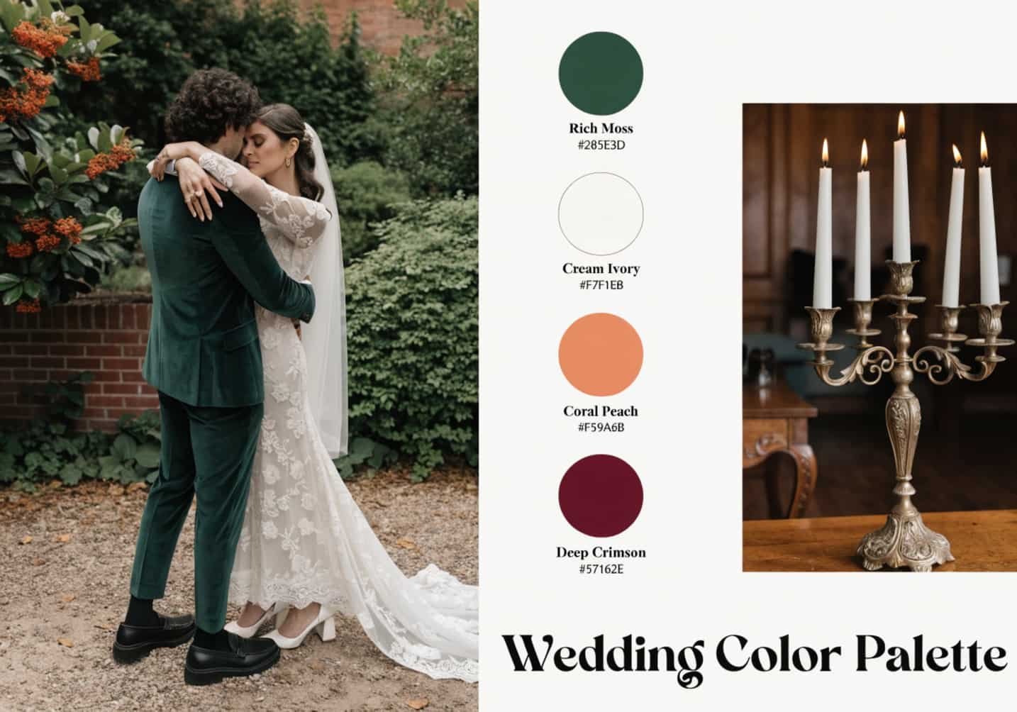
Most couples pick their wedding colors the way they’d pick a paint swatch — something they like the look of on a screen. Then the flowers arrive, the tablecloths get pressed under tent lighting, and the photos come back looking nothing like the Pinterest board. Color on a wedding day isn’t static. It moves through fabric, flowers, glass, skin tone, and light, and it reads differently in every one of those materials. This guide walks through how to actually choose a palette that holds up once it leaves the swatch and enters the real, three-dimensional day.
How Color Scheme Shapes the Overall Wedding Look
A wedding’s color scheme is doing more structural work than people give it credit for. It’s the thread that ties the invitation suite to the aisle runner to the cake stand to the last string light. Guests won’t consciously register “sage green and terracotta,” but they will feel whether a day looks pulled-together or assembled from forty separate Pinterest pins. The trick is picking colors early enough that they inform decisions — napkin color, suit fabric, even the cake flavor’s frosting tint — rather than being bolted on after the venue and dress are already locked in. Most planners suggest finalizing a palette before booking a florist, because florists price differently depending on whether you need in-season, easy-to-source blooms or specific hard-to-match shades.
Choosing Colors Based on Season and Venue
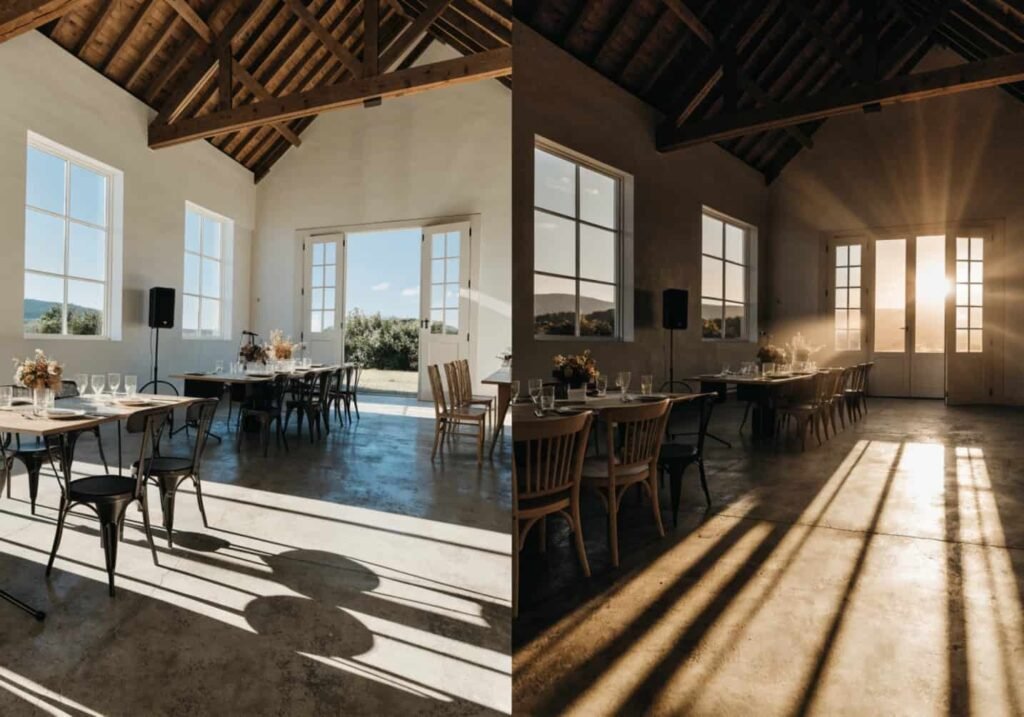
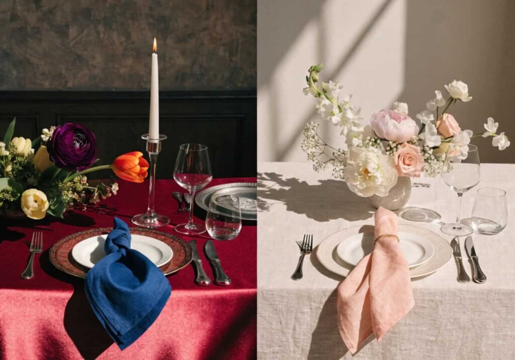
Season narrows the field more than most couples expect. A dusty lavender palette that looks romantic in a spring garden can turn muddy and cold in a November barn under tungsten lighting. As a rough rule: spring and summer palettes handle higher saturation well because there’s more ambient daylight to bounce color around, while fall and winter palettes benefit from deeper, warmer tones (burgundy, ochre, forest green) that don’t wash out under artificial light. Venue matters just as much as season. A stone church or industrial loft with gray and neutral surfaces can support almost any color, since there’s little competing tone. A venue with heavy existing color — a barn with red-brown wood, a garden with pink brick, a ballroom with gold trim — will fight anything that clashes with it. Before locking colors, it’s worth visiting the venue at the actual time of day the wedding will happen, not just during a daytime tour, since a 6 p.m. reception in October will have almost no natural light left by dinner.
Popular Color Combinations That Always Work
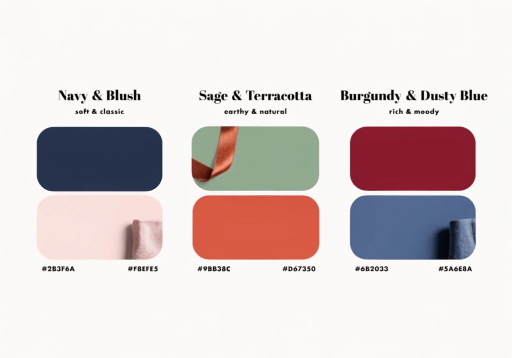
Some pairings keep coming back because they’re built on genuine color theory rather than trend cycles. Navy and blush works because it’s a near-complementary pairing — navy sits cool and dark, blush sits warm and light, so the contrast reads clean in photos instead of muddy. Sage and terracotta is an analogous-adjacent pairing (both sit in the earth-tone family but on opposite temperature ends), which is why it feels both cohesive and grounded. Burgundy and dusty blue is a classic split-complementary combination that photographs unusually well because the two colors sit far enough apart on the wheel to create separation between bridesmaid dresses and groomsmen suits without looking mismatched. If in doubt, pick one dominant color, one supporting color, and one neutral, rather than three colors of equal weight — equal-weight palettes tend to compete rather than cooperate.
Bold vs. Soft Tones — Which Suits You
Bold palettes (jewel tones like emerald, sapphire, magenta) read as confident and modern, and they photograph with more punch in evening light. But they demand more discipline — one bold color plus a neutral works, three bold colors together usually turns busy fast. Soft, muted palettes (dusty rose, sage, cream, taupe) are more forgiving of mismatched materials and mixed metals, which is part of why they’ve dominated the past several wedding seasons. The honest trade-off: bold palettes need a venue and florist who can commit to saturation, and they cost more, since deep jewel-toned flowers (think dark dahlias or garnet ranunculus) are pricier and less commonly stocked than pastel varieties. Soft palettes are cheaper to execute and easier to match across vendors, but they can wash out in flat, overcast daylight if there isn’t a strong neutral anchor like deep green foliage or dark wood furniture to give them contrast.
Exploring a Monochrome Color Scheme
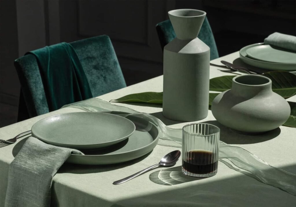
A monochrome palette — different shades and tints of a single hue — sounds like it should be the easiest option, but it’s actually one of the harder ones to execute well. The whole scheme lives or dies on texture and value contrast, since there’s no second color to lean on for visual interest. A good monochrome plan needs at least three distinct values: a deep shade, a mid-tone, and a pale tint, plus varied textures (matte linen next to a glossy vase, velvet ribbon against sheer chiffon) so the eye has something to register besides “everything is green.” All-white weddings fall into this category too, and they’re notoriously unforgiving in photos — without a warm neutral or metallic accent, white-on-white flattens out and loses definition entirely on camera.
Cultural and Traditional Color Choices
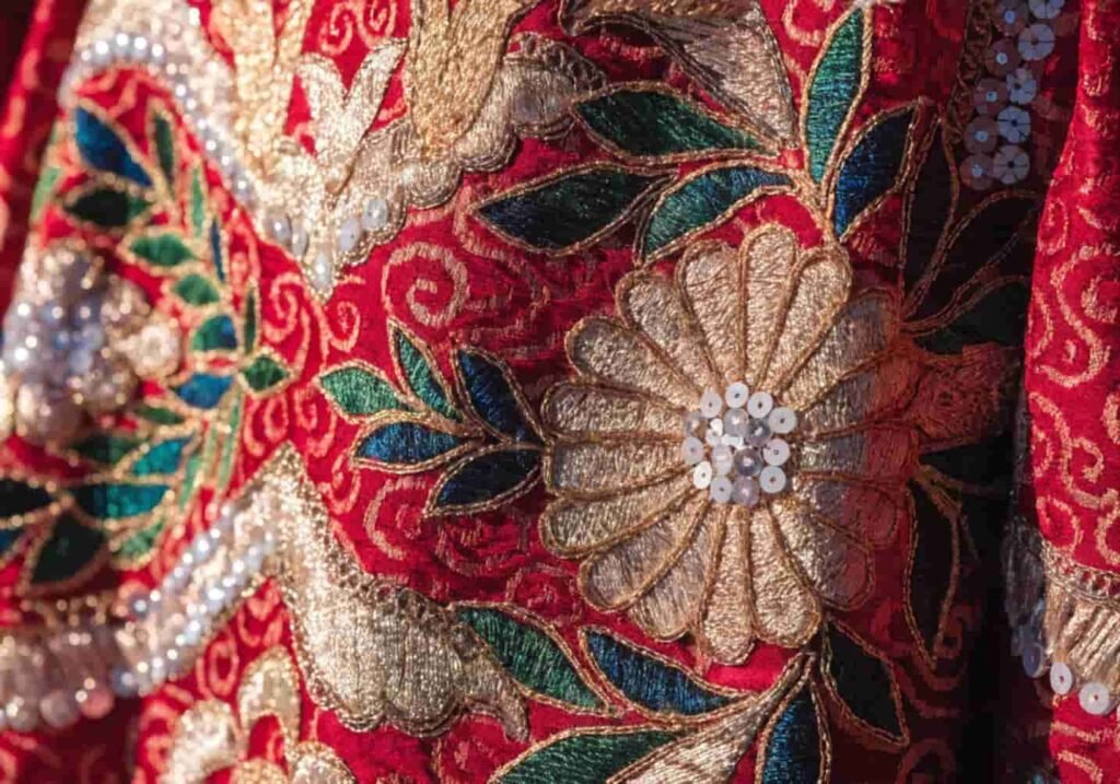
Color carries different weight depending on cultural background, and it’s worth researching before defaulting to Western bridal conventions. In many South Asian weddings, red and gold are traditional for their association with prosperity and auspiciousness, while white is traditionally avoided since it’s associated with mourning in some communities. In Chinese weddings, red remains the dominant color for luck, though modern couples increasingly blend it with a Western white gown for at least one part of the day. Nigerian and other West African weddings often lean into vivid, saturated aso-ebi fabrics chosen collectively by family and wedding party, which functions almost like a coordinated uniform rather than a subtle accent palette. None of this needs to be either/or — a lot of couples are successfully blending a traditional palette for one ceremony element (the aisle, the attire) with a more neutral modern palette for the reception decor.
Coordinating Colors for Bridesmaids and Groomsmen
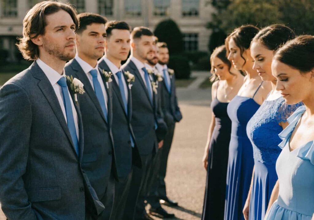
The mistake most couples make here is trying to match everyone to the exact same shade of fabric, which almost never works because dye lots vary between fabric orders and between different garment types (a chiffon dress and a cotton tie in “identical” sage green will still look slightly different in person). A more forgiving approach is picking one color family and letting each person’s outfit sit somewhere within it — dusty blue, slate, and steel gray bridesmaid dresses, for instance, paired with charcoal suits and a dusty blue tie. This “tonal” approach also solves the real-world problem of different body types and skin tones wearing the exact same shade differently; a single rigid hex code rarely flatters everyone equally, but a color range does. For groomsmen, it’s usually cheaper and more flexible to unify through one accessory (tie, pocket square, or boutonniere) rather than renting matching suits, unless the wedding has a strict formal dress code.
Matching Color Schemes With Decor
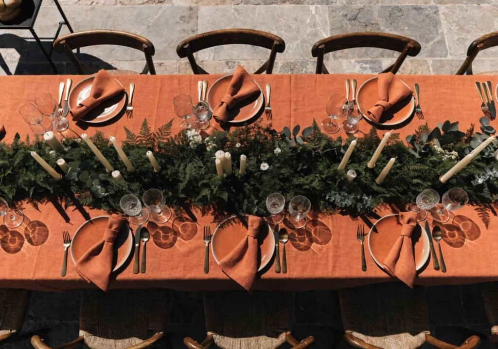
Decor is where a lot of palettes get diluted, mostly because rental companies have limited stock and couples end up compromising on linen color, chair style, or tableware to fit what’s available. It helps to rank your palette by priority before you start renting — decide which one or two colors are non-negotiable (usually the linens and the florals) and which ones can flex (chair color, charger plates, table numbers). Metallics count as part of the palette too, and they’re not neutral the way people assume: gold reads warm and pairs naturally with terracotta, rust, and cream, while silver and pewter read cool and sit better with navy, dusty blue, or sage. Mixing warm and cool metallics in the same tablescape is possible, but it needs a strong neutral in between (a white or cream runner, for example) or it starts to look accidental rather than intentional.
Highlighting Your Color Theme Through Flowers
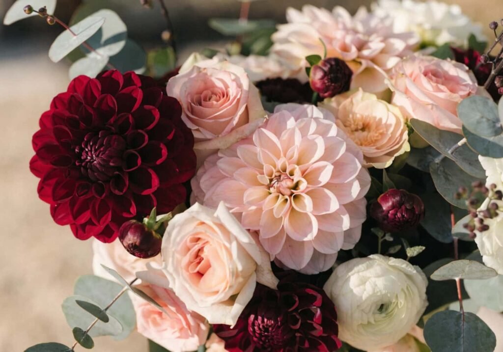
Flowers are the single biggest lever for reinforcing a color palette, but they’re also the least controllable, since availability shifts with season and region. A florist can usually dye white flowers to hit an exact shade, but dyed flowers have a shorter vase life and a slightly artificial look up close — fine for a centerpiece nobody’s examining, less ideal for a bridal bouquet in close-up photos. Garden roses, ranunculus, and dahlias offer the widest natural color range and are worth building a palette around if color accuracy matters. Greenery is doing more work than most couples realize, too — eucalyptus reads blue-gray and cools a palette down, while ferns and ivy read warmer and yellow-green, and swapping between them can shift the whole mood of an arrangement without touching the flowers at all.
How Lighting Affects Your Colors
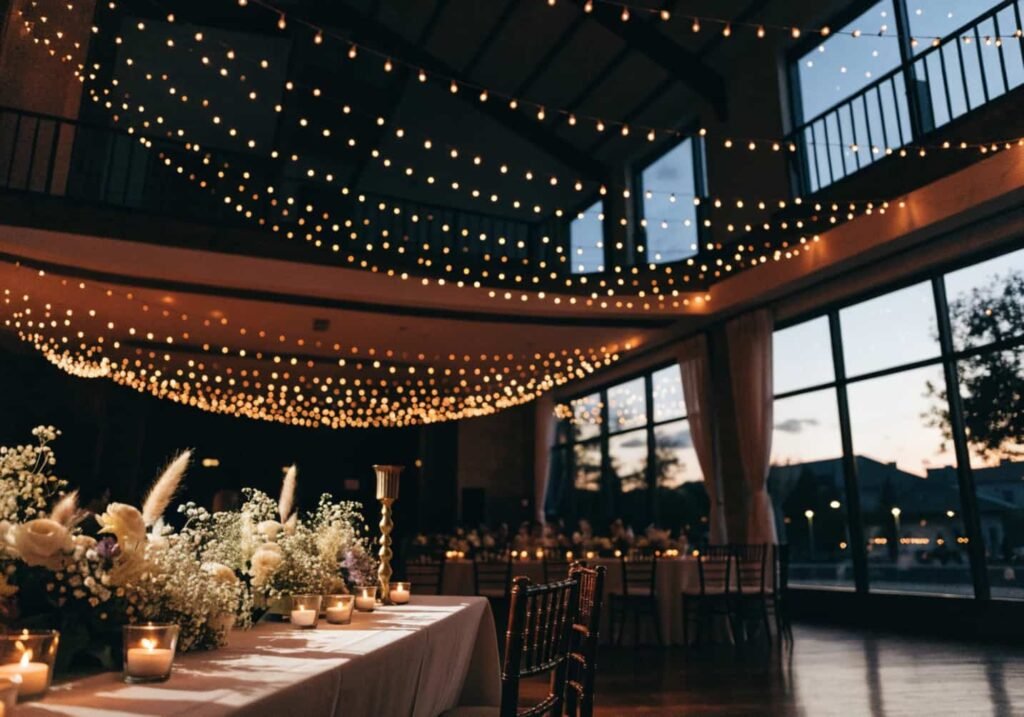
This is the part most color guides skip, and it’s the one that causes the most day-of disappointment. Venue lighting has a color temperature, measured in Kelvin, and it shifts how every other color in the room reads. Warm incandescent or string lighting (around 2700K) pushes everything toward amber and can turn a crisp white tablecloth slightly yellow and a cool blue palette muddy. Cooler LED or daylight-balanced lighting (5000K+) does the opposite — it keeps whites true but can make warm palettes like rust or gold look flat and less rich. If a venue’s fixed lighting can’t be changed, the workaround is choosing florals and linens a shade or two more saturated than you’d normally pick, since warm light in particular tends to mute and lighten colors rather than intensify them. It’s worth asking the venue directly what bulb type is installed, not just “is the lighting warm or bright,” since that’s the detail that actually predicts the outcome.
Reflecting Your Color Scheme in Invitations
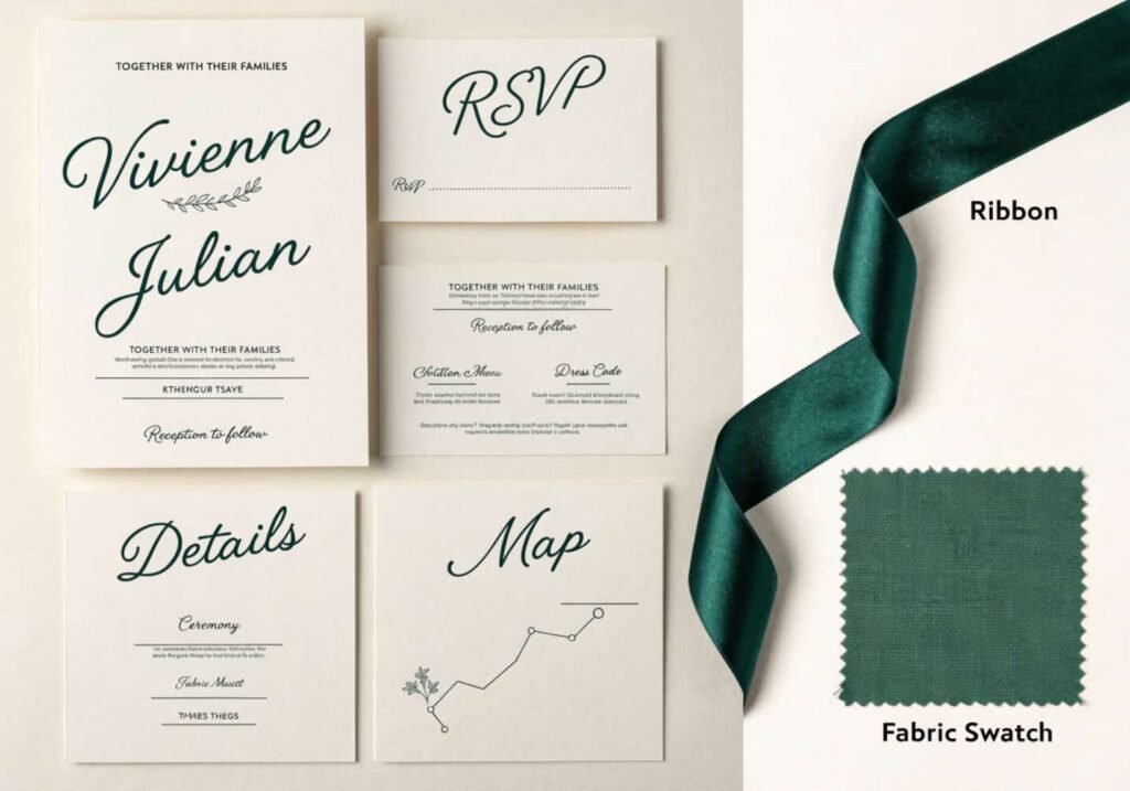
Invitations are usually the first physical object guests see, and they’re also where color most commonly goes wrong, because screen colors (RGB) and printed colors (CMYK) are not the same color space. A sage green that looks perfect on a laptop screen can print noticeably grayer or more yellow once it’s converted to CMYK, and different print shops calibrate their presses differently, so the same file can come out looking slightly different from two vendors. The fix is requesting a physical proof before the full print run, not just approving a digital mockup — and if an exact match to the wedding’s other elements (ribbon, florals) really matters, giving the printer a physical fabric or paint swatch to match against works far better than a hex code or Pantone number alone, since printers can eyeball-adjust in a way a code can’t account for.
Balancing Color in Outfits and Accessories
The couple’s own outfits usually anchor the palette, whether intentionally or not, since they’re the visual focal point of nearly every photo. A common misstep is choosing a dress or suit color that technically matches the palette on paper but sits at the wrong saturation level compared to everything around it — a pale blush dress can disappear into a similarly pale blush color scheme instead of standing out from it. A safer approach is picking the couple’s attire slightly lighter or slightly darker in value than the rest of the palette, so there’s built-in contrast even if the hue family matches. Accessories (shoes, jewelry, ties, sashes) are the easiest place to introduce a small accent color that doesn’t appear elsewhere, which keeps the overall look from feeling too matched, almost like a uniform.
How Colors Show Up Best in Photography
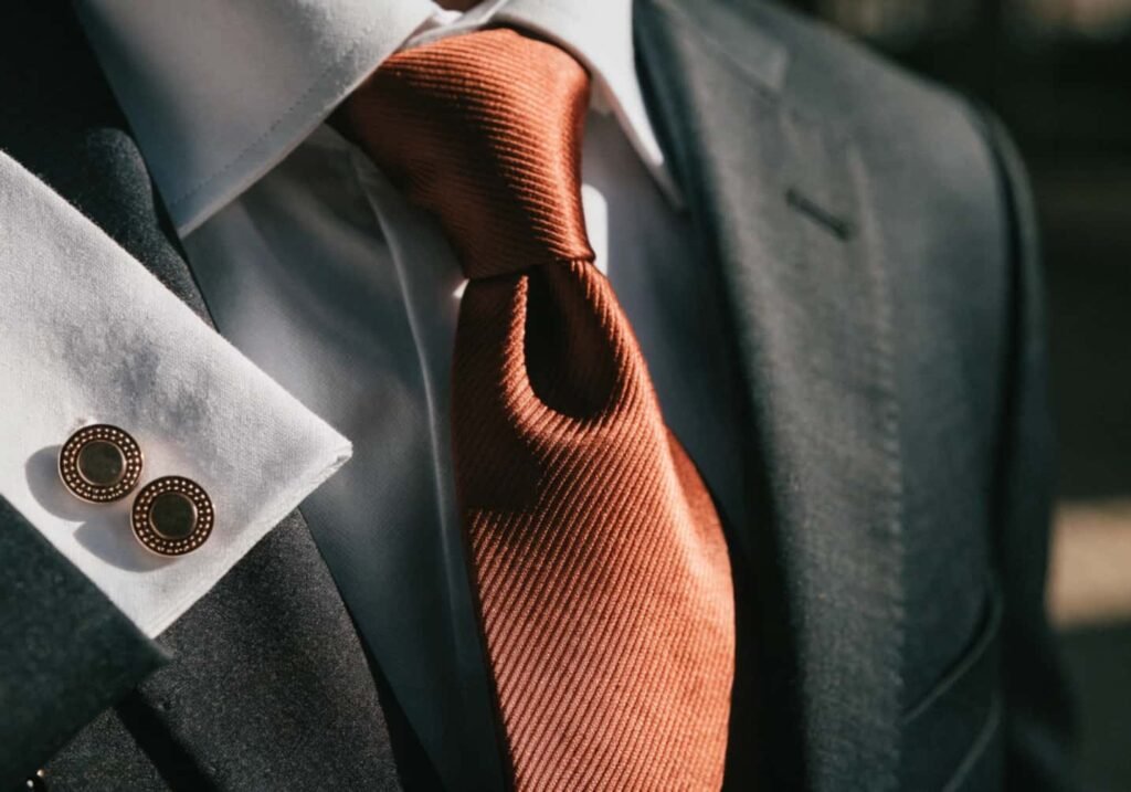
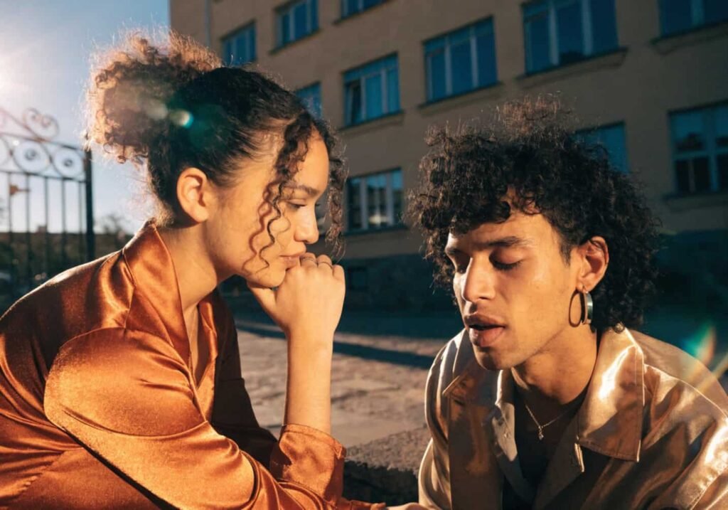
Cameras don’t see color exactly the way the eye does, and this trips up more couples than any other part of planning. Complementary colors — pairs that sit opposite each other on the color wheel, like blue and orange, or purple and yellow — create the strongest visual separation in photos, which is part of why so many editorial wedding shoots lean on that pairing even when it’s not obvious in person. Skin tone also interacts with the palette more than people plan for; warm-toned palettes (terracotta, gold, rust) tend to flatter most skin tones in golden-hour light, while very saturated cool tones (true blue, purple) can occasionally cast an unflattering tint onto skin in close-up shots, especially under shade or overcast light. A good photographer will flag this during an engagement shoot, which is one more reason to book that session before finalizing every color decision.
This Year’s Trending Color Palettes
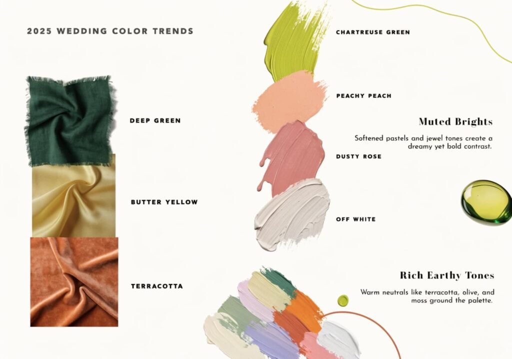
Trend palettes shift almost every season, but a few threads are holding steady right now: warm, earthy neutrals (terracotta, clay, butter yellow) paired with deep greens; muted “dopamine” brights used sparingly as accents rather than dominant colors; and a return to richer, more saturated jewel tones for fall and winter weddings after several years of almost exclusively soft, muted palettes. Pantone’s yearly color announcements tend to influence bridal palettes about a season behind — florists and linen rental companies need time to stock new shades, so a Pantone color announced in December usually shows up meaningfully in wedding palettes the following fall, not that same spring. Trend-chasing is fine for accents (a napkin color, a ribbon) but riskier for anything expensive and hard to change later, like bridesmaid dresses, since trend palettes can look dated in photos within just a couple of years.
Finalizing the Perfect Color Scheme for You
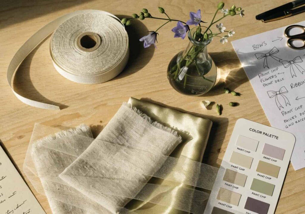
Once the research is done, the fastest way to actually commit is building a small physical sample board — real fabric swatches, a flower stem or two, a paint chip, maybe a ribbon — rather than relying on a digital mood board alone. Digital boards flatten texture and lighting differences that matter enormously in person. Take that physical board to the venue at the time of day the wedding will happen, and if possible photograph it there with a phone camera, since that’s a reasonably close approximation of how a real photographer’s lighting will read. If the palette still looks right in that context — not just on a screen in a bright kitchen — it’s probably ready to hand off to the florist, printer, and rental company.