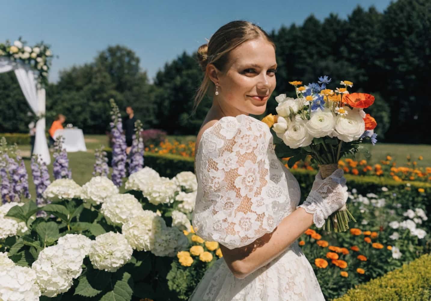
Summer weddings live or die by their color palette in a way spring and fall weddings don’t. The light is harsher, the days are longer, and every color you pick gets tested against direct sun for hours at a time — not the soft, forgiving light of an October afternoon. A palette that looks gorgeous on a Pinterest board can wash out completely at 2 p.m. in July, or worse, look muddy in photos once the sun drops low and turns everything orange. Here’s how to actually pick colors that hold up.
How Summer Weather Influences Color Choices
Direct sunlight is a bleaching agent, functionally speaking. Colors with a lot of red or yellow pigment (corals, warm pinks, marigold) tend to hold their saturation better in strong light because the sun’s warmth doesn’t fight against them. Cooler, more delicate colors — baby blue, lilac, sage — can look almost gray by mid-afternoon if the venue doesn’t have shade, because the light is overpowering the pigment. This is why so many “beautiful” mood boards look flat in actual event photos: the palette was chosen indoors, under soft lighting, and never tested against real sun.
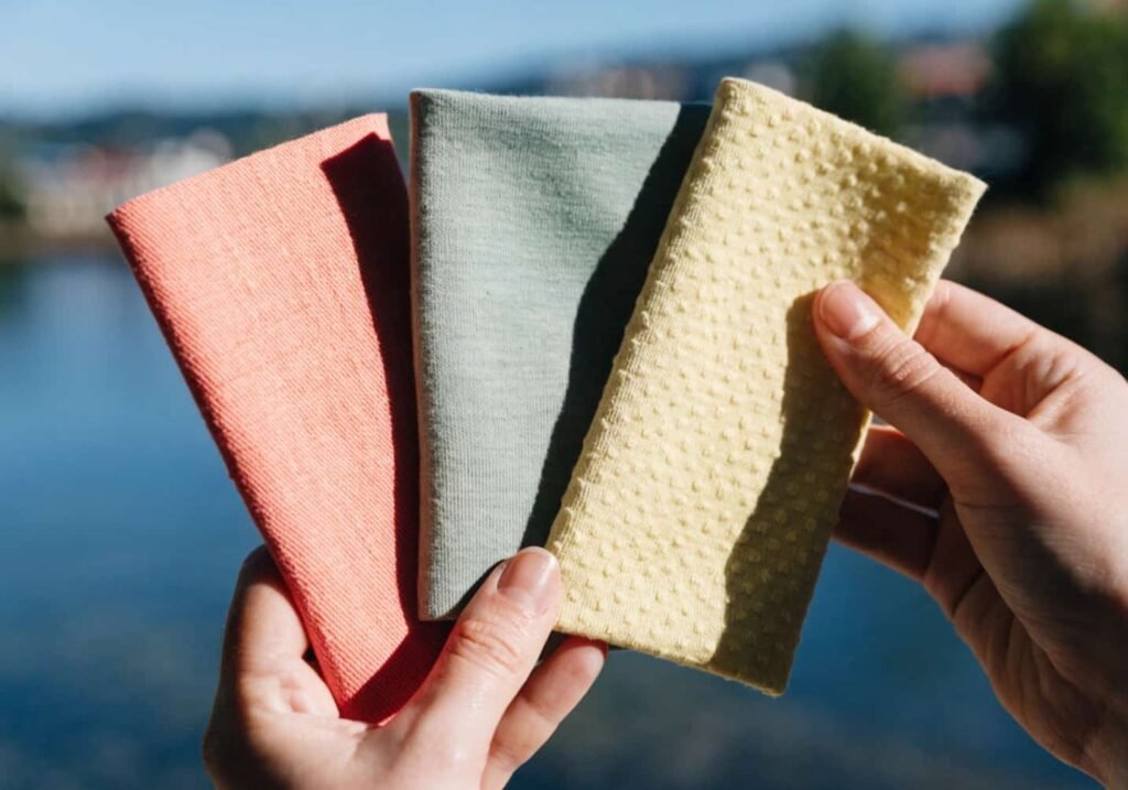
A trick planners use: hold your fabric swatches or paint chips outside at noon and again around 6 p.m. Colors shift more than people expect — a dusty rose can read almost beige at noon and turn rich and warm by golden hour. If you’re set on a specific palette, pick your ceremony time around the color, not the other way around.
The Fresh Appeal of Pastel Shades
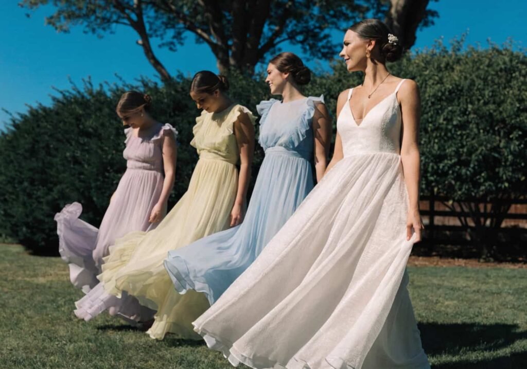
Pastels work best in summer when they’re not too cool-toned. Think buttery yellow, peach, blush, and celadon green rather than icy lavender or baby blue, which can feel more suited to spring. The undertone matters more than people realize — a peach with a slightly orange base will photograph warmer and more alive than a peach that leans pink, especially under tent lighting where color temperature is already shifted.
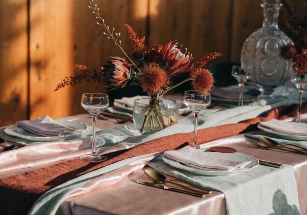
If you want pastels without the “too soft to notice” problem, pair two pastels with one saturated anchor color — for example, blush and sage with a deep terracotta runner. The anchor keeps the palette from disappearing in photos.
Combining Vibrant and Bold Colors
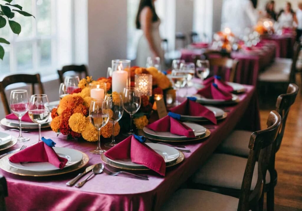
Bold summer palettes (think magenta, cobalt, marigold, emerald) need one rule to avoid looking chaotic: pick one dominant color, one supporting color, and one accent used sparingly — roughly a 60/30/10 split, the same ratio interior designers use for rooms. A wedding that’s magenta, cobalt, and marigold in equal amounts will fight itself in photos. Magenta at 60%, marigold at 30%, and cobalt as a 10% accent (napkin ties, a signage detail) reads as intentional instead of random.
Bougainvillea, hibiscus, and zinnias are the easiest flowers to source in these tones without paying a premium, since they’re already in peak season from June through August in most of the U.S.
Best Color Combinations for Outdoor Summer Weddings
A few combinations consistently photograph well outdoors because they mimic what’s already in the natural landscape, so nothing clashes with the greenery or sky in the background:
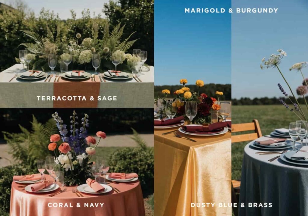
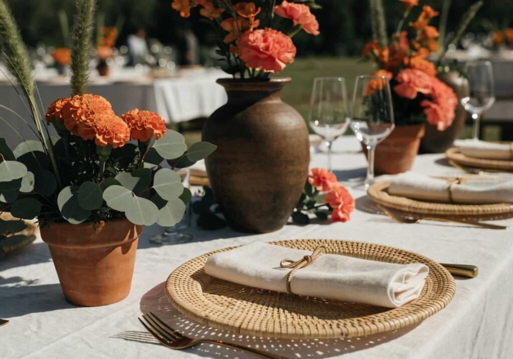
- Terracotta + sage + cream — works almost anywhere, especially venues with a lot of exposed wood or stone
- Coral + navy + gold — good for waterfront or coastal venues; the navy keeps coral from looking too sweet
- Marigold + burgundy + ivory — better for late-summer weddings (August/September) since it edges toward fall without fully committing
- Dusty blue + white + brass — the coolest-toned option on this list, best for venues with heavy shade or overcast climates
If your venue has a lot of green lawn or foliage in the background, avoid heavy sage or olive tones in your palette — they’ll blend into the background in photos instead of standing out.
Tips for Staying Fresh-Looking in the Heat
This is less about color theory and more about fabric physics, but it affects color perception directly. Dark, saturated colors absorb more heat, which means fabric wilts faster, makeup runs sooner on anyone wearing it, and dye can bleed more in high humidity, especially with cheaper polyester blends. If your wedding party is standing outside for photos in 90-degree heat, go with lighter-weight fabrics (cotton voile, linen blends under 200 GSM) even if the color itself is bold — a deep emerald in a heavy satin will look sweaty and creased within twenty minutes; the same emerald in a lightweight crepe holds up much better.
One thing people get wrong: white doesn’t automatically mean cooler. Weave and fabric weight matter more than color for actual temperature comfort. A tightly woven white polyester can trap more heat than a loosely woven cotton in a mid-tone color.
Floral Colors That Complement Summer Tones
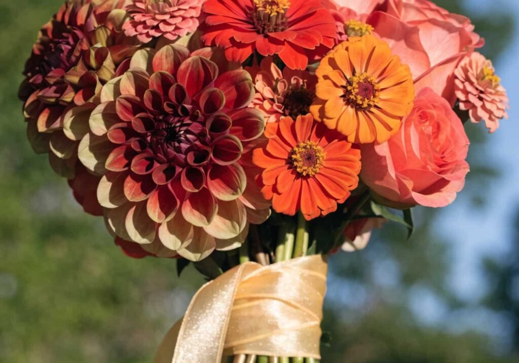
Peak summer florals — dahlias, zinnias, sunflowers, garden roses — naturally lean warm, so building your palette around what’s actually in season (rather than forcing an off-season color) saves money and looks more cohesive. Off-season florals like peonies or ranunculus have to be imported in July and cost noticeably more, often 30–40% above locally available blooms.
If your palette is cool-toned (blues, lavenders), lean on delphinium, hydrangea, and thistle, which are some of the few naturally blue-toned flowers available in summer without dyeing. True blue is rare in nature, so most “blue” wedding florals are actually tinted or are a very dusty periwinkle rather than a vivid blue — worth knowing before you show a florist a saturated blue reference photo and expect an exact match.
The Role of Color in Summer Wedding Outfits
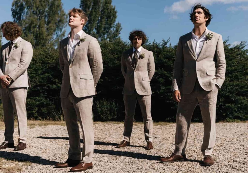
For guests and wedding parties alike, summer outfit colors need to account for sweat and sun glare, not just the palette on paper. Pale colors show sweat marks faster under arms and at the back; mid-tones (dusty rose, sage, terracotta) hide it better than either stark white or very dark navy. For groomsmen in suits, lighter fabric weights (around 260–280 GSM wool blends, or linen-cotton blends) in tan, light gray, or sage hold their shape better in heat than heavier traditional suiting, which can look wilted by the reception.
I helped a friend plan a backyard July wedding a couple of years ago, and the one thing that saved the photos was switching the groomsmen from navy wool suits to a lighter taupe linen blend two weeks before — the navy ones looked fine in the morning fitting but were visibly rumpled and dark with sweat by the ceremony.
Highlighting Summer Colors Through Decor
Decor is where you can afford to go bolder than you would with fabric, since it doesn’t have to move or breathe. Painted signage, ceramic vases, and ribbon work all hold saturated color well. A good rule: keep large-surface decor (linens, backdrops) in your softer palette colors, and save your boldest colors for small, repeated details — napkin ties, menu card borders, candle holders. Repetition of a small bold accent across many tables reads as more intentional than one giant saturated backdrop.
Terracotta pots, unglazed ceramic vases, and rattan details also pair naturally with summer palettes and cost less than glass or metal alternatives, while giving off the same warm, sun-friendly tone as the flowers themselves.
Color Ideas for Sunset or Evening Weddings
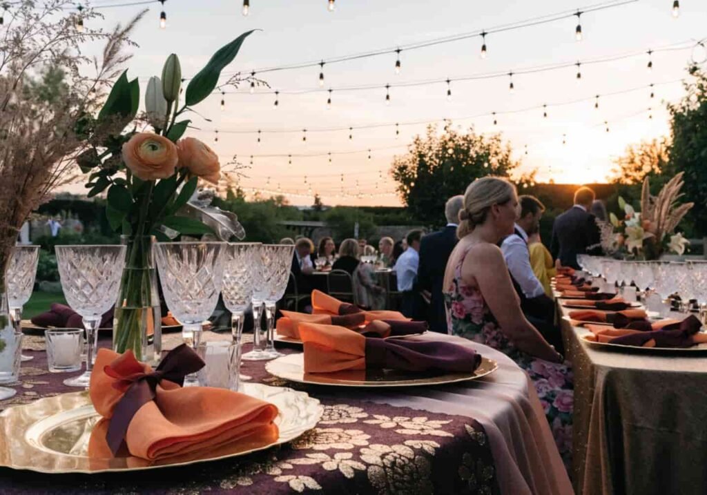
If your ceremony or reception runs into golden hour or evening, plan your palette around artificial and ambient light, not just daylight. Warm string lighting (2200K–2700K bulbs, which is the “warm white” range most rental companies use) will shift blues toward gray and intensify anything already warm-toned — so a coral palette gets richer and more romantic at night, while a blue or lavender palette can look muted or even slightly green under warm bulbs.
For a true sunset-inspired palette, burnt orange, dusty plum, and gold hold up beautifully because they’re already close to the actual colors in the sky at that hour, so the decor and the backdrop work together instead of competing.
Choosing Colors for Fabric and Drapery
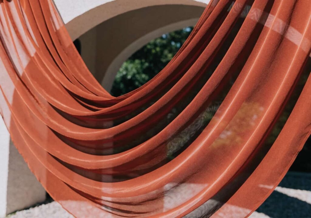
Drapery is one of the most color-sensitive elements at a summer wedding because it’s often backlit by the sun for part of the day. Sheer fabrics like chiffon and organza (usually in the 25–40 GSM range) let light pass through, which lightens whatever color you choose — a “deep” terracotta chiffon can look more like a soft peach once the sun is behind it. If you want the drape to actually read as bold in photos, go one to two shades darker than your target color, or layer two panels of the same fabric for more opacity.
Heavier fabrics like velvet or cotton canvas hold true color better but trap heat and aren’t practical for most outdoor summer setups unless they’re purely decorative and not near guest seating.
Final Color Tips for Your Summer Wedding
Test everything in real daylight before you commit — swatches under store lighting or on a screen almost never match how a color behaves at noon versus sunset. Build your palette around what’s actually blooming locally in your wedding month rather than a color you saw online, since it’ll be cheaper and more consistent. And if you’re torn between a bold palette and a soft one, remember they don’t have to be mutually exclusive: soft on the large surfaces, bold on the small repeated details, is usually the combination that photographs best and holds up through a full day of heat.