I still remember the first time I used a plain white background for a flyer I was designing for a friend’s café. It looked clean, sure — but it also looked cold and forgettable. Then I dropped a simple aged paper texture under the text and suddenly the whole thing felt warm, handcrafted, and real. That one small change made a huge difference. Paper textures have that kind of quiet power. They don’t shout, they just make everything around them feel better. Whether you’re building a website, designing social posts, or putting together a presentation, the right paper texture can take your work from “meh” to actually memorable.
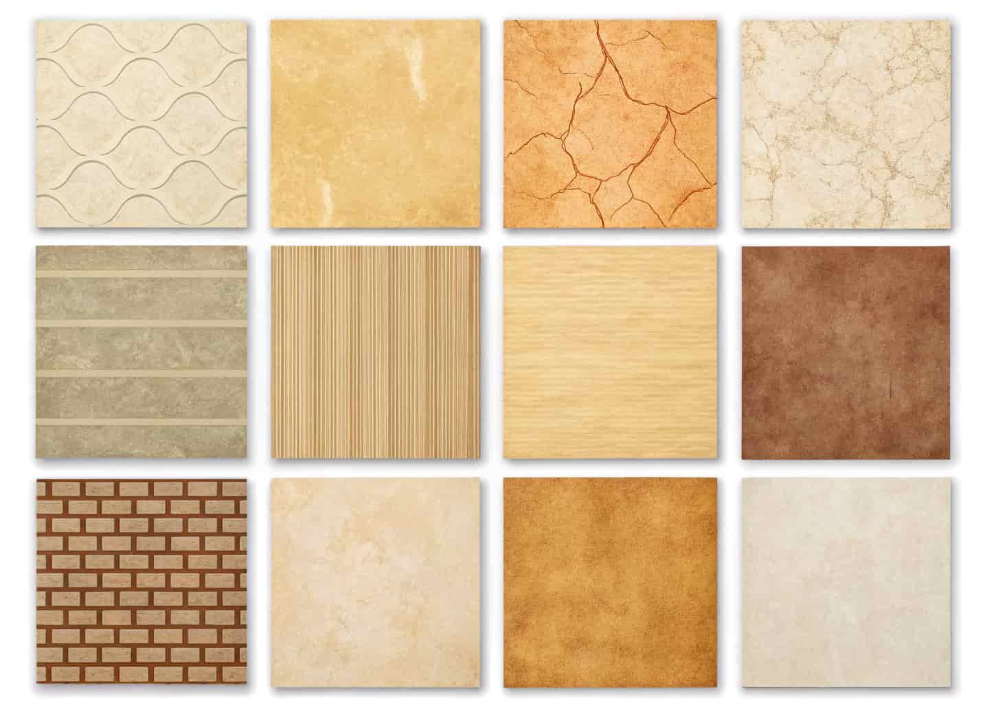
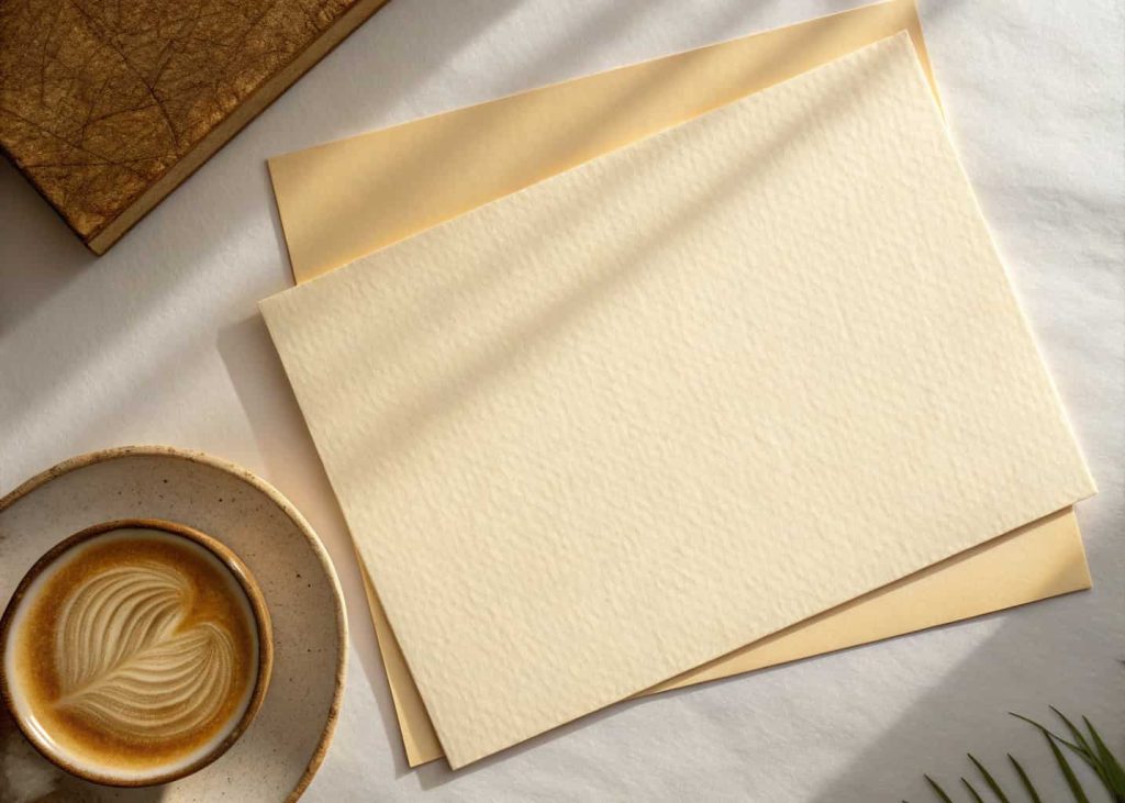
1. Classic Cream Paper Texture
This one is the bread and butter of paper textures. It’s warm, soft, and works with almost every kind of project you can think of. The cream tone feels natural — like the paper you’d find in an old book or a handwritten letter from your grandmother. Designers love it because it pairs beautifully with dark serif fonts, giving everything a timeless editorial feel. I’ve used this on wedding invites, blog headers, and even a birthday card for my mom. Every single time, people asked if I hired a professional designer. It’s that kind of texture. Start here if you’re new to using paper backgrounds.
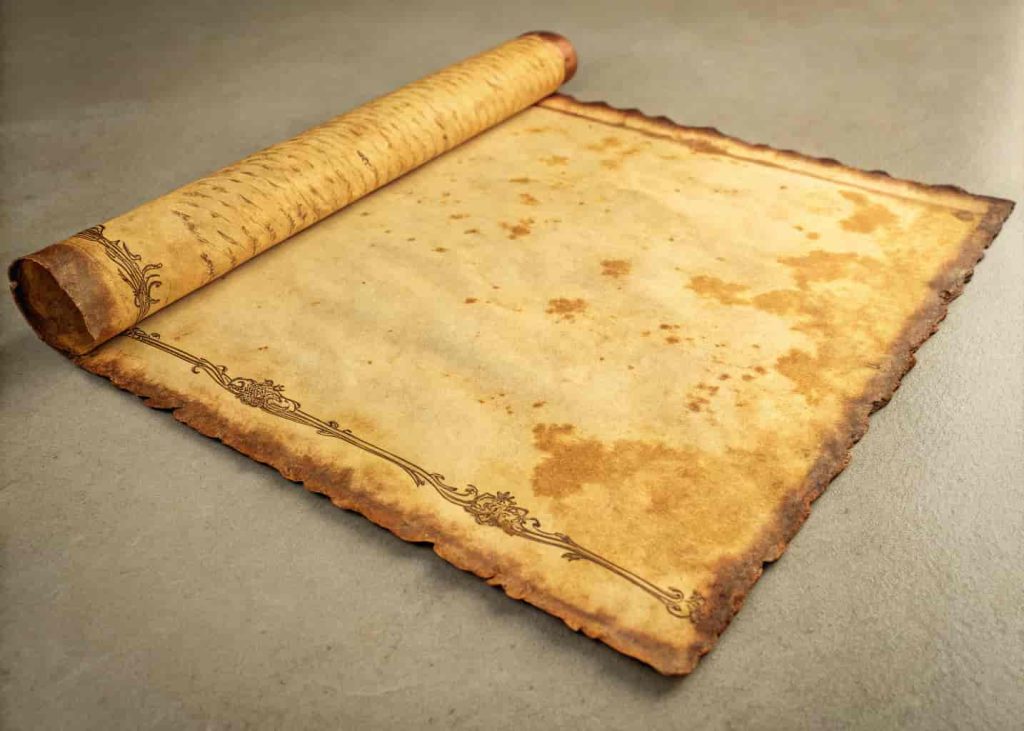
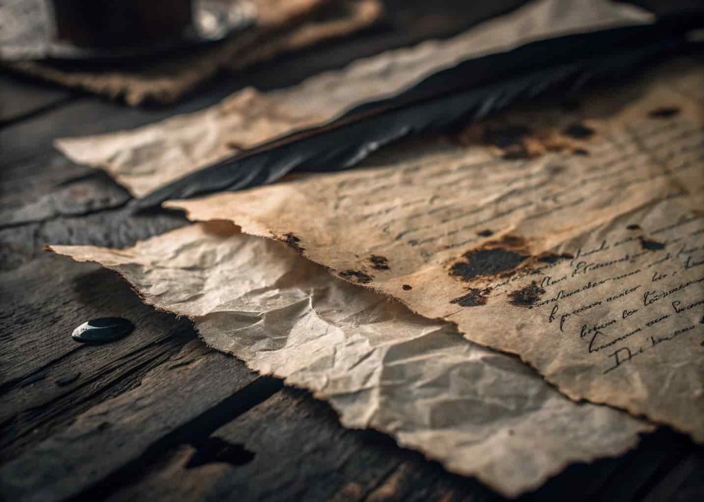
2. Aged Vintage Paper Texture
Think old treasure maps, vintage menus, and antique book pages. Aged paper textures have that slightly yellowed, worn-out look that instantly gives your design a story. It’s not just a background — it’s a mood. This works incredibly well for history-related content, rustic brand identities, and anything that needs to feel like it came from another era. A travel blogger I follow uses this for her journal-style posts, and the texture alone makes you feel like you’re reading a real diary from the 1940s. The key is to pair it with vintage-style fonts and muted color palettes for maximum effect.
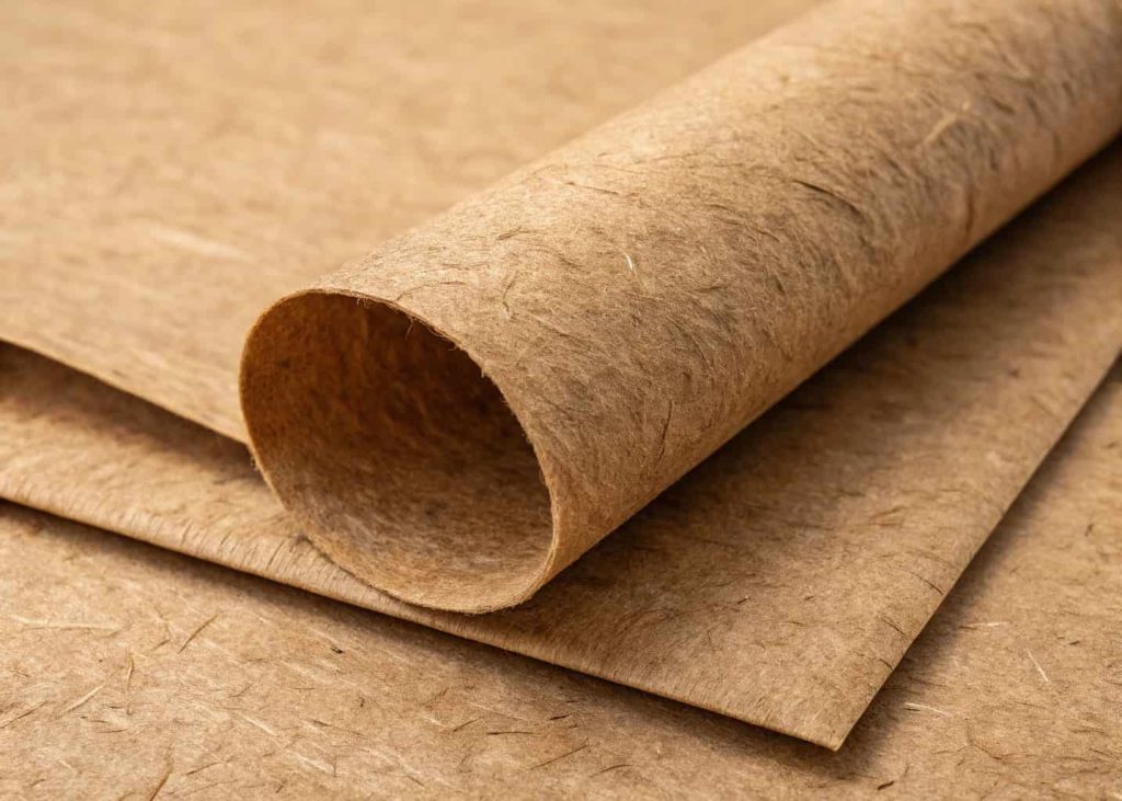
3. Rough Kraft Paper Texture
Kraft paper is that brown, fibrous paper you see on shopping bags, packaging, and artisan food labels. It has a rough, earthy texture that screams handmade and organic. Brands that want to feel eco-friendly, natural, or down-to-earth absolutely love this one. I’ve seen small coffee shops use it as a website background, and it fits so perfectly that you can almost smell the fresh beans just from looking at the page. The coarse grain adds visual depth without being distracting. Try it under bold, simple typography — the contrast between rough texture and clean fonts is genuinely striking.
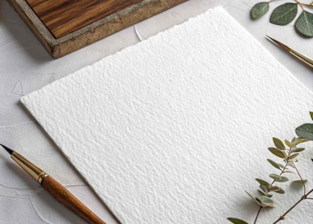
4. Watercolor Paper Texture
Watercolor paper has a slightly bumpy, absorbent surface that gives designs this wonderfully soft and artistic quality. Even if you’re not painting anything, just using this texture as your background adds a creative, hand-crafted touch to digital projects. It works beautifully for art portfolios, children’s book covers, wedding websites, and any creative brand that wants to feel approachable and artistic. When I used a watercolor paper background for a kid’s birthday party invitation, the parents thought I had hand-painted the whole thing. Combine it with a pastel color overlay for an effect that looks expensive but takes about five minutes to set up.
5. Grunge Torn Paper Texture
Grunge textures aren’t for everyone, but when used right, they’re absolutely electric. Torn, distressed, wrinkled paper textures bring raw energy to designs — perfect for music posters, streetwear brands, or anything that wants to feel rebellious and edgy. The torn edges especially add a sense of drama and movement that smooth backgrounds simply can’t replicate. A friend of mine runs a small punk band and uses a grunge paper texture for all their event posters. People regularly stop on the street to look at them. That’s the power of texture used with intention. Just don’t overdo it — one strong grunge background is enough.
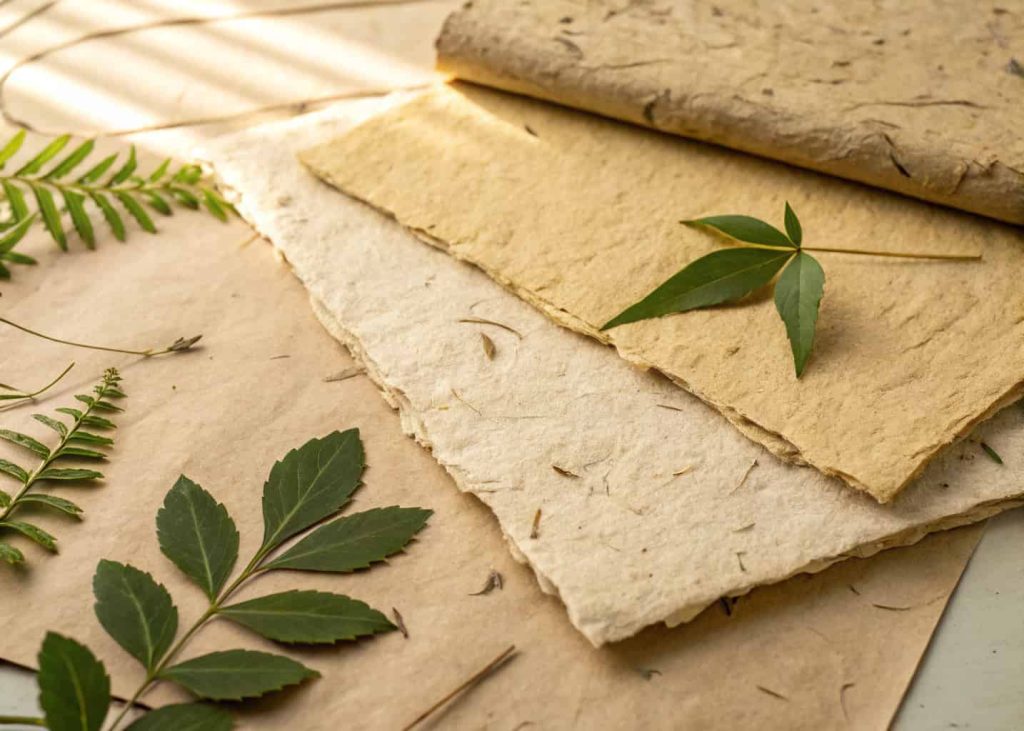
6. Handmade Recycled Paper Texture
Recycled paper textures have this beautifully imperfect, grainy look with visible fibers and subtle color variations. They feel honest and real — like something made by actual human hands rather than a machine. Sustainability-focused brands, environmental organizations, and organic product companies use these textures constantly because they visually communicate their values without saying a word. I once saw a zero-waste brand’s packaging that used a recycled paper texture digitally, and even online it made you feel like you were holding something responsibly made. It’s soft enough to not distract from your content but distinctive enough to add real character.
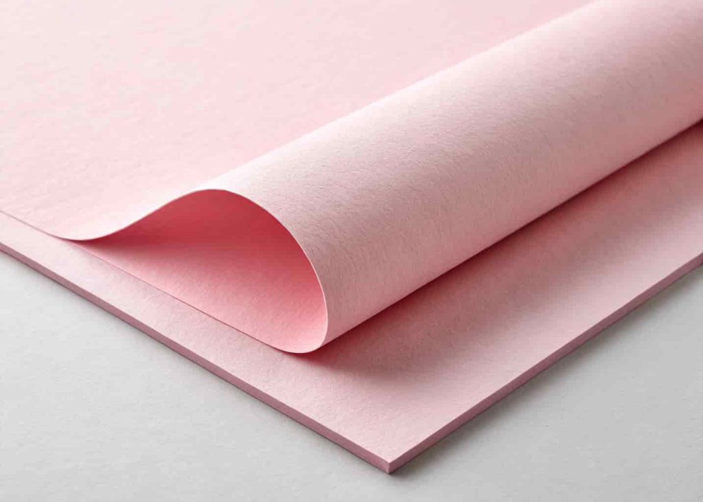
7. Pastel Colored Paper Texture
Not all paper has to be beige or brown. Pastel-colored paper textures — think soft pink, mint green, lavender, and baby blue — bring freshness and personality to designs without being overwhelming. These are incredibly popular in lifestyle blogging, beauty branding, and social media content because they photograph beautifully and feel approachable and friendly. A food blogger I follow uses a soft pink paper texture for all her recipe card graphics, and her engagement shot up because the backgrounds made her content instantly recognizable. Pick one pastel color and stick with it across a project for a cohesive, professional look that people will remember.
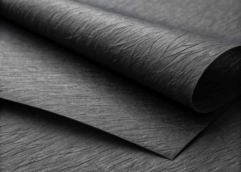
8. Dark Black Paper Texture
Dark paper textures don’t get nearly enough love. A deep charcoal or matte black paper background creates an incredibly dramatic and sophisticated feel. It’s perfect for luxury brands, tech startups going for a sleek vibe, Halloween designs, or premium product presentations. The slight texture keeps it from feeling flat and lifeless like a solid color would. When you layer white or gold text on top of a dark paper texture, the result looks genuinely expensive. I tried this for a mock luxury candle brand project once, and the difference compared to a plain black background was night and day. The texture gives your eyes something to land on without pulling focus from the content.
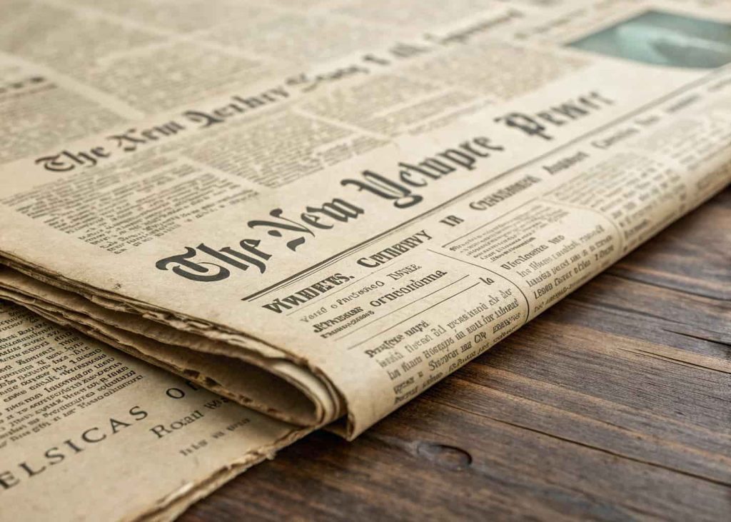
9. Newspaper Print Paper Texture
There is something immediately nostalgic about newspaper-style paper texture. The slightly off-white, thin, and slightly transparent feel brings old journalism, indie zines, and vintage editorial design to mind instantly. It’s a fantastic choice for content-heavy designs where you want the background to feel intentional and full of character without drawing too much attention to itself. Food wrapping paper, newsletter designs, retro podcast branding — this texture fits in all of them naturally. I’ve even used it for a school project presentation once, and my teacher said it looked like something out of a 1960s magazine. That’s a win in any room.
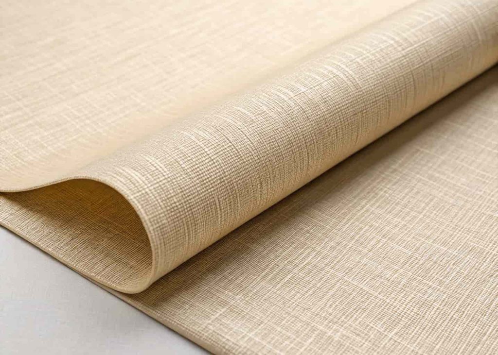
10. Linen Fabric Paper Texture
Linen textures sit somewhere between fabric and paper, and that’s exactly what makes them interesting. They have a woven, crosshatch pattern that adds real visual richness to backgrounds without feeling busy or messy. Interior design brands, home décor blogs, and stationery companies use linen textures constantly because they communicate quality and refinement. It’s the kind of background that makes your font choices look better just by being there. I used a light linen texture for a client’s online boutique homepage last year, and she immediately got compliments from customers saying the site felt “luxurious.” That’s a paper texture doing its job quietly and well.
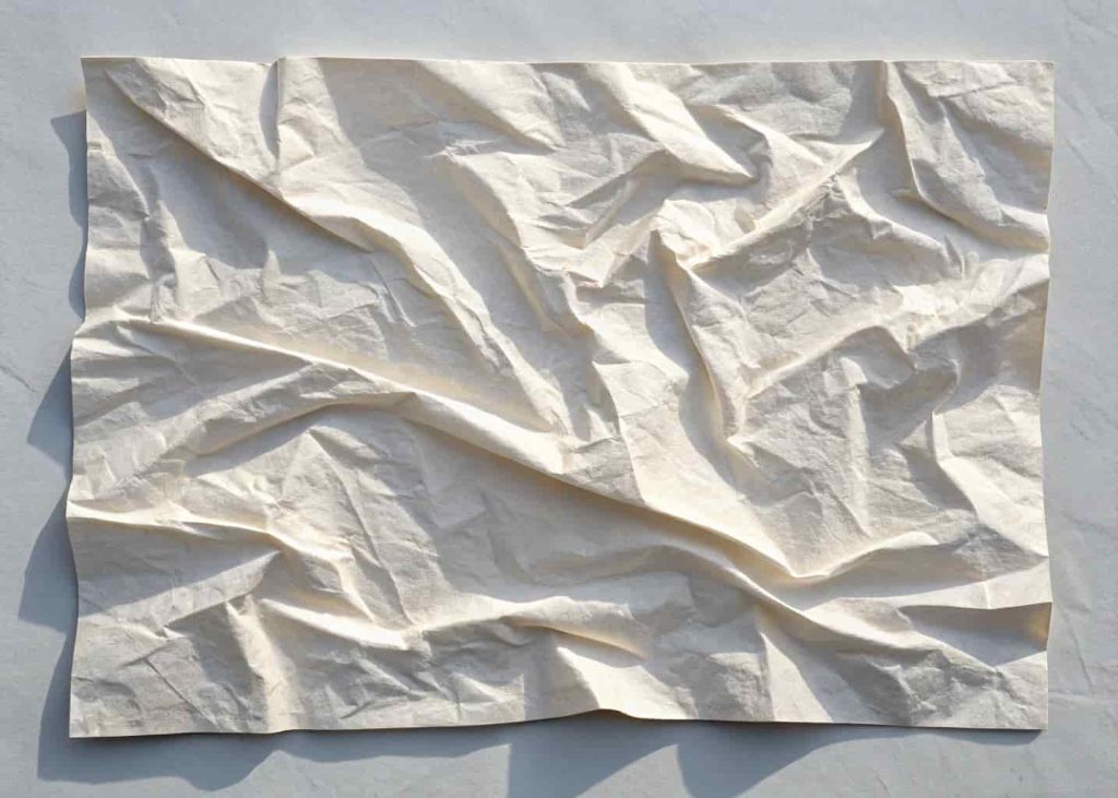
11. Wrinkled Crumpled Paper Texture
Wrinkled paper textures are surprisingly versatile. The creases and folds create natural shadows and depth that give your design a real three-dimensional quality. They work especially well for backgrounds in collage-style art, scrapbook layouts, journal aesthetics, and social media posts that want a casual, real-life feel. There’s something deeply human about a crumpled piece of paper — it tells a story of being used, touched, and worked with. A DIY craft blogger I admire uses crumpled paper backgrounds for her tutorial posts and it makes every photo feel cozy and personal, like you’re looking over her shoulder at her actual workbench.
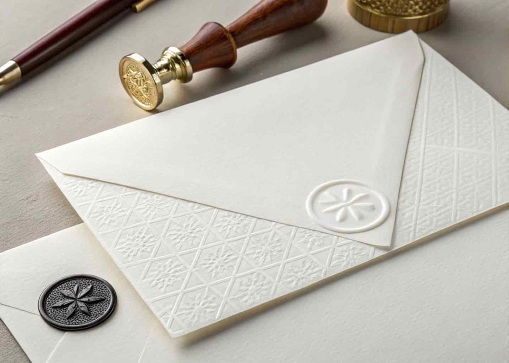
12. Watermarked Elegant Paper Texture
Last but absolutely not least — watermarked paper texture. This is the fancy one. Watermarked paper has a subtle pattern or design embedded into the paper itself, visible only when held up to the light. Digitally, designers recreate this with very faint, translucent patterns layered into a clean paper background. It screams formal, professional, and high-end. Think corporate letterheads, legal documents, wedding stationery, and certificates. When I designed a certificate template for a small online course, adding a watermark texture made it look a hundred times more official. Students were actually printing them out and framing them — all because the texture made the design feel worth keeping.
Conclusion
Paper textures are one of those design tools that look simple but carry a lot of weight. A single texture swap can completely change how a project feels — warmer, cooler, edgier, more refined, more human. The twelve textures we walked through here cover a huge range of styles and moods, from rustic kraft to elegant watermark, so there’s genuinely something for every kind of project. The best part? You don’t need to be a pro designer to use them well. Start with one, experiment with how it interacts with your colors and fonts, and pay attention to how it changes the feeling of the whole piece. Good design often comes down to these small, thoughtful choices — and choosing the right paper texture might just be the fastest upgrade you make all year.