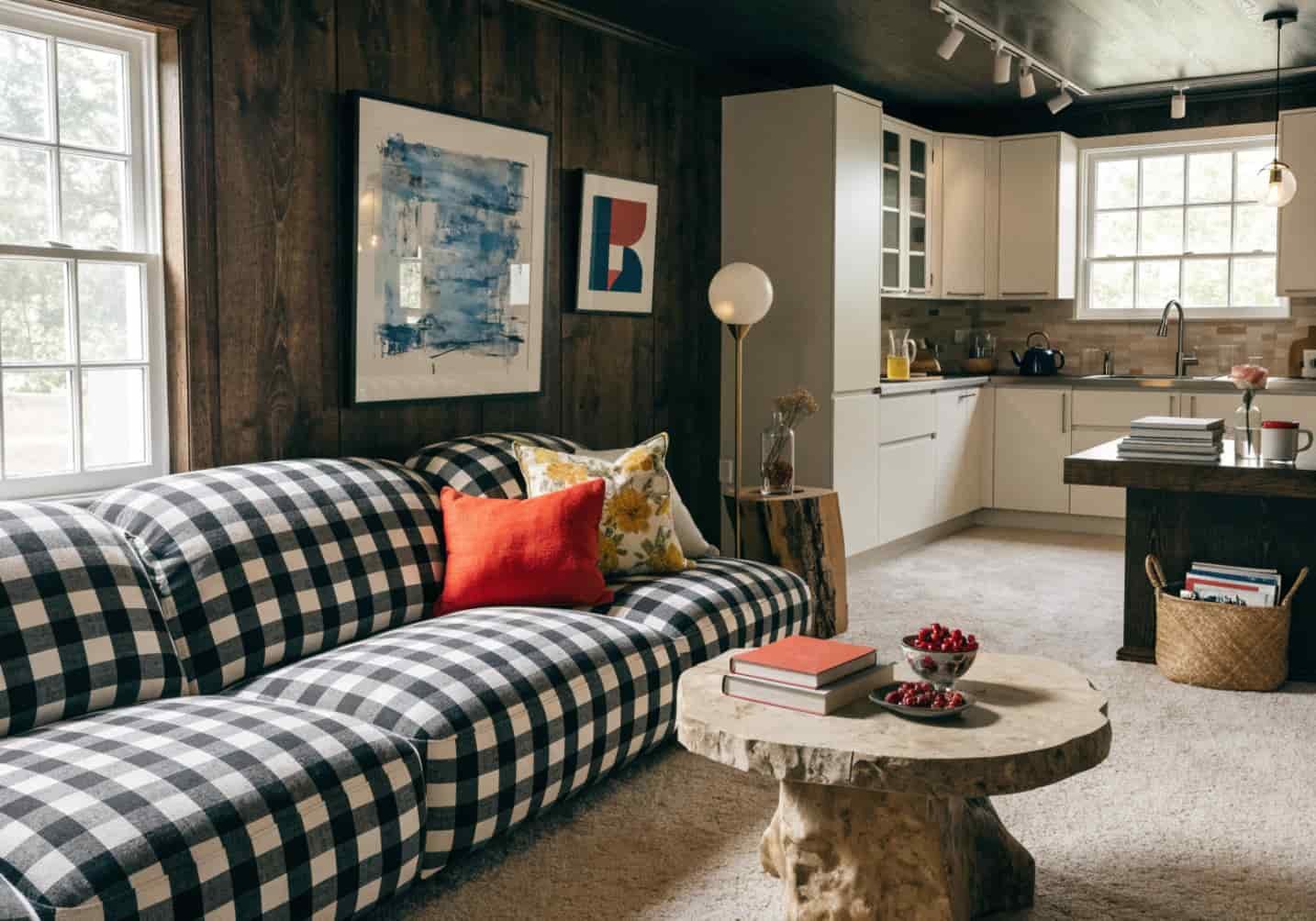
Scrolling through decor images is easy. Turning one of those images into something that actually works in your house is the part most people get stuck on. You save forty photos, none of them match your ceiling height, your outlets, or your budget, and six months later the folder is still just a folder. This is less about finding more inspiration and more about knowing what to do with the inspiration you already have.
How to Find Decor Inspiration Images
Skip generic searches like “living room ideas” — they return the same twelve staged photos every site reuses. Instead, search by constraint: “small living room low ceiling layout,” “galley kitchen no island,” “north-facing living room paint colour.” Adding your actual limitation to the search filters out images that look great but assume space or light you don’t have.
Design magazines’ own sites (Elle Decor, House Beautiful, Livingetc) tend to credit the designer and room dimensions, which Pinterest reposts strip out — that context matters more than the photo itself once you’re trying to replicate something.

How to Collect Ideas from Pinterest
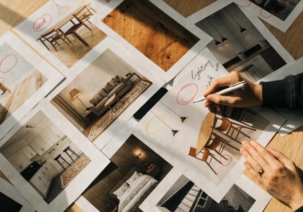
Don’t dump everything into one board. Split by room and by decision type — one board for “kitchen colour,” another for “kitchen layout,” another for “kitchen lighting fixtures.” A single mixed board of 200 pins is unusable when you’re actually shopping; a board of 15 pins that all answer one question (what colour for my cabinets) is something you can act on in a weekend.
Use Pinterest’s board sections feature to tag images by budget tier too — under $500, $500–2000, over $2000 for a given change. It sounds tedious but it’s the difference between a mood board and a project plan.

How to Choose the Right Image Style for Your Room
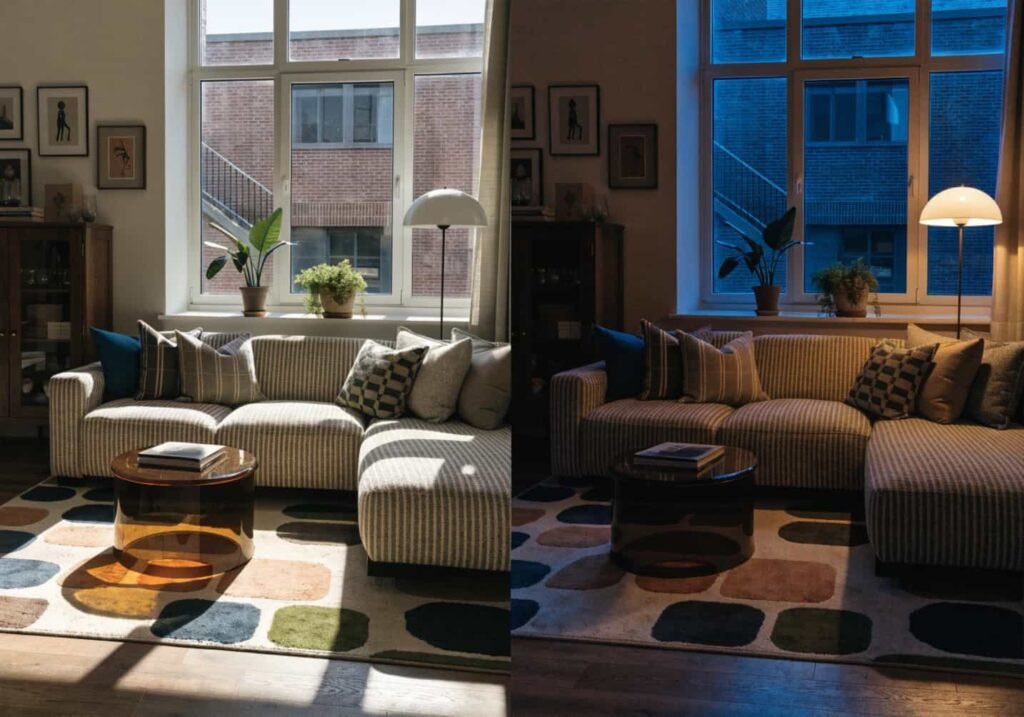
Most inspiration photos fall into one of three lighting setups: bright daylight staged shots (flattering, misleading about evening use), warm lamp-lit evening shots (better for judging cosiness), and flat product-catalogue lighting (accurate colour, terrible atmosphere). If your room gets limited natural light, prioritise the evening-lit images — a space that only looks good under studio daylight will disappoint you at 7pm in January.
Also check the camera angle. Wide-angle lens shots (common in real estate and interior photography) exaggerate room size by roughly 20–30%. A “spacious” kitchen photo shot at 16mm can look 30% bigger than the same room shot at 35mm, which is closer to how your eye actually sees it standing in the doorway.
How to Apply Inspiration to Your Own Home
Pick one image as your anchor and treat everything else as supporting reference, not a checklist to complete in full. Trying to replicate five different Pinterest kitchens in one renovation is how people end up with a room that has no single point of view — a marble backsplash from one photo, brass hardware from another, a colour palette from a third, none of which were designed to sit together.
A trick that actually helps: before buying anything, hold the inspiration image up next to your own room on your phone screen and check what’s structurally different — ceiling height, window placement, floor material. If three or more structural elements differ, the image is a mood reference, not a blueprint.

How to Decide a Colour Scheme from Kitchen Decor Images
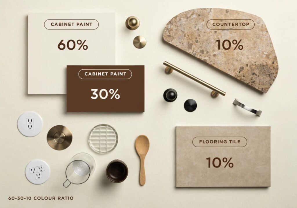
Don’t pick the wall colour first — pick the fixed elements last, because they’re the hardest and most expensive to change. Countertop, cabinet material, and flooring should anchor the palette; paint is the cheap, reversible layer you adjust around them. If an inspiration image has navy cabinets and you have oak flooring with warm undertones, the exact navy in that photo will likely look muddy against your floor — you need a navy with slightly warmer undertones to bridge the two.
A rule that’s rarely mentioned: pull three colours max from any single inspiration image — one dominant (60%), one secondary (30%), one accent (10%). Kitchens with five “inspired” colours usually read as cluttered, not curated, because the original photo had those colours balanced across a much larger visual field (walls, floor, ceiling, appliances) that a smaller kitchen doesn’t have room to replicate.
How to Analyze Before-After Transformation Images
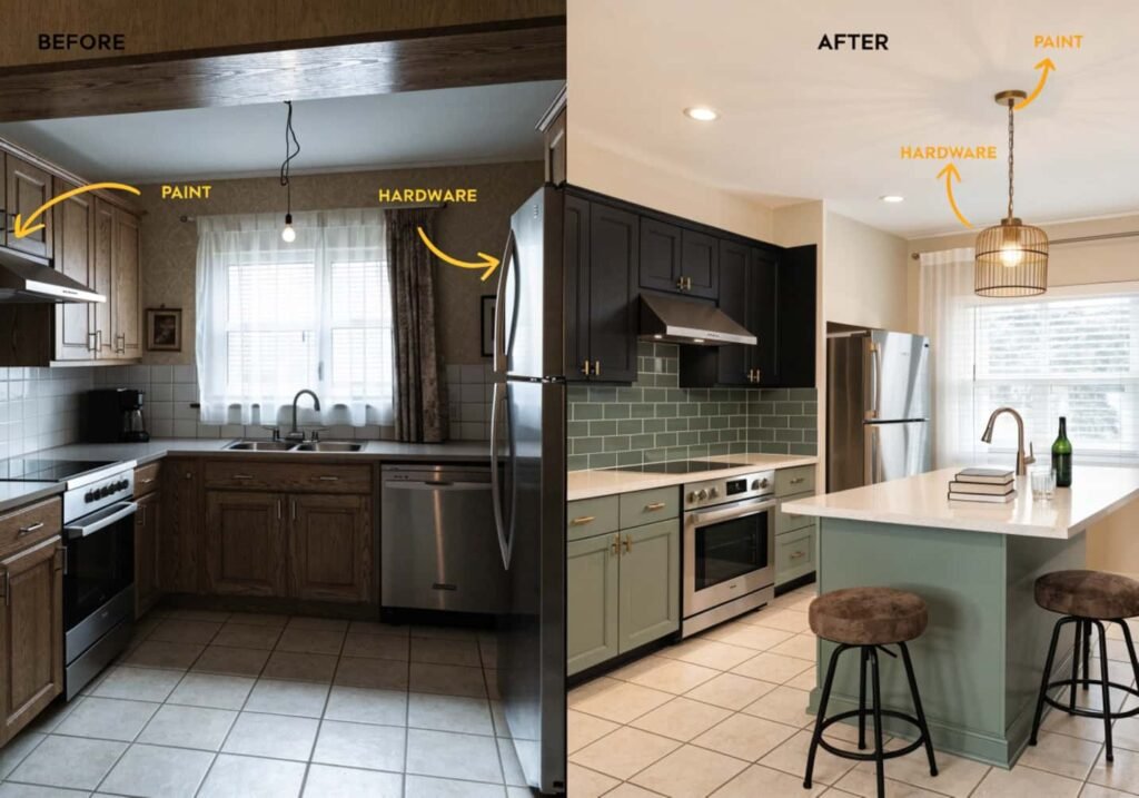
Before-after photos are the most persuasive and the most misleading category of decor content, because the “before” shot is often deliberately under-lit or badly staged (empty furniture, harsh overhead lighting, clutter pushed into frame) to maximise contrast with the after. When you’re evaluating whether a transformation is realistic for your budget, ignore the before photo entirely and ask what specifically changed: paint, hardware, lighting fixtures, furniture, or structural work like removing a wall.
Structural changes (knocking down a wall, moving plumbing for an island) routinely cost 10–20x what a paint-and-furniture refresh costs. A lot of viral “before-after” kitchen transformations bury a $15,000 plumbing relocation inside a caption that only mentions the $200 cabinet paint — read the comments or linked source post before assuming the whole look is achievable on a small budget.
How to Create a Mood Board from Images
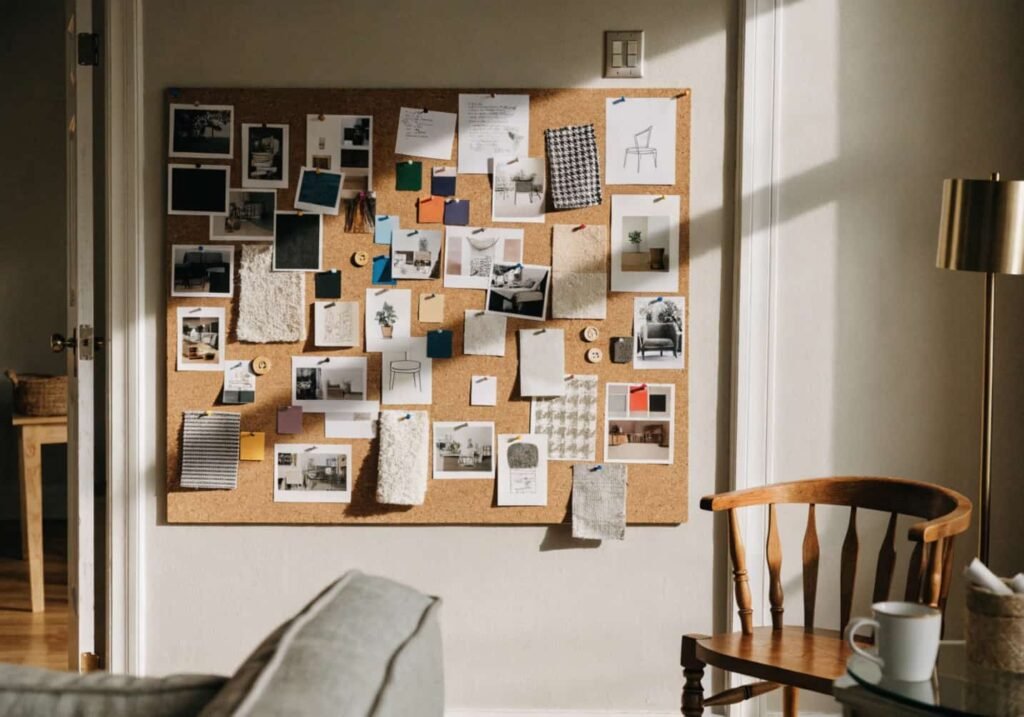
Physical mood boards (printed images pinned to a corkboard) still beat digital ones for one practical reason: you see them under your room’s actual lighting, at your room’s actual scale, every day, rather than on a backlit screen that makes every colour look more saturated than it is. If you’re serious about a colour decision, print 4×6 versions of your top three inspiration images and tape them to the wall you’re planning to paint, then check them again in the morning and at night.
Digital tools like Canva or Milanote work fine for organising the research phase — just don’t make the final colour call from a screen.
How to Follow Trending Decor Images
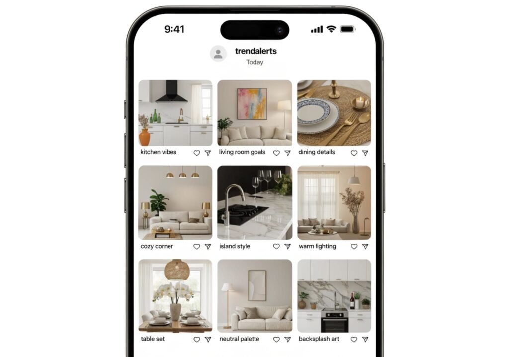
Trending images move fast and most trends have a shelf life of 18–24 months before they start reading as dated rather than current — think the all-white kitchen wave of the early 2020s, which is now being replaced in a lot of new builds by warmer wood tones and coloured cabinetry. If you’re renovating something semi-permanent like cabinetry or flooring, weight trend-driven inspiration less heavily than you would for cushions, art, or a lamp — things you can swap out in an afternoon.
A useful filter: if an image style has appeared in more than three unrelated influencer accounts within the same month, treat it as peak-trend, not classic. Classic choices (Shaker cabinet fronts, subway tile, neutral wall colours) show up consistently across years, not weeks.
How to Convert an Image into Real-Life Decor
Once you’ve settled on an image, break it into a shopping list of five categories: wall colour, floor/rug, major furniture, lighting, and accessories — then price each category separately before buying anything. This stops the common mistake of spending the whole budget on one showpiece sofa and having nothing left for the lighting that actually made the original photo look finished.
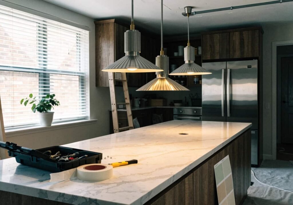
For kitchens specifically, lighting is the most underspent category relative to visual impact. A $150 swap of a single flush-mount ceiling light for two or three pendant lights over an island can change a room’s feel more than a $2,000 cabinet repaint, because most inspiration photos you’re chasing were shot with layered lighting — ambient, task, and accent — not one overhead bulb.
How to Identify Your Own Style from Images
Instead of naming a style upfront (“I like modern farmhouse“), save 20 images with no label and then look for what repeats — the same wood tone, the same lack of clutter, the same type of window treatment. Most people’s actual taste is narrower and more specific than a named style category, and forcing your room into “modern farmhouse” or “coastal grandma” often means chasing accessories that don’t matter to you just because the label demands them.
If your saved images keep returning to warm wood, brass, and minimal counter clutter, that’s your style — you don’t need the label to shop for it, and skipping the label usually saves money, because you stop buying the “required” pieces of a trend name you don’t actually care about.