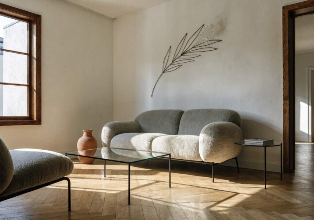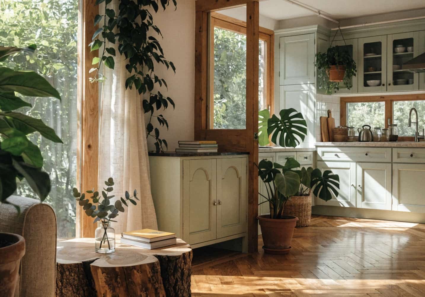
Green is the one color that never really goes “out” — it just shifts shades. Olive and sage had their moment a few years back; forest green and moss are having theirs now, and if history repeats, emerald will reevaluate within the decade. If you’re planning a green scheme for your living room and kitchen, don’t chase a trend. It’s to pick greens that work with your light, your wood tones, and your actual furniture budget, so the room still looks right in five years.
Here’s what that actually takes, room by room.
How to Bring a Green Colour Scheme into the Living Room
The mistake most people make is picking one green and painting all four walls with it. Green reads very differently depending on the light hitting it, so a color that looks calm on the swatch can go murky or overly minty once it’s on a large wall. Test any shade on at least two walls — one that gets direct light and one that stays shaded — and look at it at 8 am, midday, and after dark under your lamps before committing.
A more forgiving approach for a first-time green room: use green as 60% of the palette, not 100%. Paint one wall or leave walls neutral (warm white, greige, or a soft plaster tone) and bring green in through a large sofa, an oversized rug, or curtains. This way, if the green starts to feel dated in a few years, you’re repainting one wall or swapping one textile instead of redoing the whole room.
For paint specifically, mid-tone greens with a grey undertone (like sage or eucalyptus) are far more forgiving of mismatched lighting than pure, saturated greens. A true grass green under warm LED bulbs (2700K) can shift toward yellow-olive, which not everyone wants — check your bulb temperature before you buy the paint, not after.
How to Choose Green Tiles for the Kitchen
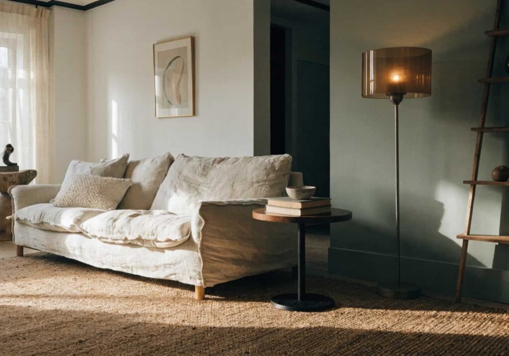
Green tiles are a bigger commitment than green paint because they’re harder to undo, so this is the one place where sample-testing really matters. Order physical tile samples (most suppliers send these for $2–5 or free) and place them against your actual cabinet color and countertop material at home — showroom lighting almost always flatters tile more than your kitchen will.
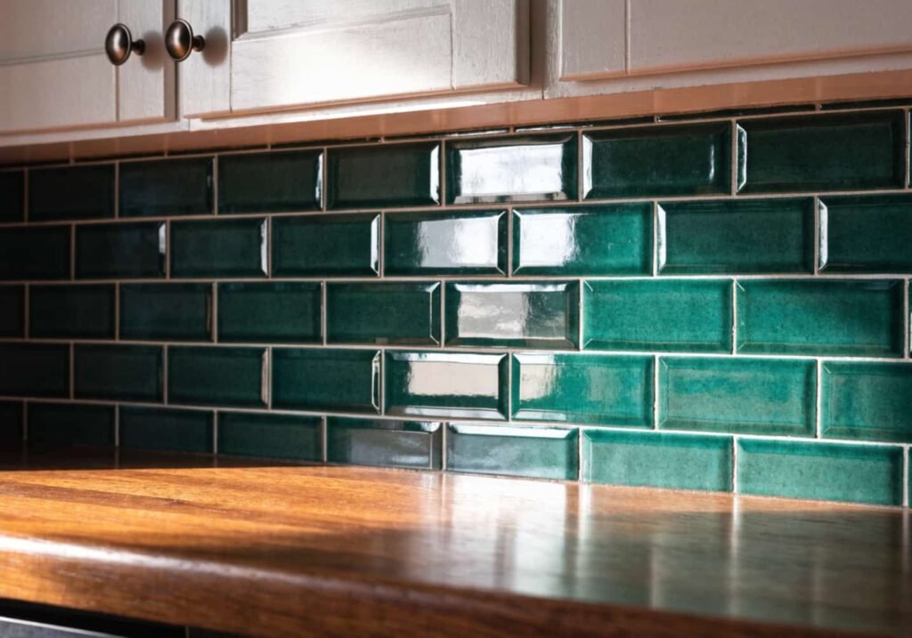
For backsplashes, glossy green subway tile in a bottle-green or forest shade works well against white or light wood cabinets, but it shows water spots and grease more than a matte finish does — something worth knowing if you cook often and hate wiping tile daily. Matte or slightly textured zellige-style tiles hide those marks better and give a more handmade, organic look that suits a nature theme, though they typically cost 30–50% more per square foot than standard glossy ceramic.
If you’re tiling a floor rather than a backsplash, go lighter and more muted — dark green flooring in a small kitchen will visually shrink the room, especially without strong overhead lighting.
How to Create a Green Vibe with Indoor Plants
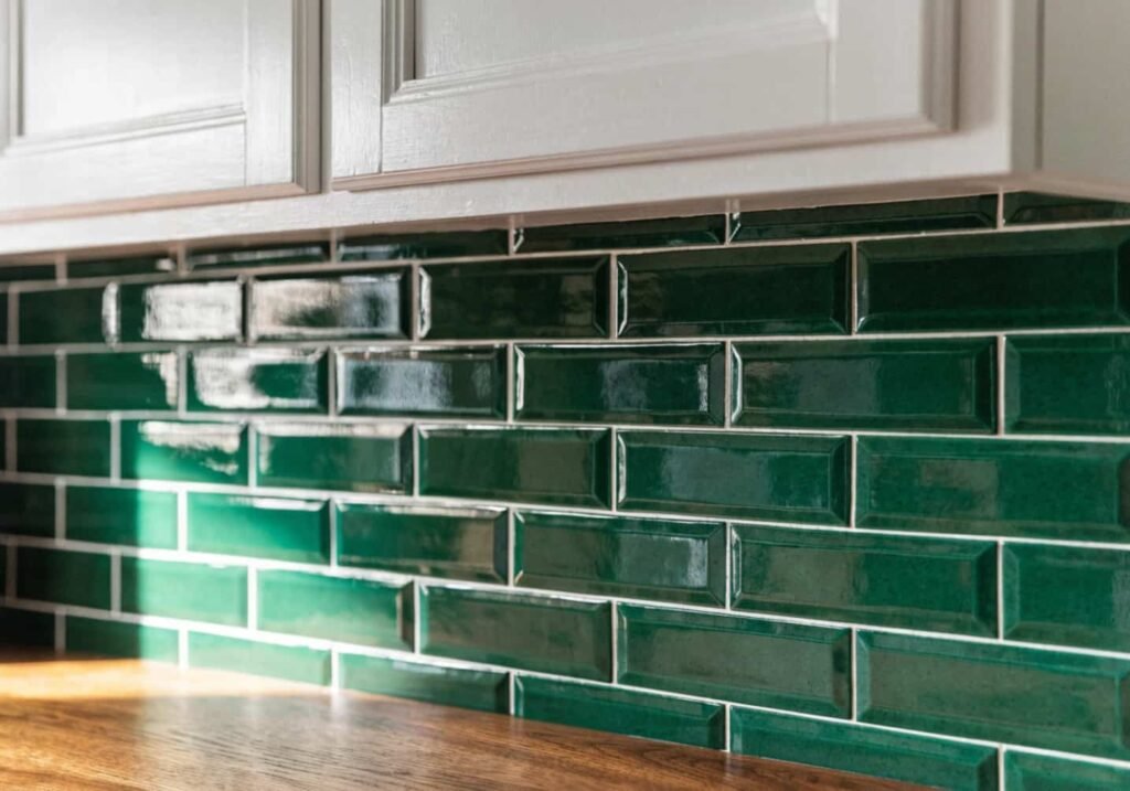
Plants do more for a “nature-inspired” room than any paint color, but most people under-plant a space and then wonder why it still feels flat. A general rule interior stylists use: one plant per 15–20 square feet of visible floor and shelf space in the main living areas, mixed in varying heights — not six identical pots lined up on a windowsill.
Layer three heights: a floor plant (a fiddle leaf fig, rubber plant, or — if your light is low — a snake plant, which tolerates neglect and low light far better), a mid-height plant on a stand or shelf (pothos, philodendron), and small trailing plants on top of bookshelves or cabinets where vines can hang down naturally.
The real misconception is that all “green rooms” need bright light. Most popular houseplants (pothos, ZZ plant, snake plant, peace lily) are understory jungle plants that evolved under a forest canopy — they actually prefer indirect or filtered light, not a south-facing window blasting direct sun. Direct sun scorches their leaves. If your living room only gets moderate light, you’re not limited — you’re actually in the right range for most low-maintenance houseplants.
How to Use Sage Green in Furniture
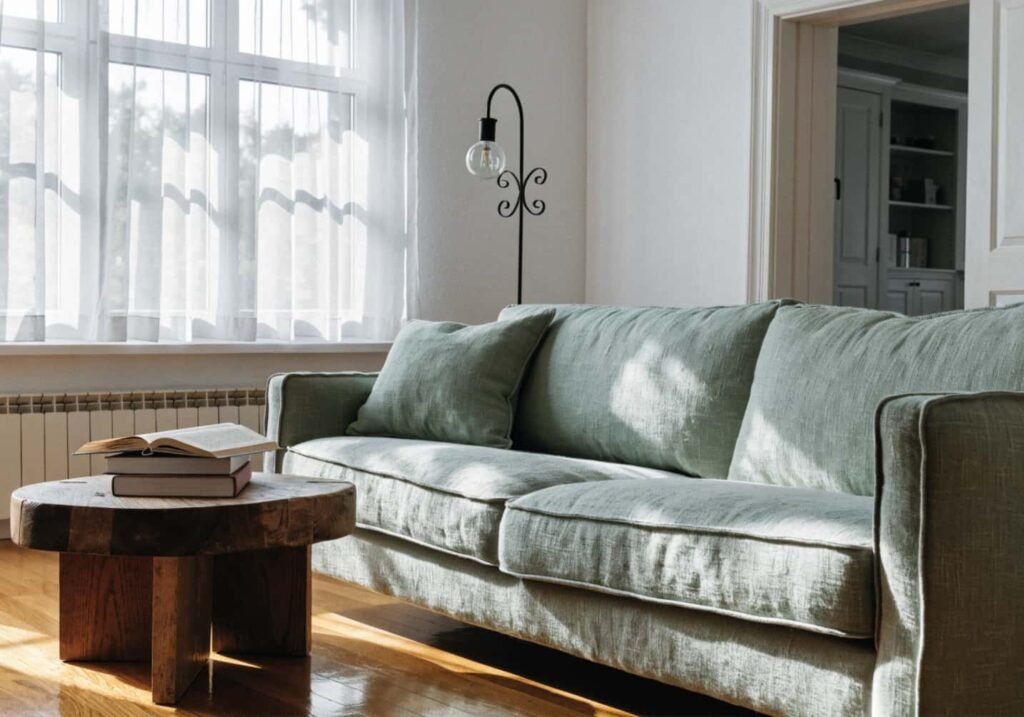
Sage works as a furniture color specifically because it has enough grey in it to act almost like a neutral — it pairs with warm wood, black metal, cream, terracotta, and navy without clashing, which is rare for a color this saturated. A sage-green sofa is a safer long-term investment than a sage-green rug, because upholstery is expensive to replace and you want it to outlast a color trend.
If you’re buying a sage sofa, check the fabric composition before checking the color. A linen or linen-blend sage sofa will look more relaxed and slightly textured — better suited to a nature theme — while a velvet sage sofa reads more formal and can look almost teal under certain lighting because velvet’s pile catches light differently than flat weaves. If you want the softest, most “botanical” look, linen or a linen-cotton blend is the better call; if you want something that photographs richer and more saturated, velvet wins, but expect a cooler undertone indoors.
One practical note: sage is a low-contrast color, so a room built entirely around sage furniture and sage walls can start to look washed out. Break it up with one dark accent — black iron lamp base, dark wood coffee table, charcoal throw pillow — so the room has depth instead of just varying shades of the same green.
How to Match Green Curtains with Your Room
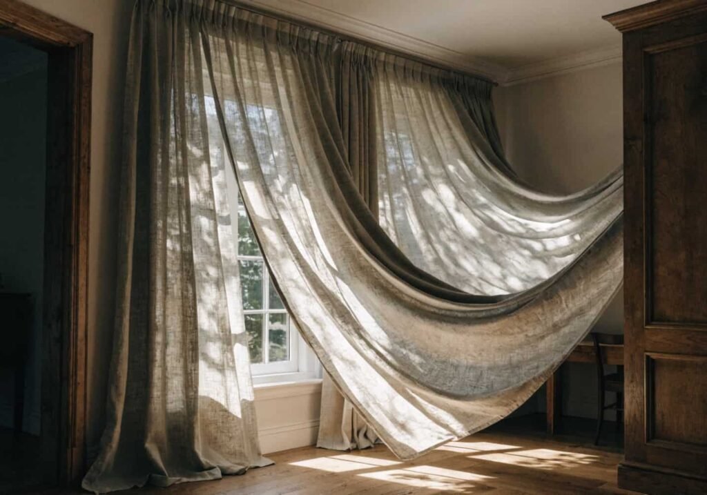
Curtains are one of the cheapest ways to add green without repainting, but the fabric weight matters more than most guides mention. Lightweight linen or cotton-linen curtains in sage or olive let light filter through and keep a room feeling airy — good for a living room where you want a soft, natural glow rather than a heavy, formal look. Heavier velvet curtains in emerald or forest green block more light and add drama, which suits a bedroom or a north-facing room that needs warming up, but can make an already dim living room feel closed in.
For length, floor-to-ceiling curtain rods mounted 4–6 inches above the window frame (not directly on it) make ceilings look taller and rooms look bigger — this is a stylist trick that costs nothing extra but is skipped constantly. Curtains should just graze the floor or “break” slightly, like a well-hemmed trouser — puddling fabric reads dated in most modern nature-inspired spaces, though it’s still intentional in more traditional or maximalist rooms.
If your walls are already green, don’t match the curtain to the wall exactly — go one or two shades lighter or darker, or switch to an off-white or cream curtain with a subtle leaf print. Matching a saturated wall color to a saturated curtain color in the same fabric type usually flattens the room instead of adding depth.
How to Select Botanical Wallpaper
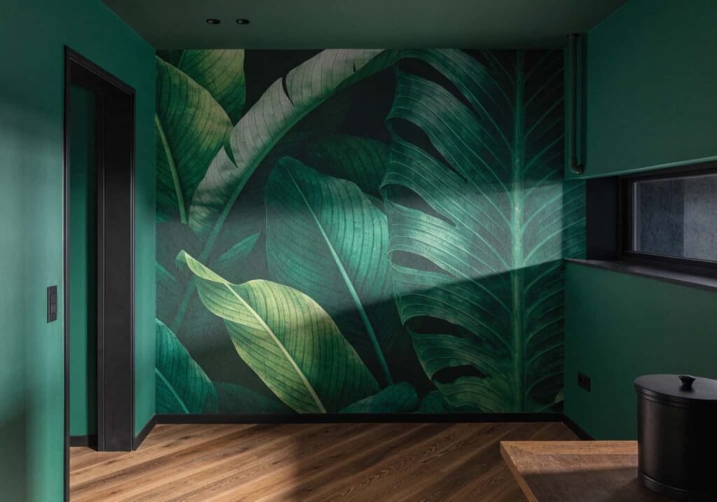
Botanical wallpaper is one of the fastest ways to commit hard to a nature theme, and it’s also one of the easiest to get wrong at scale. Large tropical leaf prints (think oversized banana leaf or monstera patterns) work best on a single feature wall or in a smaller room like a powder room or entryway — on all four walls of a large living room, the pattern can start to feel overwhelming and busy rather than calming.
A trick that works well: use a large-scale, high-contrast botanical print on one wall, then pull the darkest or lightest color from that print and use it as the solid paint color on the remaining three walls. This ties the pattern into the whole room without wallpapering everything.
Peel-and-stick botanical wallpaper has improved a lot in the last few years and is a legitimate option for renters, but it performs differently depending on your wall texture. It adheres cleanly to smooth, freshly painted drywall but often bubbles or peels on textured or older painted walls within a few months — if your walls have any texture, traditional paste wallpaper (or a professional peel-and-stick install) will hold up better long term.
How to Create a Green Accent Wall
An accent wall is really a framing decision, not just a paint decision — pick the wall the eye lands on first when you walk into the room (usually the wall behind the sofa or the one facing the entrance), not the largest or most convenient wall. Painting a side wall or the wall with the window tends to look accidental rather than intentional.
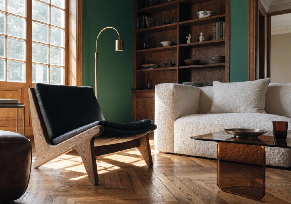
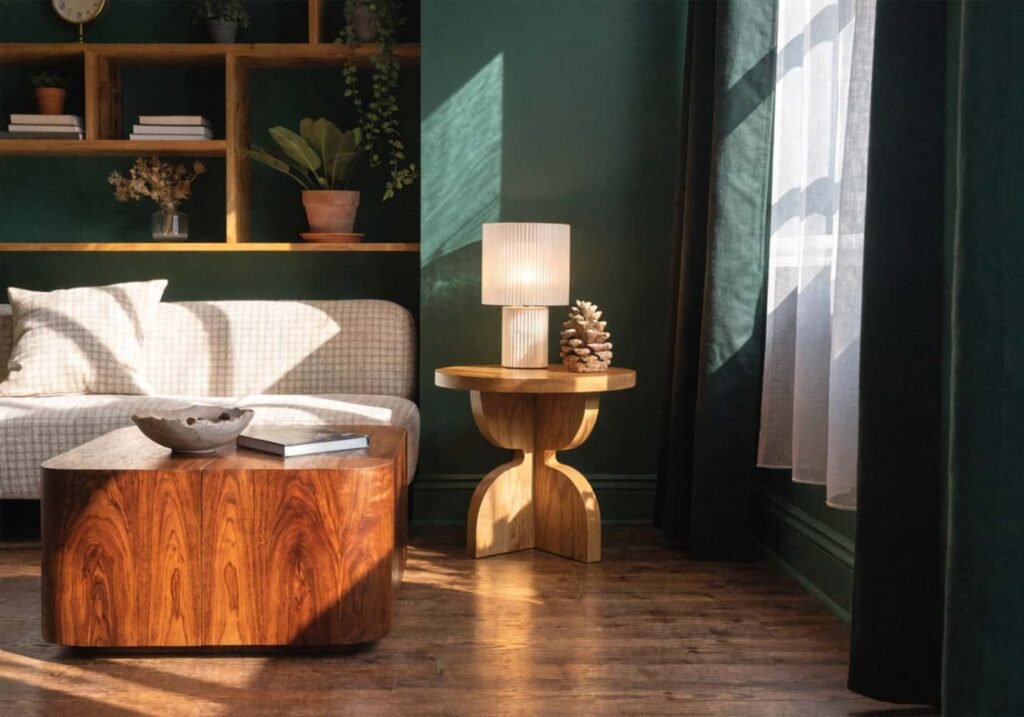
For a nature-inspired scheme, deep green accent walls (forest, hunter, bottle green) pair especially well with warm wood tones and brass or matte black hardware — the combination echoes a natural woodland palette rather than a purely decorative one. Avoid pairing a deep green accent wall with cool-toned grey furniture; the combination can read cold and a bit corporate instead of organic.
If you’re nervous about full commitment, a half-wall treatment (painting the bottom two-thirds and leaving the top third white, divided by a simple wood trim strip) gives you the accent-wall effect with less visual weight — useful in smaller rooms or rentals where a full dark wall might feel heavy.
How to Find Eco-Friendly Decor Items
“Eco-friendly” gets used loosely in decor marketing, so it helps to know what to actually check. For furniture, look for FSC-certified wood (Forest Stewardship Council — it means the timber came from responsibly managed forests) rather than just “sustainably sourced,” which isn’t a regulated term and can mean almost anything.
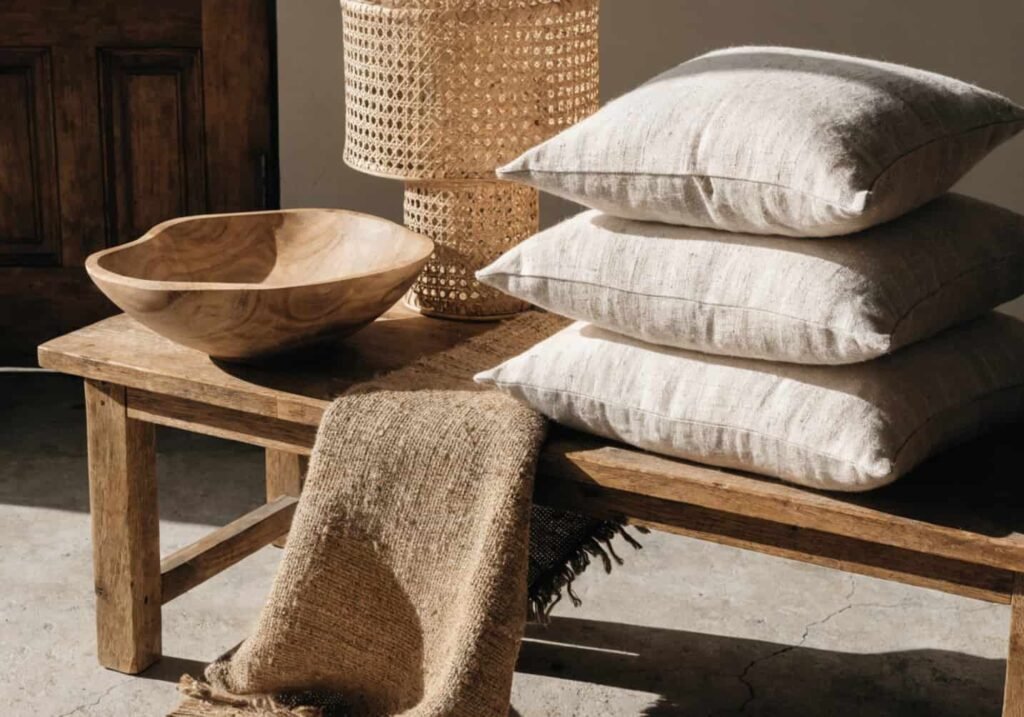
For textiles — cushions, throws, curtains — organic cotton and linen are lower-impact than synthetic blends, but also check the dye process if it’s listed; GOTS certification (Global Organic Textile Standard) covers both the fiber and the dyeing method, which regular “organic cotton” labeling often doesn’t. For rugs, jute, sisal, and wool are biodegradable and renewable, while most budget rugs are synthetic (polypropylene), which isn’t recyclable in most municipal systems and sheds microplastics over its lifespan.
Secondhand and vintage furniture is arguably the single biggest eco-friendly move you can make in a decor project, since it requires no new manufacturing at all — and a lot of solid wood mid-century pieces from secondhand shops are better built than comparable new furniture at three times the price.
How to Style Green Kitchen Cabinets
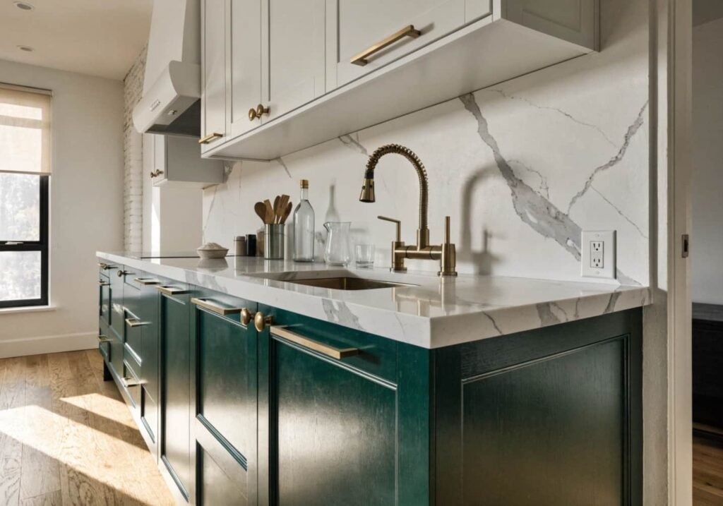
Green cabinets are having a real, sustained moment, but the shade you choose should be decided by your countertop and hardware first, not the other way around. Dark green (forest, hunter, bottle) pairs cleanly with brass or unlacquered brass hardware and a white or light stone countertop — the contrast keeps the kitchen from feeling too dark overall. Sage or olive green cabinets read softer and pair well with butcher block or a warm-toned quartz, plus black or matte nickel hardware for a more relaxed, farmhouse-adjacent look.
A detail that’s easy to miss: green cabinets almost always look better with a two-tone kitchen than fully green top-to-bottom. Green on the lower cabinets with white, cream, or wood-toned upper cabinets (or open wood shelving) keeps the kitchen feeling grounded rather than like a green box. This also happens to be more budget-friendly, since you’re painting or buying fewer cabinet fronts in the more expensive color.
If you’re repainting existing cabinets rather than buying new ones, budget for cabinet-specific paint (like a bonded polyurethane or cabinet enamel) rather than standard wall paint — kitchen cabinets take daily wear that wall paint isn’t built for, and it’ll chip at hinges and handles within a year otherwise.
How to Maximize Natural Light in a Green Theme
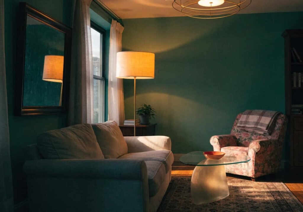
Darker greens absorb more light than they reflect, so a room painted in forest or hunter green needs roughly 20–30% more artificial lighting than the same room in white or cream to avoid feeling like a cave after sunset. This is the part most decor articles skip — they’ll tell you to “add plenty of light” without saying how much more you actually need once you’ve committed to a dark, saturated wall color.
Layer three light sources rather than relying on one overhead fixture: ambient (ceiling or overhead), task (a reading lamp or under-cabinet kitchen lighting), and accent (a smaller lamp or LED strip highlighting a plant shelf or artwork). Warm white bulbs (2700–3000K) suit green rooms better than cool white or daylight bulbs (4000K+), which can make green walls look slightly grey or clinical instead of warm and natural.
Mirrors placed opposite windows genuinely help bounce daylight deeper into a green room — but avoid placing a mirror where it reflects a wall of deep, saturated green back into the room, since that doubles the color intensity instead of brightening the space.
How to Combine Green and Wooden Elements
Green and wood is the pairing that makes a room feel like it belongs in a forest rather than a paint store, but the undertone matching matters more than people expect. Warm-toned wood (oak, walnut, teak with yellow or red undertones) pairs best with green shades that also lean warm — olive, moss, sage. Cool-toned wood (ash, some grey-washed oak) pairs better with cooler, bluer greens like teal-green or spruce. Mixing a warm wood with a cool-toned green can look slightly “off” in a way that’s hard to pinpoint until you see it corrected.
For a kitchen or living room, mixing two wood tones is fine — and actually more natural-looking than matching every wood surface exactly — as long as one tone dominates (roughly 70%) and the second appears only in smaller pieces like a side table or picture frames. A room with three or four different, competing wood tones in equal amounts starts to look unplanned rather than eclectic.
Unfinished or raw wood (a live-edge shelf, an unlacquered wood stool) reinforces the nature theme more than heavily lacquered, glossy wood furniture, which reads more formal and less organic.
How to Add Small Green Accents on a Budget
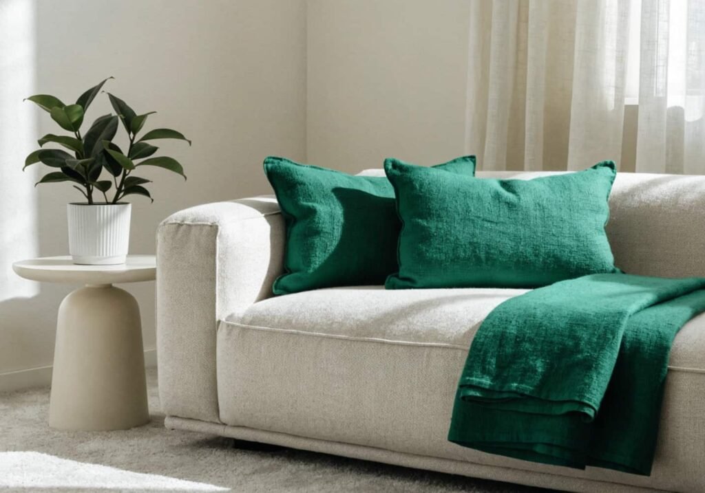
If a full green room isn’t in the budget yet, the highest-impact, lowest-cost additions are usually textiles and greenery, not furniture. A set of green throw pillow covers ($15–30 total) changes a neutral sofa’s whole mood for a fraction of reupholstering it. A single large plant ($20–40 for something like a pothos or snake plant in a 10-inch pot) does more visual work than five small $5 succulents scattered around, because scale reads as intentional in photos and in person.
Thrifted green glassware or ceramics — vases, bowls, candle holders — are usually $2–8 secondhand and layer well on a coffee table or open shelf. Green cookbooks, a green ceramic planter, or a green-framed botanical print are all under $25 and add color without touching walls or furniture at all.
The order that gives the most visible change per dollar, roughly: throw pillows and a throw blanket first, one statement plant second, small accessories (vases, candle holders, books) third, and wall art or a print last. Skip buying a green rug on a tight budget unless it’s secondhand — rugs are expensive to replace if the color doesn’t work once it’s actually in the room.
How to Give Green Decor a Modern Touch
The line between “modern” and “traditional” green decor mostly comes down to how much pattern and ornamentation you’re using, not the green itself. A modern green room usually leans on solid-color textiles, clean-lined furniture (straight or gently curved legs, minimal carving), and one or two botanical patterns used sparingly rather than layered wallpaper-on-top-of-print-on-top-of-pattern.
Matte black or unlacquered brass hardware, thin metal furniture legs, and simple linen or bouclé upholstery all read contemporary against a green backdrop, while ornate wood carving, heavy florals, and gold-tone everything push the same green toward a more traditional or maximalist look. Neither is wrong — it’s about picking one direction and staying mostly consistent, rather than mixing a modern sofa with an ornate traditional cabinet and a farmhouse light fixture in the same small room.
One current, genuinely modern move: pairing green with an unexpected accent color instead of the usual wood-and-cream combo — a single terracotta or rust-colored object (a vase, a cushion, a piece of art) against green and warm wood adds a modern, slightly Mediterranean edge that a fully green-neutral-wood palette doesn’t have on its own.