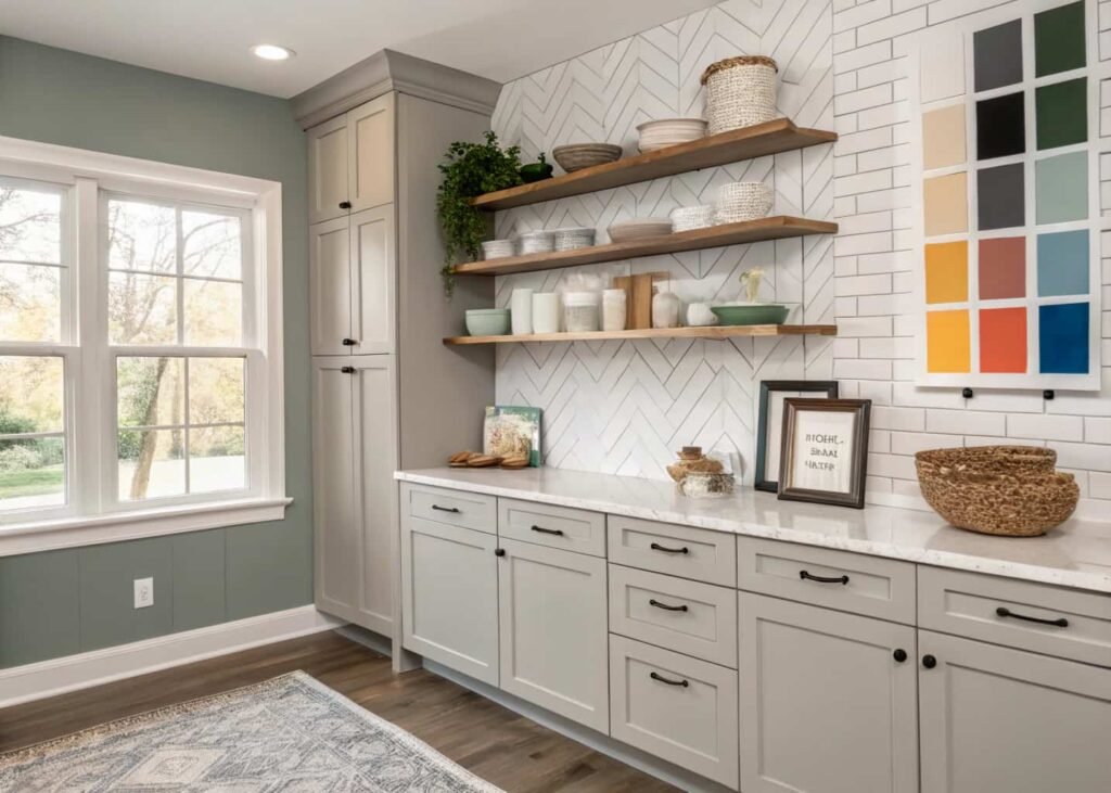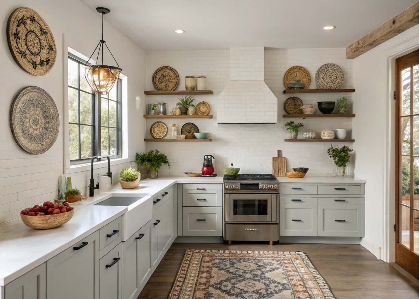
If you’ve ever stood in your kitchen wondering why it doesn’t feel quite “you” even though every piece was chosen on purpose, the problem usually isn’t your taste. It’s that you picked items from three or four different aesthetics without realizing they don’t talk to each other. A rattan pendant light, a stainless steel backsplash, and a distressed farmhouse table can all be nice on their own, but together they read as indecision instead of style. This guide breaks down the seven most common kitchen aesthetics people search for, what actually defines each one beyond the mood-board buzzwords, and how to figure out which one (or combination) fits the way you actually live and cook.
What Is a Kitchen Decor Aesthetic, Really?
A kitchen aesthetic is the combination of three things: your color temperature (warm vs. cool), your material palette (natural and textured vs. smooth and manufactured), and your hardware finish (matte vs. polished vs. aged). Most people think aesthetic is about buying the “right” items, but it’s really about consistency across those three variables. A cottage kitchen and a coastal kitchen might both use white cabinetry, but cottage leans warm with brass hardware and linen textiles, while coastal leans cool with brushed nickel and woven jute. That’s the whole difference — and it’s why two kitchens that look similar in a single photo can feel totally different once you’re standing in them. Before you pick paint colors or shop for decor, nail down your temperature, material, and hardware answers first. Everything else follows from those three decisions.
Cottage Aesthetic: Soft and Homey
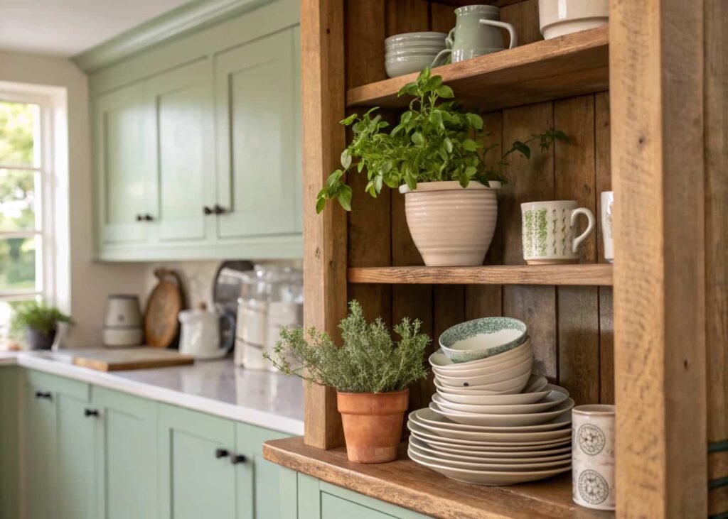
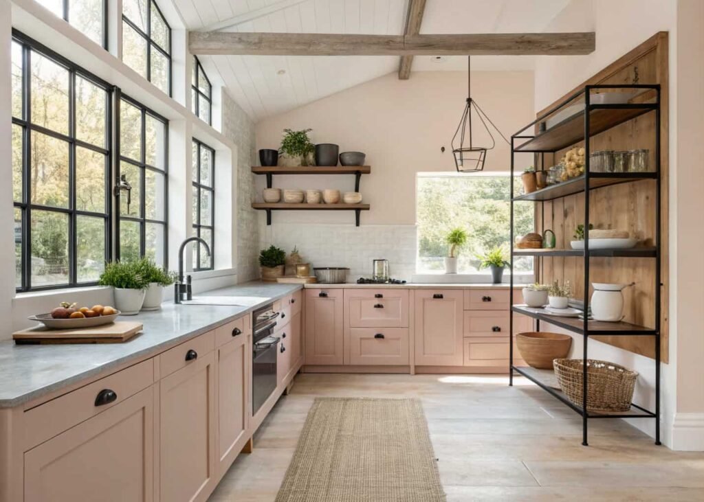
Cottage kitchens are built around imperfection on purpose. Think uneven ceramic, visible brushstrokes on painted cabinets, and open shelving that shows your actual dishes instead of hiding them behind glass. The color palette stays soft — sage, buttercream, dusty rose — and almost never goes fully white or fully dark. Hardware is usually unlacquered brass or black iron with a hand-forged look, not the perfectly straight lines of modern pulls. One thing people get wrong: they think cottage means cluttered. It doesn’t. The best cottage kitchens have maybe 8–10 curated objects on display (a crock of wooden spoons, a stack of vintage plates, one trailing plant) rather than every surface covered. If your kitchen already has original wood beams, a farmhouse sink, or older cabinetry with some character, cottage is often the easiest and cheapest aesthetic to lean into because you’re working with the house instead of against it.
Minimalist Aesthetic: Clean and Functional
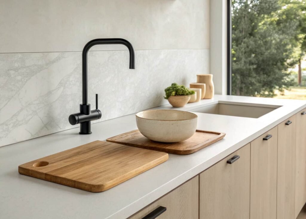
Minimalist kitchens are defined less by what’s there and more by what’s hidden. Handleless cabinets, integrated appliances, and a single accent material (usually stone or matte black) keep the eye from bouncing around. The trap most people fall into is confusing “minimalist” with “empty” — a truly minimalist kitchen still needs warmth, usually from a wood cutting board left out, a single ceramic bowl, or under-cabinet lighting with a warmer color temperature (2700K–3000K, not the cold 5000K office lighting). Countertops stay almost entirely clear; if you need daily-use items like oil, salt, or a coffee grinder visible, minimalist design solves that with a designated tray rather than pretending those items don’t exist. This style photographs beautifully but is genuinely harder to live in if you cook a lot, since storage has to be planned meticulously to keep surfaces bare.
Industrial Aesthetic: Raw and Bold
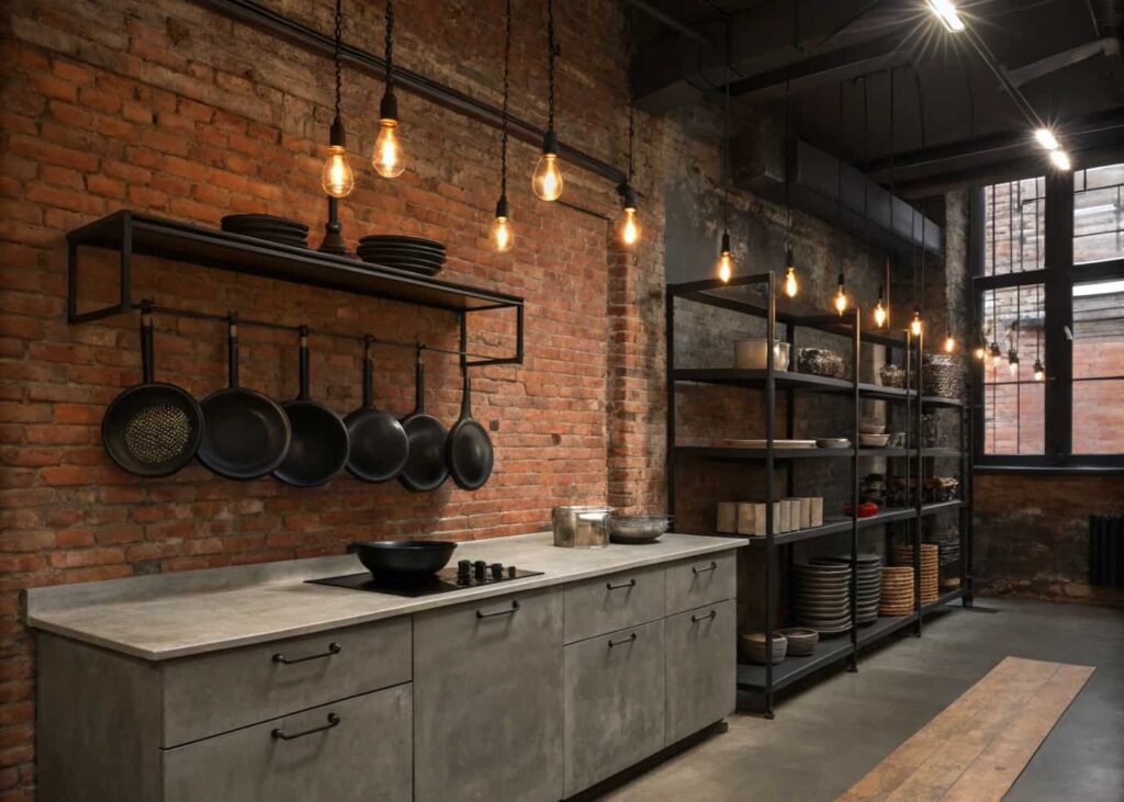
Industrial kitchens take their cues from converted warehouses and old factories — exposed brick or concrete, black metal shelving, and materials that are allowed to show wear. Unlike most other aesthetics, industrial actually benefits from visible utility: exposed pipes, Edison-style bulbs, open metal shelving instead of cabinet doors. The color palette is narrow on purpose — charcoal, rust, raw wood, and aged brass — because too many colors fight the raw materials. A common mistake is going industrial with brand-new, obviously mass-produced black metal fixtures that look flat instead of textured; the finish needs some variation (hammered, brushed, or slightly oxidized) or the whole look reads cheap instead of intentional. Industrial pairs surprisingly well in older apartments or converted spaces where you already have exposed structural elements, since you’re not fighting the bones of the room.
Coastal Aesthetic: Breezy and Bright
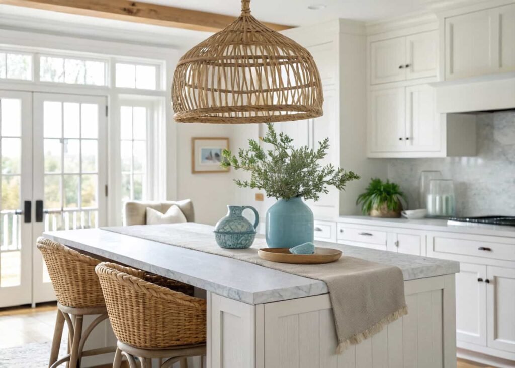
Coastal kitchens run cooler and lighter than cottage, even though people often confuse the two. The palette is whites, soft blues, and sandy neutrals, with natural fiber textures like jute, rattan, and linen doing the warming work instead of wood tone. Hardware leans brushed nickel or unlacquered brass with a matte, weathered finish rather than shiny chrome. The detail most articles skip: coastal kitchens use texture layering to avoid looking sterile — a woven rattan pendant next to smooth quartz counters, a linen runner against a glossy tile backsplash. Without that contrast, an all-white coastal kitchen just looks like a plain white kitchen. If your space gets strong natural light for most of the day, coastal tends to hold up better long-term than darker aesthetics, since the whole palette is designed to reflect light rather than absorb it.
Moody Aesthetic: Dark and Dramatic
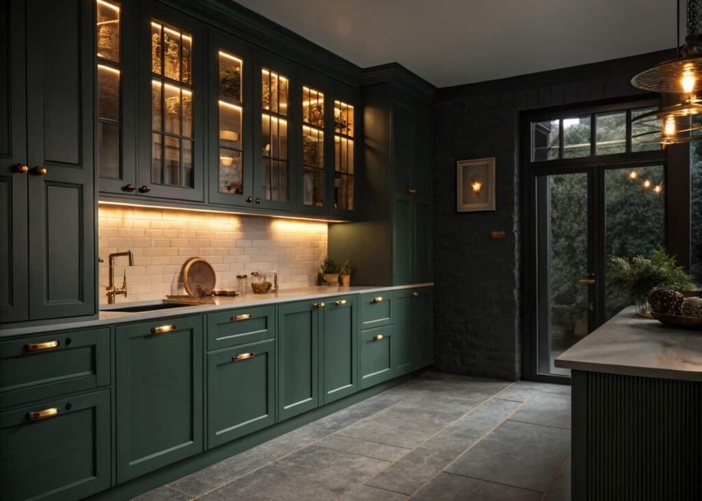
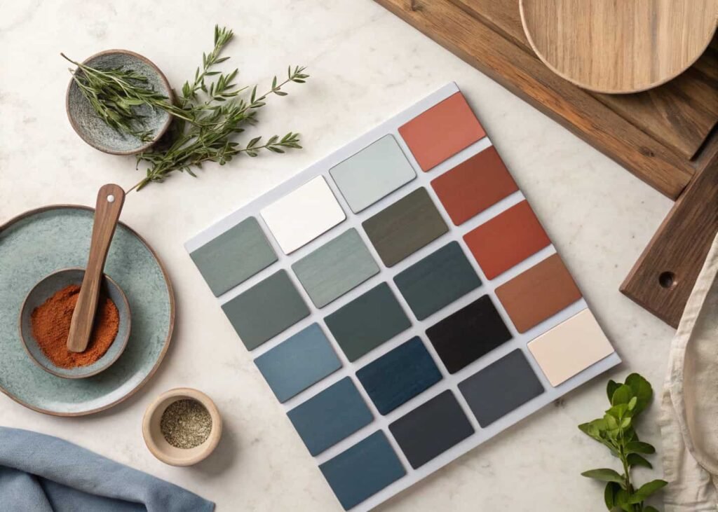
Moody kitchens use dark, saturated colors — forest green, charcoal navy, deep espresso — as the dominant cabinet color rather than an accent. The biggest misconception is that dark kitchens feel small or cave-like; done right, they actually recede visually because there’s less contrast between cabinet and wall, which can make a small kitchen feel more cohesive instead of choppy. The key technical detail: moody kitchens need more lighting layers than lighter aesthetics to work, typically under-cabinet task lighting, a statement fixture, and at least one warm ambient source, because dark surfaces absorb light instead of bouncing it around the room. Brass or aged gold hardware against a dark cabinet reads expensive; chrome or stainless against the same cabinet often reads cold and unfinished. If you’re considering moody, test the color on your actual cabinets with a large sample board first — these colors shift dramatically between north-facing and south-facing light.
Vintage Aesthetic: Nostalgic Charm
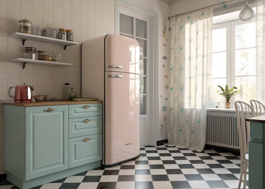
Vintage kitchens borrow specific decades rather than a general “old” feeling — a 1950s vintage kitchen with pastel appliances and checkerboard flooring looks nothing like a 1920s vintage kitchen with subway tile and glass-front cabinets. Picking a specific decade before you shop prevents the mismatched look that happens when people grab “vintage-coded” items from different eras. Retro-style appliances (colored fridges, chrome toasters) are the fastest way to commit to a decade, since they’re the most visually dominant object in most kitchens. A practical tip: thrifted or estate-sale finds usually look more authentic than new “vintage-inspired” decor because they carry actual wear patterns manufacturers can’t fully replicate. If budget is tight, start with small vintage anchors — a single pendant light, cabinet hardware, or a rug — rather than trying to source vintage everything at once.
Bohemian Aesthetic: Eclectic and Warm
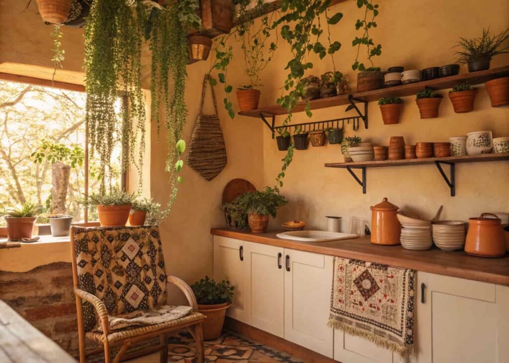
Bohemian kitchens are the one aesthetic where visual busyness is the goal, not the mistake — but it still needs an organizing thread, usually a consistent color family or a repeated material like terracotta or woven rattan. Plants do a lot of the work here; a bohemian kitchen with no greenery usually just looks cluttered instead of intentional. Layering matters more than in any other style: patterned textiles, mismatched ceramics, and hanging plants all need breathing room, so bohemian actually works best with slightly more counter and wall space than other aesthetics, not less. A common failure point is over-relying on one supersaturated color (like a lot of orange or turquoise) without any neutral to rest the eye — the best boho kitchens still have a neutral base (raw wood, cream walls, natural fiber rugs) underneath all the pattern and color.
How to Identify Your Personal Aesthetic
Skip the personality quizzes and look at your own photo camera roll instead. Pull up the last 20 home or interior photos you’ve saved — not just kitchens, any room — and note the recurring color temperature and material. If most of your saves lean warm wood and soft textiles, cottage or bohemian is probably closer to your instinct than industrial or minimalist, regardless of what you think you “should” like. A second, more physical test: open your closet. People who dress in structured, neutral pieces tend to gravitate toward minimalist or industrial kitchens once they actually live with them, while people who wear a lot of pattern and texture tend to regret stark minimalist spaces within a year. It sounds unrelated, but the same instinct that shapes how you dress shapes how you want to feel in a room you spend an hour a day in.

Mixing Two Aesthetics Successfully
Most real kitchens aren’t a single pure aesthetic — they’re one dominant style at about 70% with a second style layered in at 30% through smaller, changeable elements. The dominant aesthetic should control the big, expensive, hard-to-change items: cabinet color, countertop material, flooring. The secondary aesthetic shows up in the cheap, swappable layer: textiles, open-shelf decor, light fixtures, hardware. Cottage-industrial is a common and workable pairing (soft cabinetry with raw black metal shelving), while minimalist-bohemian is harder to pull off because the two styles want opposite amounts of visual noise. If you’re mixing, pick your dominant style first and commit to it in the permanent fixtures, then experiment with the secondary style only in things you could realistically change in an afternoon if it doesn’t work.
Colors That Define Each Aesthetic
Cottage runs on muted pastels — sage, buttercream, dusty rose — always with a slightly grayed-down, chalky quality rather than saturated. Minimalist sticks to a two-color rule: one neutral base (white, greige, or black) plus one material-driven accent, and nothing else. Industrial leans into charcoal, rust, and raw metal tones with almost no pure white. Coastal is whites and soft blues with sandy neutrals doing the grounding work. Moody goes fully saturated and dark — forest green, navy, espresso — used as the primary color, not an accent. Vintage colors are decade-specific: mint and pink for the 1950s, mustard and avocado for the 1970s, black and white checker for 1920s diner-style. Bohemian is the only aesthetic built around multiple saturated colors at once, usually terracotta, ochre, and deep teal, anchored by a neutral base so it doesn’t tip into chaos.
Materials That Support Each Look
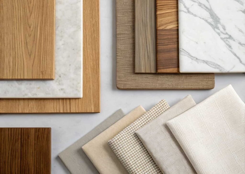
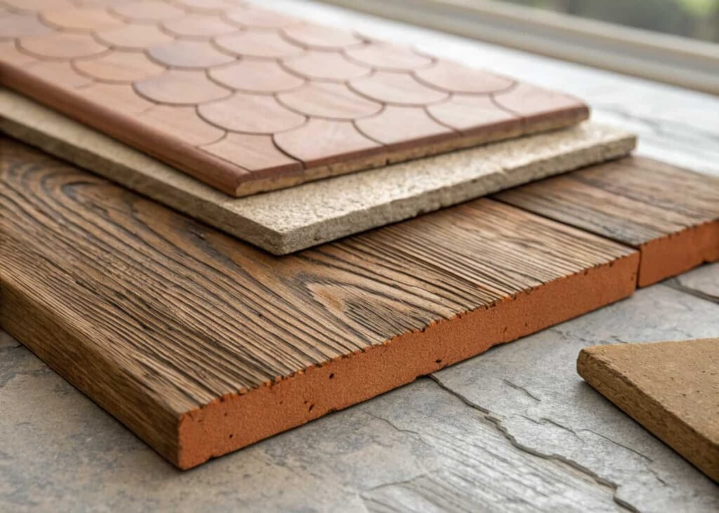
The material choice usually matters more than the color choice, because materials carry texture information a photo can’t fully show. Cottage wants natural, slightly imperfect materials — reclaimed wood, hand-glazed ceramic, unlacquered brass that’s allowed to patina. Minimalist wants materials with no visible grain or texture — engineered quartz, lacquered cabinet fronts, matte black steel. Industrial wants materials that show their manufacturing process — raw concrete, blackened steel, unfinished wood with visible knots. Coastal wants natural fiber and light wood — rattan, jute, whitewashed oak. Moody wants materials with depth and a slight sheen — honed marble, brushed brass, dark stained wood. Vintage wants materials tied to a specific manufacturing era — chrome, laminate, checkerboard linoleum. Bohemian wants handmade-feeling materials — terracotta, woven textiles, unglazed clay. If you’re shopping and unsure which aesthetic an item belongs to, check whether the surface is perfectly uniform (minimalist/industrial) or has natural variation (cottage/coastal/boho) — that one test resolves most of the ambiguity.
Bringing Your Aesthetic to Life Room by Room
Once you’ve picked a direction, start with the layer that’s cheapest to change and easiest to test: open shelving and countertop decor. Live with that for two to four weeks before committing to anything permanent like cabinet paint or a backsplash. If the small stuff still feels right after a month of actually cooking and living in the space, move to the next tier — hardware and lighting fixtures, both of which are moderate-cost and reversible. Save the biggest financial commitments (cabinetry, countertops, flooring) for last, once you’re confident the aesthetic works with your actual lighting conditions, not just how it looked in reference photos taken in someone else’s house. This staged approach costs a little more time upfront but avoids the expensive mistake of repainting cabinets twice because the color read differently once the room was actually lived in.