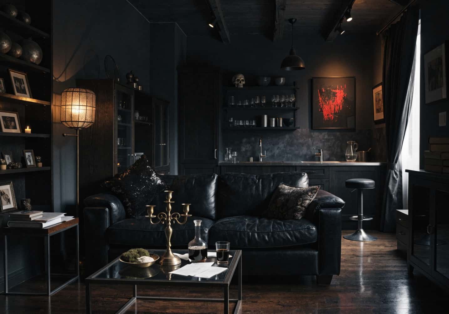
Dark interiors get blamed for making rooms feel smaller and gloomier, and if you just slap matte black paint on every wall without a plan, that’s exactly what happens. The difference between a moody room that photographs beautifully and one that feels like a cave usually comes down to three things: undertone, sheen, and where the light is actually landing. Here’s how to get the details right instead of just picking “the darkest black you can find.”
1. How to Choose the Right Dark Colour Palette for Living Room
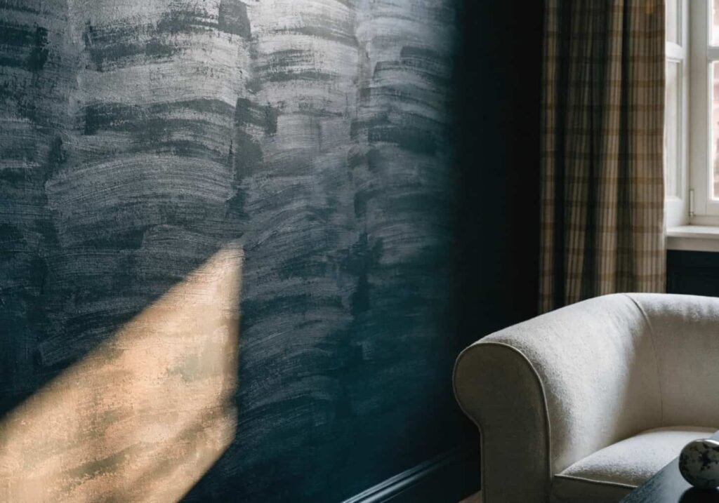
Most dark colours aren’t neutral — they carry a hidden undertone (green, blue, or purple) that only shows up once the paint is on a full wall under your actual lighting. A colour like Farrow & Ball’s “Railings” (LRV 12) reads almost black in dim light but turns distinctly blue-green under warm bulbs. Before committing, buy a sample pot, paint a 2×2 ft board (not the wall directly), and check it at 8 AM, midday, and after dark with your lamps on — colour shifts more than people expect across a 24-hour cycle.
For a living room, look at colours in the LRV 5–20 range rather than true black (LRV 0–2). Anything under LRV 5 tends to look flat and absorb detail in photos and in person; LRV 8–15 (think Benjamin Moore “Wrought Iron” or “Black Beauty”) still reads as “dark” but keeps enough depth that crown moulding and trim shadows are visible. If the room gets less than 3–4 hours of direct sun, warm-toned darks (charcoal-brown, deep olive) will feel far less cold than blue-based blacks.
2. How to Make Your Kitchen Dark and Elegant
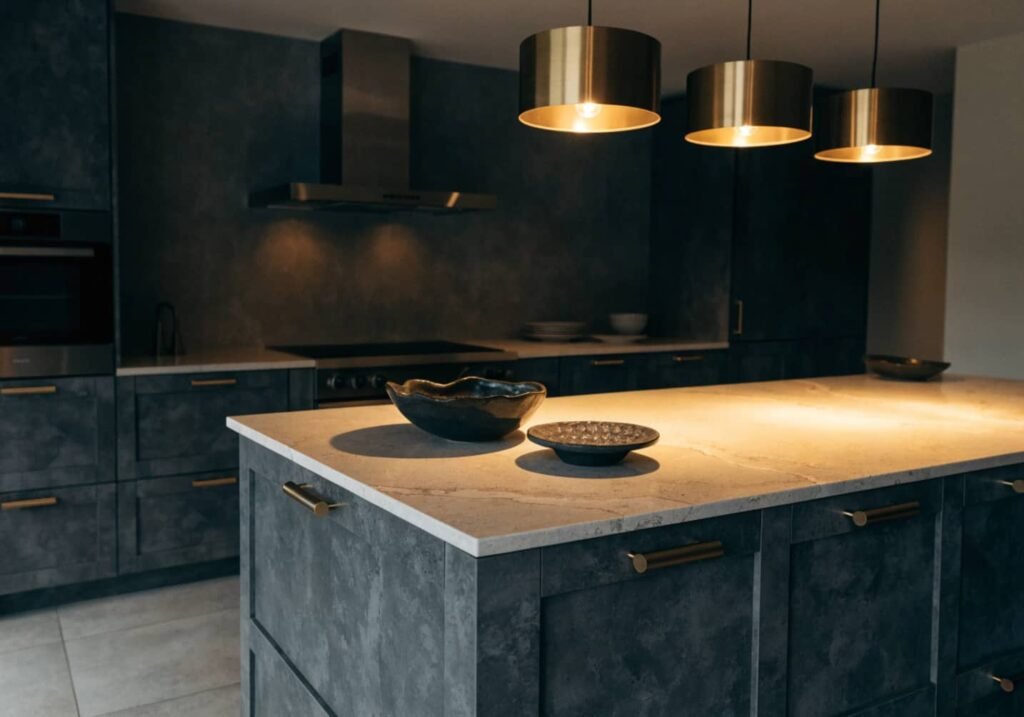
Dark kitchens work best when the cabinet finish is matched to the room’s real-life use, not just the mood board. Matte and satin lacquer cabinets (common in fluted or slab MDF fronts) look richer than high-gloss, but they show grease and water spots faster near the stove and sink — satin (around 20–35% sheen) is the realistic middle ground for daily cooking households, while full matte is better suited to a low-traffic butler’s pantry or bar area.
Pair dark lower cabinets with a lighter or honed stone countertop rather than matching dark-on-dark, which tends to visually collapse the counter into the cabinetry and makes it harder to see crumbs or knife lines while prepping food. A common upgrade people skip: matching the grout colour to the tile instead of using white grout, which keeps a dark backsplash from looking “gridded” and busy.
3. How to Balance Lighting with Dark Walls
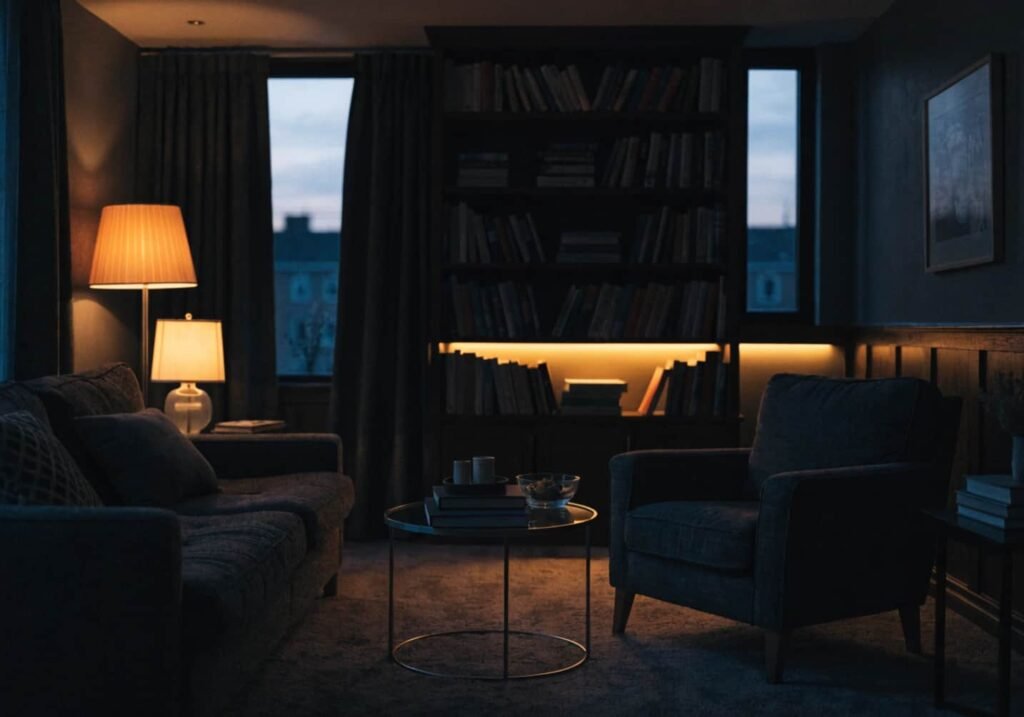
Dark walls absorb light instead of bouncing it around the room, so the standard lighting math changes. As a rough rule, plan for roughly 30–40% more total lumens than you would in a white-walled room of the same size, split across at least three layers: ambient (ceiling or cove lighting), task (reading lamps, under-cabinet lights in the kitchen), and accent (picture lights, LED strips behind furniture).
Stick to warm colour temperatures — 2700K to 3000K — because cool white (4000K+) against dark paint reads clinical rather than moody. Dimmers aren’t optional here; a dark room at full brightness looks stark, but the same room at 40–60% output with layered sources looks intentional. One detail worth knowing: place at least one light source below eye level (a floor lamp, a low sconce) because overhead-only lighting on dark walls creates hard shadows on faces and flattens the whole room in photos.
4. How to Style Black Furniture in a Room
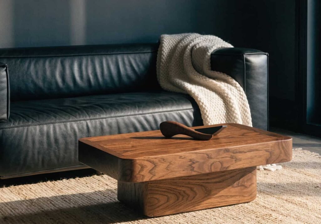
The mistake people make with black furniture is matching finishes too closely — a matte black sofa next to a matte black coffee table next to matte black shelving reads flat and heavy, almost like a stage set. Mixing sheen levels (a glossy black lacquer side table against a matte boucle sofa) gives the eye something to register as separate objects instead of one dark mass.
Break up black furniture with at least one warm wood tone (walnut or oak) and one soft, light textile — a cream or oatmeal throw, a jute or wool rug in the 30–50% lighter range than the walls. Without that contrast, black furniture on dark walls loses its silhouette entirely and the room stops reading as “furnished” in photos, even if it looks fine in person because your eyes adjust.
5. How to Make a Small Space Look Bigger with Dark Theme
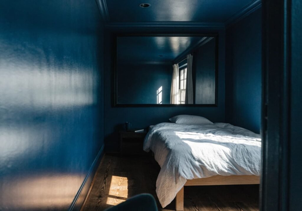
The idea that dark colours always shrink a room is only half true. Painting walls, trim, and ceiling the same dark colour (a technique often called “colour drenching”) removes the visual stopping points where wall meets ceiling meets trim, and the room’s edges blur into shadow instead of announcing themselves — in a small room this can actually make the boundaries feel less defined than stark white walls with visible trim lines.
What actually shrinks a small dark room is high-contrast trim (dark walls, white trim) because it draws a hard line around the room’s true, small dimensions. Skip contrast trim, keep window treatments minimal or the same tone as the wall, and add one reflective surface — a mirror, a glossy black side table, polished brass — to bounce the limited light around instead of absorbing all of it.
6. How to Add Textures and Fabrics to Dark Decor
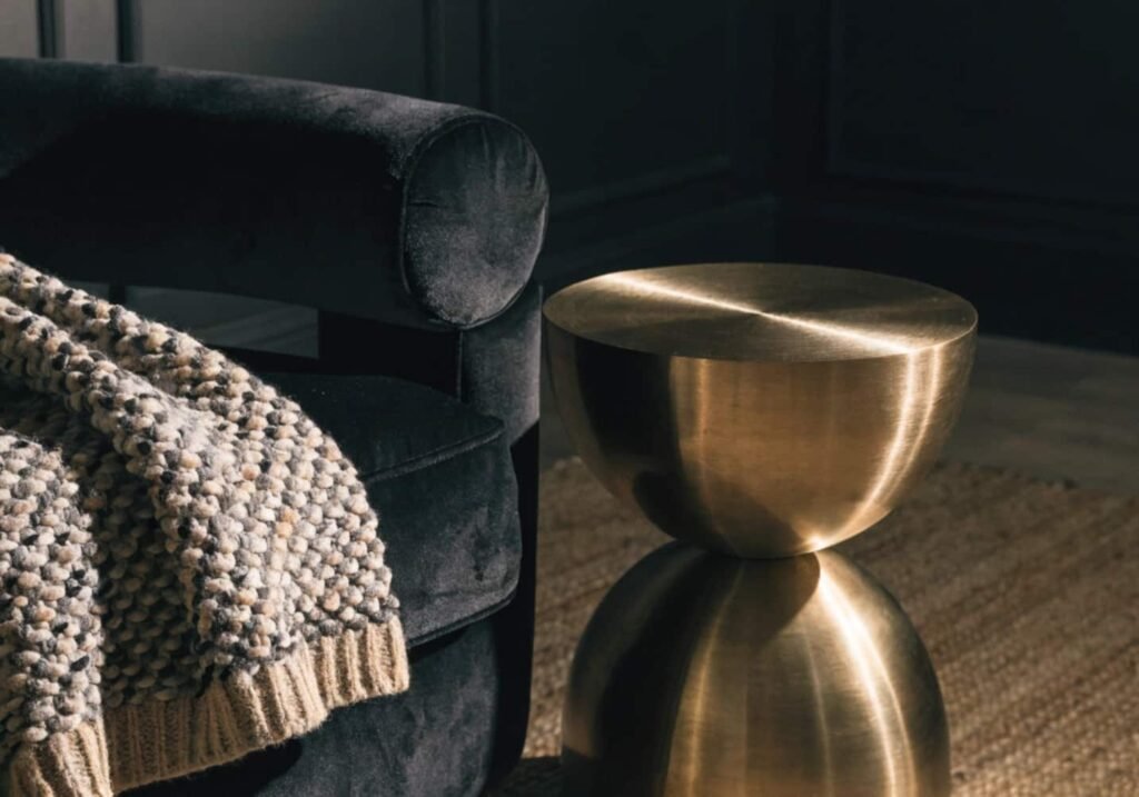
Flat, uniform darkness is what makes a room feel cold rather than cozy — the fix is textural variation, not more colour. Boucle and velvet upholstery, a chunky wool throw, linen curtains with visible weave, and a nubby jute or wool rug all catch and scatter light differently, which is what creates the sense of depth that a single flat dark paint can’t.
A practical layering order: hard matte surfaces (walls, floor) at the base, one plush textured piece (velvet armchair or boucle ottoman) as the anchor, then two or three smaller soft-texture accents (a knit pillow, a sheepskin, a woven basket). Avoid going all-matte across every surface — leather, brushed brass, or a lacquered tray gives the eye a break and keeps the room from feeling like it’s absorbing all the light in it.
7. How to Maintain Dark Kitchen Cabinets
Dark cabinets show water spots, grease, and fingerprints far more visibly than light ones, especially in satin or gloss finishes near handles and the sink area. Wipe daily-use zones with a microfiber cloth and a pH-neutral cleaner — avoid ammonia-based or abrasive cleaners on matte lacquer specifically, since they can dull the finish and leave faint streaking that’s hard to reverse.
For matte MDF or painted cabinets, a soft cloth lightly dampened with water is usually enough; skip anything with grit or vinegar-based solutions, which can strip matte sealant over time. If fingerprints near handles are a recurring issue, brushed or matte-black hardware hides smudges noticeably better than polished chrome or glossy black pulls, which show every touch mark under kitchen lighting.

8. How to Use Gold/Brass Accents in a Dark Room
Warm brass and cool-toned gold read very differently against dark walls — warm brass (with a slight red-orange cast) pairs naturally with charcoal, walnut, and deep green, while cooler gold or champagne finishes tend to look better against blue-black or true black. Mixing the two undertones in the same room usually looks like a mistake rather than an intentional choice, so pick one and stay consistent across hardware, light fixtures, and frames.
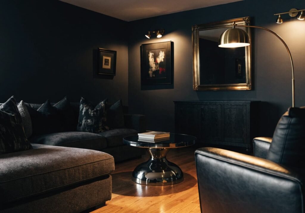
A rough guideline that works well in practice: keep metallic accents to around 15–20% of visible surfaces in the room — enough to catch light and add warmth, not so much that the space starts to look like a hotel lobby. Unlacquered brass will also patina and darken over months of use, which some people love for an aged look and others find frustrating; if you want it to stay bright, buy the lacquered or sealed version instead.
9. How to Make Dark Decor Feel Cozy
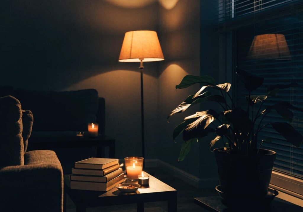
Coziness in a dark room comes almost entirely from light temperature and layering, not from the wall colour itself. Swap any cool-white bulbs (4000K+) for warm 2700K bulbs, and use at least three separate light sources at different heights in a room instead of one central overhead fixture — a floor lamp, a table lamp, and a candle or LED strip does more for atmosphere than a single bright ceiling light ever will.
Beyond lighting, cozy dark rooms usually have one organic, living element breaking up the hard surfaces — a large leafy plant, dried pampas grass, or a stack of real books rather than styled decor objects. It sounds minor, but a completely “staged” dark room with no organic texture reads as a showroom, not a home someone actually lives in.