
Color is the first language of design. Before a single word is read, before a layout is understood, color speaks directly to emotion. In 2026, designers, artists, and content creators around the world are embracing bold new directions — blending nostalgia with futurism, nature with technology, and softness with raw energy. Whether you are working on branding, interior design, digital content, or personal art, these 14 trending color palettes are your ultimate guide to staying ahead of the curve this year.
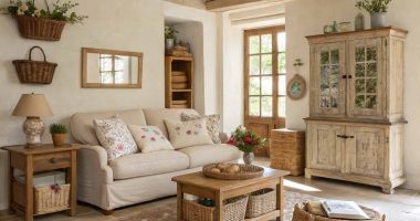
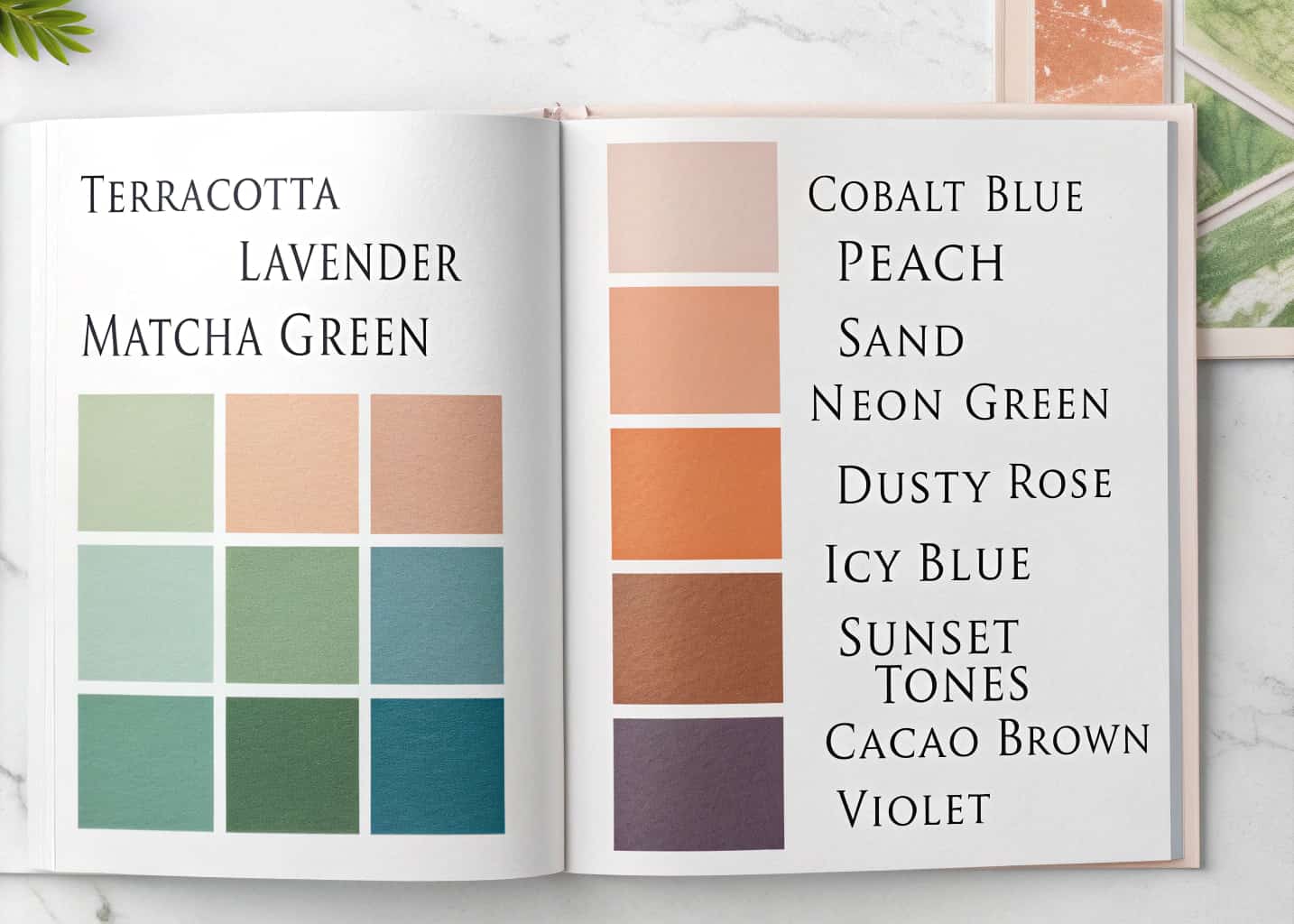
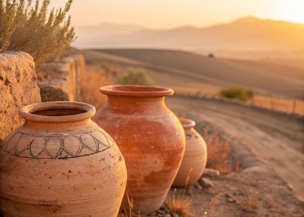
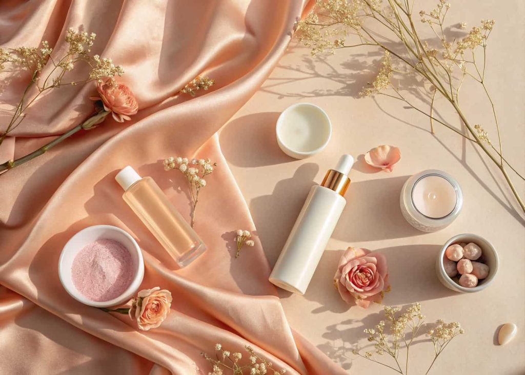
Terracotta Sunset
Terracotta has been quietly building momentum over the past few years, and in 2026, it is fully having its moment. This palette draws inspiration from sun-baked Mediterranean cliffs, desert landscapes, and traditional clay pottery. The warm brick tones of terracotta pair beautifully with soft peach highlights and deep rust shadows to create a palette that feels simultaneously ancient and modern. Brands in wellness, food, and lifestyle are heavily adopting these earthy tones to convey authenticity, warmth, and a sense of grounded confidence that resonates with today’s consumers on a deeply emotional level.
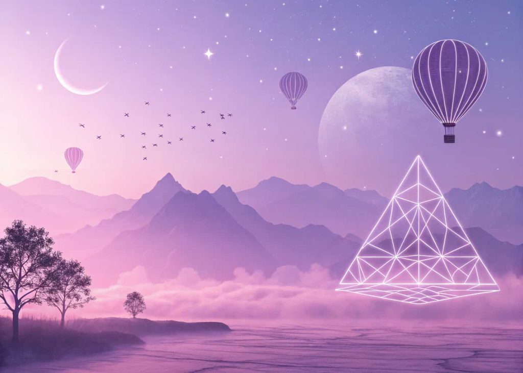
Digital Lavender Dream
Digital Lavender was named one of the colors of the year by multiple forecasters, and in 2026 it has evolved into a full spectrum palette. This soft purple family communicates calm, creativity, and gentle futurism. It’s the go-to palette for tech brands, mental wellness apps, and beauty companies that want to feel innovative without being cold or clinical. The lightest tints feel airy and ethereal, while the deeper violets add sophistication and depth. Digital creatives especially love this palette for UI design, social media aesthetics, and packaging that needs to feel both trustworthy and imaginative at the same time.
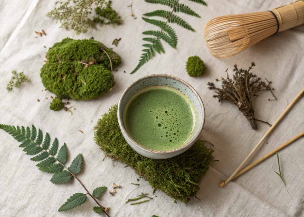
Matcha & Moss
Green is the color of 2026, and the Matcha & Moss palette is its most refined expression. Inspired by Japanese tea culture, forest floors, and the growing obsession with biophilic design, this palette moves beyond the bright greens of previous years into something deeper, more muted, and quietly sophisticated. The muted sage tones and deep forest greens create a sense of peace, naturalness, and environmental mindfulness. This palette is being used extensively in sustainable fashion brands, organic food packaging, and home decor that wants to communicate a genuine connection to nature without feeling overly corporate or performative in its green messaging.
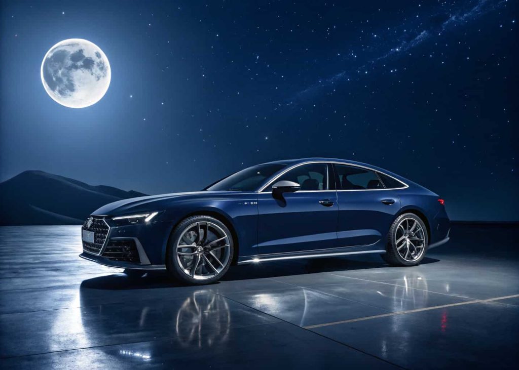
4 Midnight Chrome
The Midnight Chrome palette is where luxury meets the digital frontier. Deep navy and near-black backgrounds are elevated by cool silver and metallic blue-gray highlights that feel like reflections off polished metal or moonlit water. This palette speaks to a younger, tech-savvy audience that finds beauty in the intersection of darkness and precision. It is everywhere in gaming brands, premium tech products, fintech platforms, and high-fashion campaigns that want to project exclusivity and cutting-edge confidence. The contrast between the dark foundations and the luminous silver accents creates drama that commands attention without ever feeling overdone.
5 Peach Fuzz & Cream
Building directly on Pantone’s Color of the Year legacy, the Peach Fuzz & Cream palette expands peach into a full, luxuriously soft color story. These tones are nurturing, warm, and deeply human — evoking skin, warmth, and intimate comfort. In 2026, this palette has found its home in feminine wellness brands, luxury skincare, maternity fashion, and even interior design where soft warmth replaces the cold grays of previous decades. The full palette ranges from warm cream whites all the way to saturated peachy corals, giving designers enormous flexibility to layer depth and softness simultaneously in ways that feel fresh, gentle, and undeniably inviting to every audience.
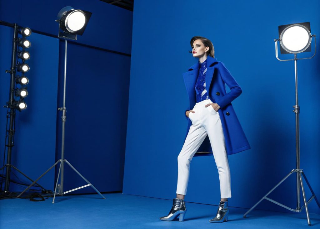
6 Electric Cobalt
Electric Cobalt is the bold statement palette of 2026. Where past years leaned into muted blues, this year the pendulum swings hard toward vibrancy and confidence. Cobalt blue in its most saturated form communicates power, intelligence, and fearlessness. From high-visibility sportswear and political campaigns to bold editorial fashion and statement home furnishings, this palette refuses to be ignored. It pairs especially well with crisp whites and warm neutrals that prevent it from feeling overwhelming. Graphic designers and brand strategists are particularly drawn to cobalt this year because it photographs beautifully, stands out in digital feeds, and still carries a timeless authority that transcends fleeting micro-trends.
7 Warm Sand & Dune
The Warm Sand & Dune palette is the sophisticated cousin of beige, and in 2026 it has been fully rehabilitated from its boring reputation into something genuinely elegant. Inspired by Saharan dunes, coastal shores, and the raw textures of natural stone, this palette layers golden tans, warm biscuit tones, and bleached sand whites into a palette that feels both organic and refined. It’s the palette of choice for luxury hotels, high-end real estate marketing, artisan food brands, and timeless fashion labels that value quiet elegance over loud statements. In interiors, it creates a sense of sunlit calm that makes any space feel simultaneously effortless and intentionally curated.

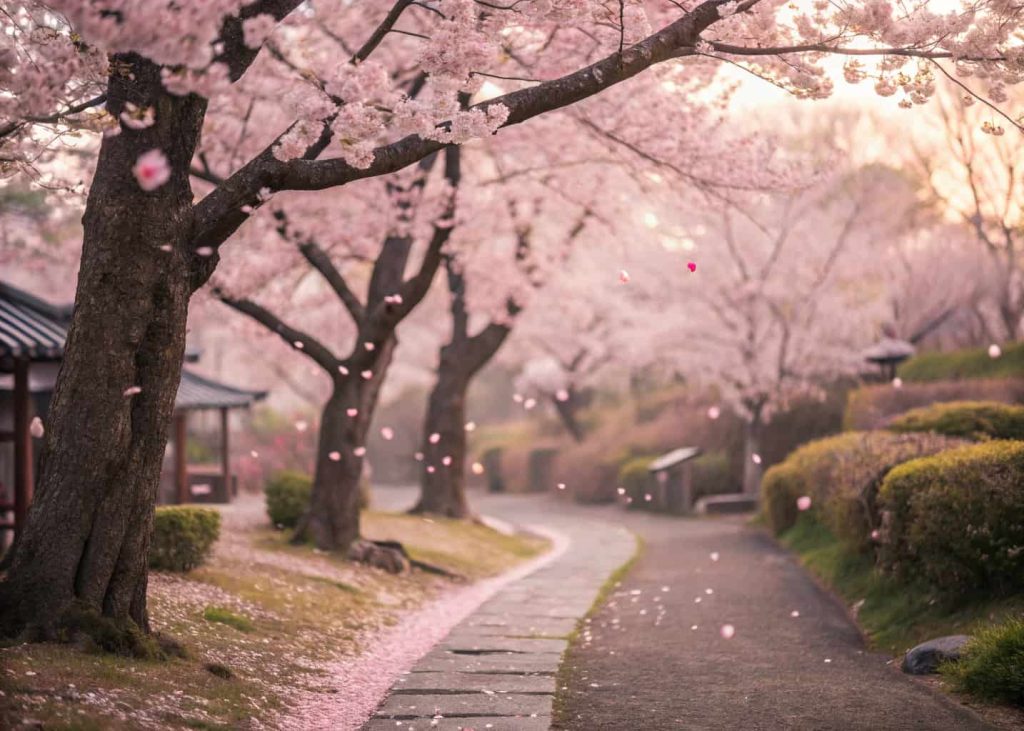
8 Cherry Blossom Pop
Japan’s cultural influence on global design continues to grow, and the Cherry Blossom Pop palette is its most joyful expression in 2026. Moving beyond pale blush pink into a fuller, more saturated range of rose and magenta pinks, this palette is celebratory, youthful, and unapologetically romantic. K-beauty and J-beauty brands have led the charge, but Cherry Blossom Pop has spread into streetwear, dessert branding, spring fashion campaigns, and social media aesthetics. It is particularly powerful in food marketing where its association with sweetness, freshness, and celebration makes products instantly appetite-appealing. The depth range from soft blush to deep rose adds versatility that keeps it from feeling one-dimensional.
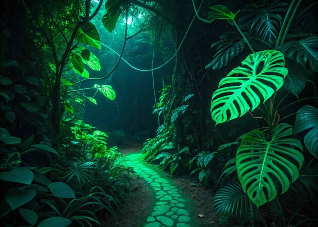
9 Neon Jungle
The Neon Jungle palette is 2026’s most electrifying green story. Where Matcha & Moss is subtle and grounded, Neon Jungle goes the opposite direction — acid greens, electric limes, and hyperreal jungle tones that pulse with life and energy. Born from rave culture, cyberpunk aesthetics, and the fashion world’s ongoing love of maximalism, this palette is designed to stop the scroll completely. It is especially beloved by streetwear brands, music festival designers, sports energy drink companies, and digital artists working in motion graphics and 3D environments. Against a dark or black background, these greens glow with an almost radioactive intensity that makes even the simplest design feel urgent and alive.
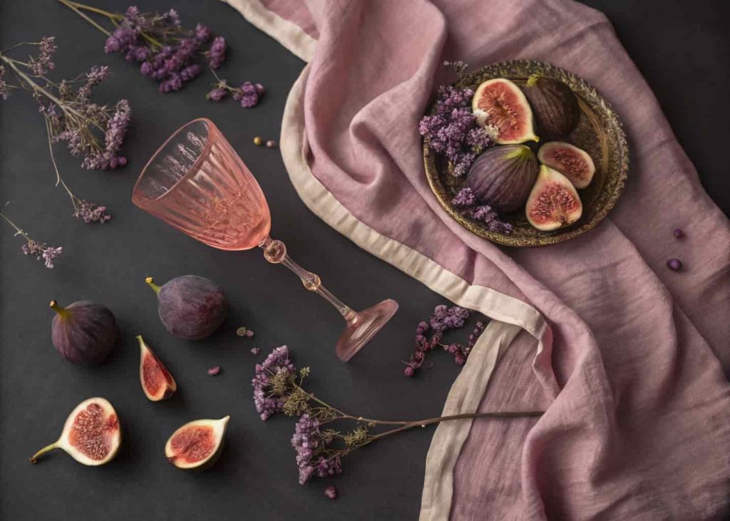
10 Dusty Rose & Fig
The Dusty Rose & Fig palette is the most emotionally complex color story of 2026. By pairing the familiar warmth of dusty rose with the deep, mysterious richness of fig purple, this palette creates a tension between vulnerability and strength that feels profoundly current. It’s romantic without being saccharine, luxurious without being cold. Wine brands, premium chocolate companies, boutique hotels, and literary publishers are especially drawn to this palette for its ability to communicate taste, sophistication, and emotional depth simultaneously. In fashion, it has become a favorite for evening wear and accessories. The full range from deep fig to pale blush gives designers a complete toolkit for creating visual stories of nuance and elegance.
11 Arctic Frost
Arctic Frost brings the crisp, clean energy of glaciers and winter skies into 2026 design. This palette of icy blues and near-white sky tones communicates clarity, freshness, and a kind of hopeful spaciousness that feels deeply refreshing in an era of visual overload. Skincare brands, water and hydration products, medical and dental brands, and technology platforms all find natural homes in this palette’s cool serenity. It works brilliantly as a background palette that makes other colors and imagery pop. Interior designers have also embraced Arctic Frost for bathrooms and spa spaces where the goal is maximum freshness and calm. Paired with white marble textures, the effect is genuinely transportive and immaculate.

12 Sunset Gradient
Few palettes are as universally beloved as a great sunset, and the Sunset Gradient palette takes that universal beauty and packages it into a toolkit for 2026 design. Moving from deep coral red through vivid orange and golden yellow into a soft lemon green, this palette captures the exact moment when the sky becomes a living painting. It’s full of warmth, energy, and optimism. Travel brands, music festivals, youth-oriented fashion labels, and mobile app interfaces all benefit from the Sunset Gradient’s ability to convey joy and adventure. The yellow-to-green transition at the cool end of the palette adds a unique twist that distinguishes it from older sunset palettes and keeps it feeling distinctly contemporary and alive.

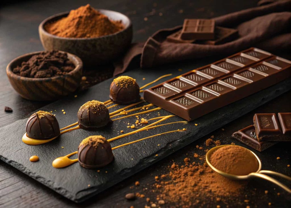
13 Cacao & Caramel
Rich, indulgent, and deeply sensory, the Cacao & Caramel palette is having a massive moment in 2026. This range of chocolate browns, amber caramels, and golden toffee tones taps into the growing luxury food culture and the broader trend toward warm, analog aesthetics that feel handcrafted and authentic. It’s everywhere in artisan coffee brands, premium confectionery, leather fashion accessories, and the interior design world’s ongoing obsession with warm brown tones as an alternative to gray. As a branding palette, Cacao & Caramel communicates indulgence, craftsmanship, and heritage in ways that few other color families can match. It is both deeply classic and remarkably fresh in the current design landscape.
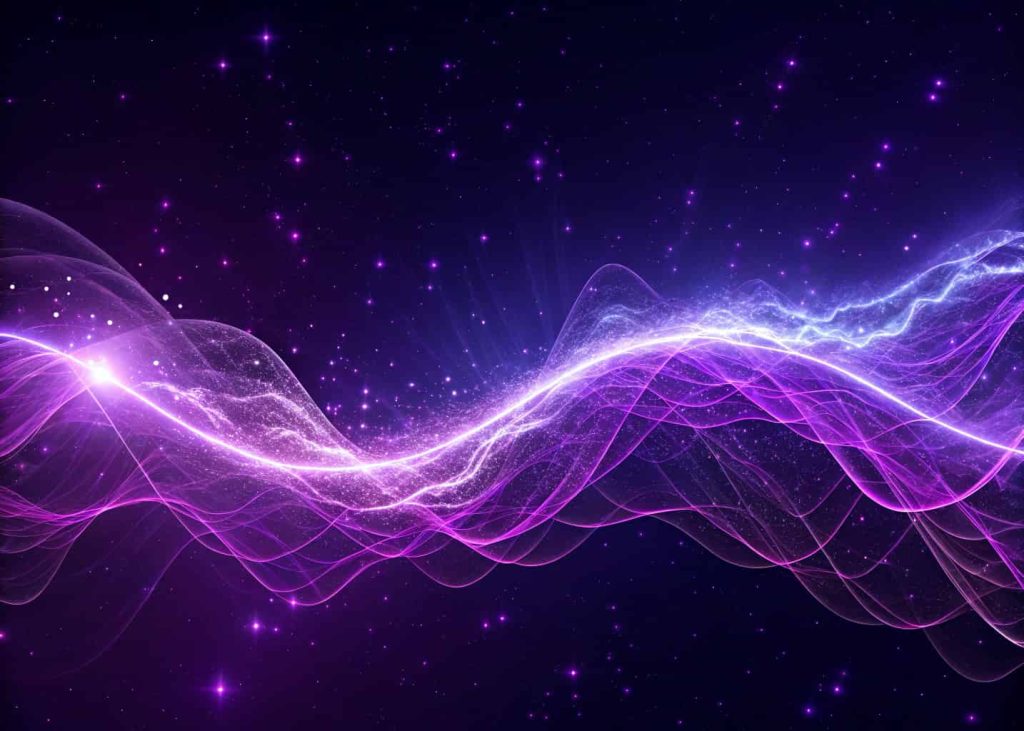
14 Quantum Violet
Quantum Violet is 2026’s most ambitious palette — bold, mysterious, and unmistakably forward-looking. These deep electric purples and vivid violets feel like the visual language of artificial intelligence, quantum computing, and the new era of technology that is reshaping everything around us. Unlike the softer Digital Lavender, Quantum Violet is intense and unapologetic. It is used by AI companies, biotech startups, luxury gaming brands, and avant-garde fashion designers who want to signal that they are operating at the absolute cutting edge of what is possible. The light orchid and pale violet tints at the top of the range provide breathing room and softness that prevent the palette from feeling oppressive, making it highly versatile across a wide range of applications.
Conclusion
Color is more than decoration — it is the emotional architecture of every great design. The 14 palettes explored in this article represent the full spectrum of what 2026 has to offer: from the quiet warmth of Warm Sand & Dune to the electric intensity of Quantum Violet, from the nurturing softness of Peach Fuzz & Cream to the raw energy of Neon Jungle. The best palette for your project is not always the most fashionable one — it is the one that most authentically speaks to your audience and purpose. Study these palettes, experiment freely, mix unexpected combinations, and never be afraid to let color lead your creative decisions. 2026 is a year that rewards boldness, and great color choices will always be at the heart of great design.